0
Category

Uncategorized

Larry J Kolb:
Without a trace
(in the world of spies)

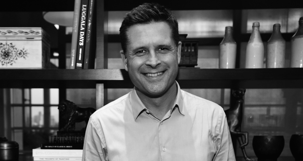
Larry J Kolb—ex-CIA operative and best-selling author—shares his experiences working in the covert world of spies. This interview was featured in Open Manifesto #5, which focused on the theme ‘Identity’.

Kevin Finn: Until your early twenties you resisted the secret world that your father was part of. Eventually Miles Copeland, one of the founders of the CIA, convinced you to join the agency, but you did so reluctantly. What changed your mind and was this a decision you came to regret?

Larry J. Kolb: Miles Copeland changed my mind. He was just so damned interesting, and charming. And by the time he finally let me know why he’d been spending so much time with me, what he really wanted from me, we were such close friends that I almost couldn’t conceive of saying no. Beyond that, he made what he was inviting me to do seem fascinating, which it certainly was. Regrets? I suffered some because of my decision, I learned some hard truths. But, no, I have no regrets.

Intelligence agencies employ covert tactics and personnel to gather information. What’s it like to be a spy or a covert operative in today’s world? Is it as gritty or as glamorous as the popular culture stereotypes lead us to believe: James Bond, Jason Bourne, Alias and Hollywood films depicting spies and CIA secret agents? Is there even a shred of truth in these depictions?

Espionage requires patience. What’s it really like? Vast, truly vast, stretches of mind-numbing boredom interspersed with some very interesting and sometimes heart-pounding moments that are absolutely not boring at all. In those moments—not the waiting, but the doing, in those interesting moments—a sort of hyperaware calm always came over me. I felt totally aware of everything—everything—that was going on around me. On the surface, I seemed my normal self, at least I hope I did. But beneath the surface, it was almost as if I was in some sort of altered state.

Espionage requires patience. What’s it really like? Vast, truly vast, stretches of mind-numbing boredom interspersed with some very interesting and sometimes heart-pounding moments that are absolutely not boring at all.

Part of that was a result of planning. The more I planned, the more time I devoted in advance to reconnaissance and to thinking through every possible outcome before I acted, the calmer I could be in the crucial moments—and that, at least for me, was very critical to my ability to perform. Is it gritty? Yes, sometimes. Glamorous? Probably less glamorous than the stereotypes would have you believe.

And yet I fit into those stereotypes better than most, because of the fact that the reason Miles Copeland recruited me was the glamorous circles I already travelled in, and the access I had as a result of that.

Similarities to James Bond? Well, yes, in my time in his profession, I wore a lot of well-tailored suits, and there was always a tuxedo packed in my suitcase. But that was my lifestyle before I met Miles, not something that grew out of Miles recruiting me, and not something all that typical for an espionage agent. I’ve still never seen a car with an ejector seat.

Jason Bourne? Car chases and big explosions make interesting scenes onscreen, but there’s certainly a lot less of that in the real espionage world than in the movies and on television. The idea is to get away without leaving a trace, and without a fight. Which, admittedly, isn’t as interesting onscreen as car chases and explosions.

Alias? Well, yes, there are certainly intelligence services whose offices and other facilities are hidden in plain sight amongst totally unsuspecting populations in major cities all over the world. However, the “intelligence work” portrayed in Alias never seemed very intelligent to me.

Broadly speaking, many ordinary people are familiar with the identities of legitimate Government secret agencies, for example the CIA, MI5, Mossad, and suchlike. However, do you know if there are any ‘secret’ secret Government agencies in existence, the identities of which are generally unknown to the wider public?

Yes, I do know. And yes there are many, many fully-sanctioned government intelligence services which fly totally beneath the public’s radar.

Over the last few decades there has been an increase in ‘identity theft’. Recently the ‘invitation-only’ website Darknet Market, an online criminal black market specialising in identity theft, was shut down after a two-year international operation involving various federal agencies. Obviously the criminal world operates in stark contrast to legitimate law enforcement agencies so, as a covert operative, how does one go about designing a convincing new or false identity?

Confidence and charm are still important, of course. No matter how good your documents and your backstory, you’re still absolutely screwed if you hesitate every time you introduce yourself by a false name. Try it; it’s not as easy as you’d think.

Confidence and charm are still important, of course. No matter how good your documents and your backstory, you’re still absolutely screwed if you hesitate every time you introduce yourself by a false name.

But, beyond that, the challenge is not creating a new identity, but backstopping it—building into both the public record and private records material, verifiable records that are consistent with a newly-created false identity.

Even today, with information so much more accessible than it ever was before, and with technology that gives almost every member of the public the ability to cross-check and cross-reference information in ways that twenty years ago only intelligence agencies with supercomputers could do, there are, of course, still ways to create all new and totally false, but seemingly verifiable, identities. And as your question foreshadows, identity theft is probably easier than the work that goes into creating and backstopping false identities.

There is a world of rogue secret agents we rarely hear about, those who use their training for malicious purposes and personal gain. A few years ago you helped track down one particular rogue agent, which you documented in your book ‘America at Night’. Your investigation involved navigating a labyrinth of various bogus identities, which had fooled all other agencies up to that point. How difficult is it to expose a well-organised and well-constructed false identity?

Apparently, it can be very difficult. In the case you mentioned—the case I recounted in America at Night—the Department of Homeland Security, the CIA, the DEA, the IRS, and other U.S. government agencies had been trying intensively but unsuccessfully for three years to discover the real identity of a former CIA agent who was going by the name of Richard Marshall. It didn’t help that all of the government’s databases had been wiped clean of information about the man who called himself Mr. “Marshall.”
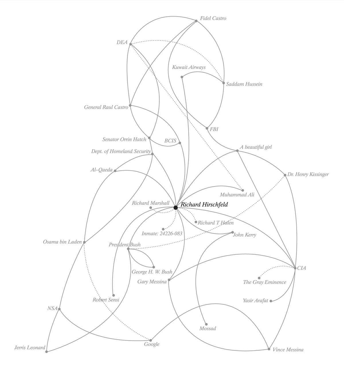
And yet, a week after a friend of mine who was at the time a very high-level official of the Department of Homeland Security asked me to get involved in the case, I had solved it, identified the bad guy, and soon after that he was arrested.

How did I pull that off? It happened that I had known the guy, many years earlier, and I have a very good memory. What the U.S. government’s security services had somehow lost from their files, I still had in my head. And much of what I couldn’t remember, I had saved in my own files. And thus “Richard Marshall” became “Richard Marshall Hirschfeld” and once I had given the United States government enough information and evidence to verify that, it became a whole lot easier to find him.

He was rather spectacularly arrested, in a safe house he had bought for himself using a corporate shell to attempt to conceal his link to the house. He then, even more spectacularly, and quite mysteriously, died, while in federal custody, while in the course of a campaign to tell every Washington power figure he could get word to that if the federal government didn’t release him immediately he was going to tell everything he knew about them.

Which brings us back to your earlier question about whether the real espionage world is ever as gritty as the popular stereotypes would have us think. In that case, yes. Richard Marshall Hirschfeld’s career as an intelligence asset and international intriguer did not end well.

In your opinion, can the media be used to engineer information for the public in order to aid covert agency operations or has the media become so efficient that it has evolved into another form of legitimate intelligence gathering? For example, in Keith Suter’s book ‘50 things you want to know about the world but were too afraid to ask’ it states: “during the Gulf War the CIA complained that the then President Bush didn’t need CIA briefings. He said he preferred to watch CNN live because the written CIA briefings took a day to arrive.”¹

Television news and other media can certainly be very immediate these days. Last year, at the Democratic and Republican National Conventions, the U.S. Secret Service was caught off guard by the immediacy of Twitter. The Secret Service found themselves learning details of the whereabouts and movements of certain candidates and others they were supposed to protect after audience members learned the same information through Twitter.

By now, that’s certainly been corrected. But as to the first part of your question, oh, yes, the media can be used, and very often is used, to engineer information in aid of covert operations.

With the Internet and immediate global access to information one could argue there is more transparency in today’s society. As a result, one would assume it is harder to hide. On the other hand, one might suggest it is easier to leave open but misleading trails. Does this make things harder for covert agencies or can they use this to their advantage?

Yes, certainly there is more transparency in today’s society, and that is a result of the amazing interactive technologies we have today. In intelligence gathering, technology has changed the way the game is played.

In intelligence gathering, technology has changed the way the game is played.

Just a few decades ago, to many people telephone answering machines seemed so inhuman and strange that most refused to leave messages on them. But that feeling soon fell away, and people began leaving messages for each other, and then responding to those messages with recorded messages of their own—without actually conversing one-on-one with the person with whom they were communicating.

The world had begun to embrace asynchronous communication. There was no longer a need to actually coordinate your schedule with another person’s schedule to have a conversation, of sorts, with them. And with the advent of email, asynchronous communication became the norm rather than the exception. That certainly lends itself to communications between espionage agents and those who control them.

We are understandably led to believe secret agents are incredibly protective of their identity and their covert status. With this in mind, what led you to write your biography ‘Overworld: The Life and Times of a Reluctant Spy’?

When I wrote my first book, I was on trial in India in connection with certain covert political operations I had been involved in for my friend Rajiv Gandhi—who, when I provided those covert services, was prime minister of India, and who, by the time I was tried, in absentia, had been assassinated. Indian press reportage concerning the case, and the trial, and me, was quite lurid. My cover was blown. And all my life, I’d wanted to be a writer, to write a book. So I did. And when the trial was finally over, acquittals all around.

In a previous conversation you once told me that one of the reasons you wrote your second book ‘America at Night’ was partly for your own protection. Rather than hide your identity from the rogue secret agents that you were exposing, would it be accurate to say you made the entire investigation public partly because being very open about your identity was critical to your safety?

Absolutely. In the beginning, everything I did related to the case I did anonymously, out of concerns for my safety. But then my identity was inadvertently exposed as a result of—how can I put it nicely?—let’s call it an “administrative mistake” made by a very high-level attorney and public official who had a lot of other things on his mind at the time and didn’t do a good job of protecting me.

From that moment on, I realized that the more people I told what I’d recently done and what I’d learned, and who was involved, the less likely I would be to end up mysteriously dead. At first, I just told the story to a lot of people I knew. Then I told a few well-placed reporters and asked them to make sure the story got out if anything happened to me. Then I told the story in a book.

I realized that the more people I told what I’d recently done and what I’d learned, and who was involved, the less likely I would be to end up mysteriously dead.

How does being a covert operative affect one’s own identity? For example, while you were a sports agent, most notably for Muhammad Ali, you were also involved with the CIA. Was the CIA just another aspect of your work or did you have to assume different identities for your CIA assignments?

In my case, I almost always used what’s known as “natural cover”—my real name, my real life story, the real access to certain halls of power that I had gained in the course of my life and my travels. On the other hand, when Richard Marshall Hirschfeld, for example, was arrested in 2004, he’d for the past several months been carrying five different mobile phones, each of which he answered with a different identity.

Politics are closely aligned with secrecy. American Vice President Dick Cheney once said: “One of the problems we have as a government is our inability to keep secrets.” In your opinion, is it important for Governments to keep secrets?

Absolutely. And Governments do keep secrets. Generally, the public hears only of intelligence services’ spectacular failures. The idea, as I said earlier, is to get away without leaving a trace.

Image credits

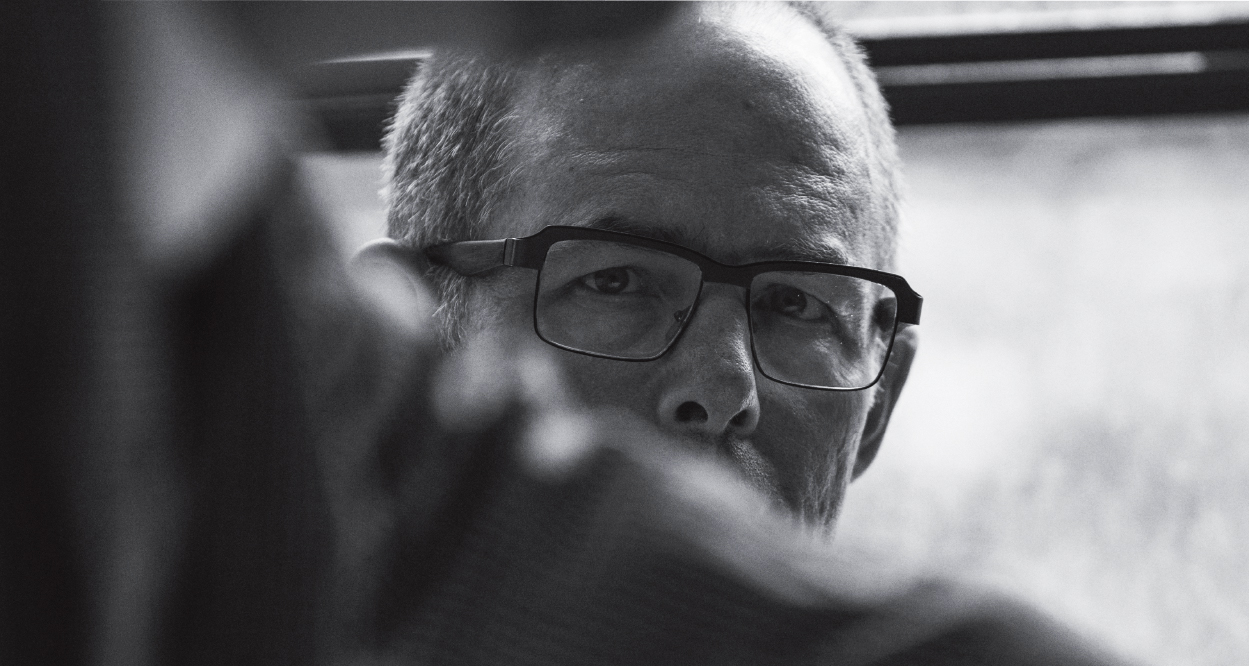
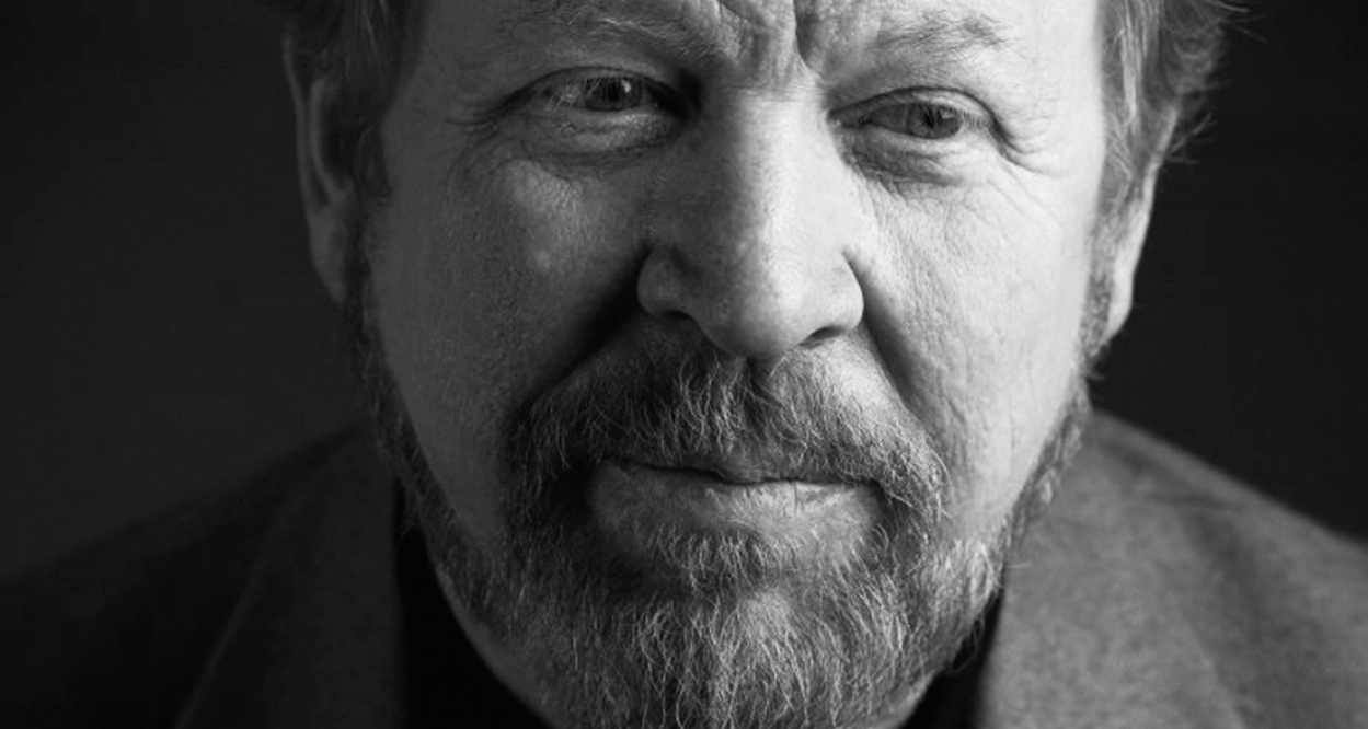
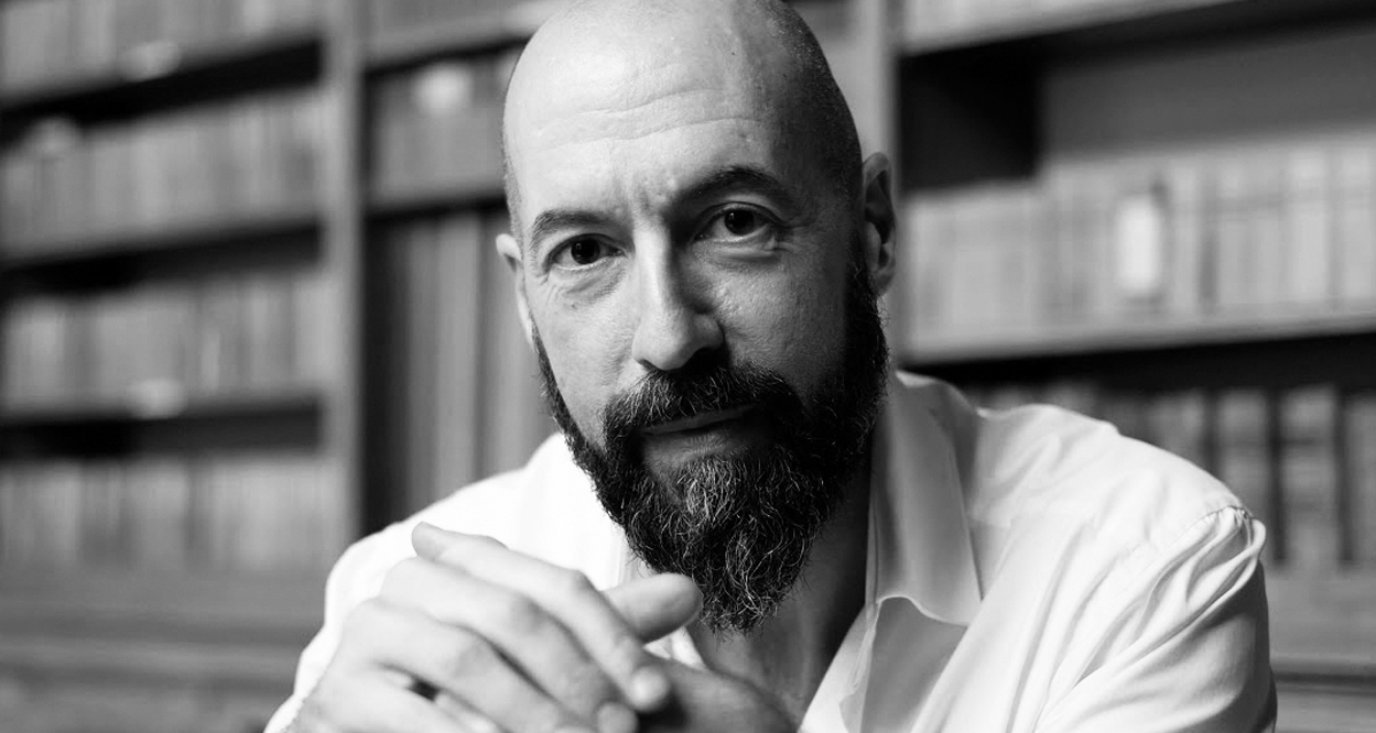
Larry J Kolb portrait supplied by Larry J Kolb

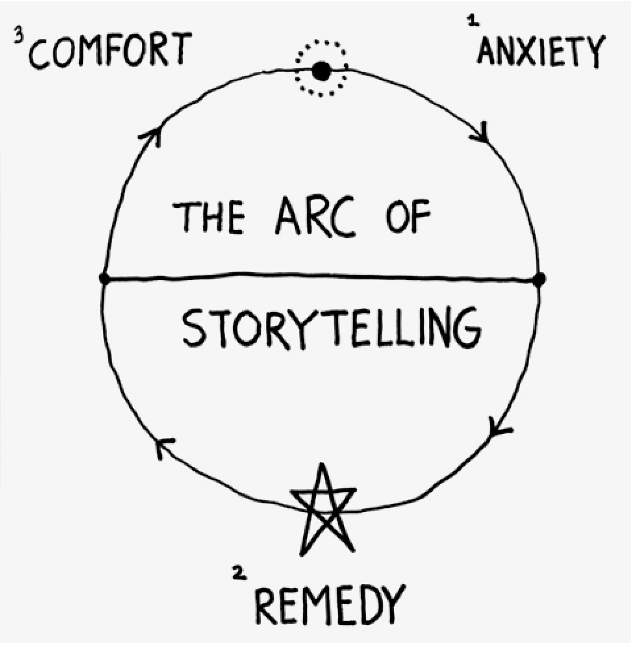
Illustration/diagram conceived and designed by Kevin Finn (in 2006, as part of a book cover proposal for Larry J. Kolb’s ‘America at Night’. It has been included in this interview at the request of Larry J. Kolb).

Reference

1. 50 things you want to know about the world but were too afraid to ask, Keith Suters, Bantam, 2005, Page 166.

Ji Lee:
Everything is connected

Ji Lee—Korean-born, Brazilian-raised, and one of the top 50 most influential American designers [now based in South Korea]—discusses the transformative power of personal projects. This discussion was featured in Open Manifesto #7, which focused on the theme ‘Enlightened Self-interest’.
Note: At the time of this interview, Ji Lee was Creative Lead at Facebook.

Kevin Finn: It’s clear your work is centered on ideas and much of it is driven by your personal interests. But an underlying objective also seems to be that other people can also interact or benefit from those particular projects. With this in mind, would it be fair to describe your personal work as an exercise in enlightened self-interest?

Ji Lee: Yes, I think so. However, enlightened is a big word. I don’t claim there’s any aspect of me that is particularly enlightened. I think the enlightened part is a process towards better understanding myself, and also trying to connect with other people through this process.

But you do get a lot more enjoyment when people do interact with the work that you’re creating…

Absolutely!

So it’s not just about your own growth and learning, and becoming more enlightened. Would you agree it’s more about asking: “How can others participate?”

Yes. My process, which is often participatory, really wasn’t something that I did consciously—it just sort of happened naturally. I think the first project where I fully realized the power of opening up for others to participate was The Bubble Project, which probably goes back ten years. It happened when I was working at Saatchi & Saatchi.

I studied graphic design, but I originally came to New York to study fine arts. That was my goal. As a child I always wanted to become a painter—Picasso and Van Gogh, those were my childhood idols. I always liked to draw and paint and my parents were always supportive of what I did, in terms of artistic activities.

Then, with the support of my parents, I came to New York to study fine arts. The first year consisted of studying general liberal arts. In my second year I chose fine arts as my major. I did the first semester and I realized that fine arts really wasn’t that interesting because the education of fine arts in my school, and I think generally speaking, is very theoretical—a lot of discussion; it’s less practical and more theoretical.

I didn’t really feel inspired by the teachers. In fact, I felt they were sort of unsuccessful, frustrated artists themselves. I saw that a lot of students, who graduated from the fine arts department, didn’t actually become successful artists. They were either waiting tables or becoming construction workers. They were really struggling financially and artistically. In the end, a lot of them simply gave up in order to pursue something else. That didn’t encourage me.

I switched my major to graphic design because I saw a lot of interesting projects coming from the graphic design department and quickly fell in love with it. I really liked the fact that graphic design had very artistic aspects that I enjoyed in fine arts, but also had very practical elements. It was commercial arts, so you could be artistic, and have a job, and make money.

Creativity really thrives with limitations.

I also liked a certain structure—the rigour and rules that you had to follow because I think creativity really thrives with limitations. For example, when studying typography you really have to understand the techniques of the font, the kerning and leading and all that stuff.

A good example is my Word As Image project. For me, that was when I really started to experiment with typography. I absolutely fell in love with the amazing possibilities you could do with typography. It’s worth noting, Word As Image really started in my second year in college—in art school. It was one of my first typography assignments. I loved this project because it was so hard to come up with something really good.

[Laughs] Yes, and considering those restrictions you mentioned earlier.

Absolutely! It is restriction because you have to represent the meaning of the word, but only through using typographic elements contained in the letters of that particular word.

In that assignment, you couldn’t add anything else. It’s almost like a puzzle and you have to follow those rules. But there’s an amazing reward when you actually crack that piece of puzzle. I love it.

When I first saw that project I referred to it as the joy of typography. It is so evident there really is a lot of joy coming through the work…

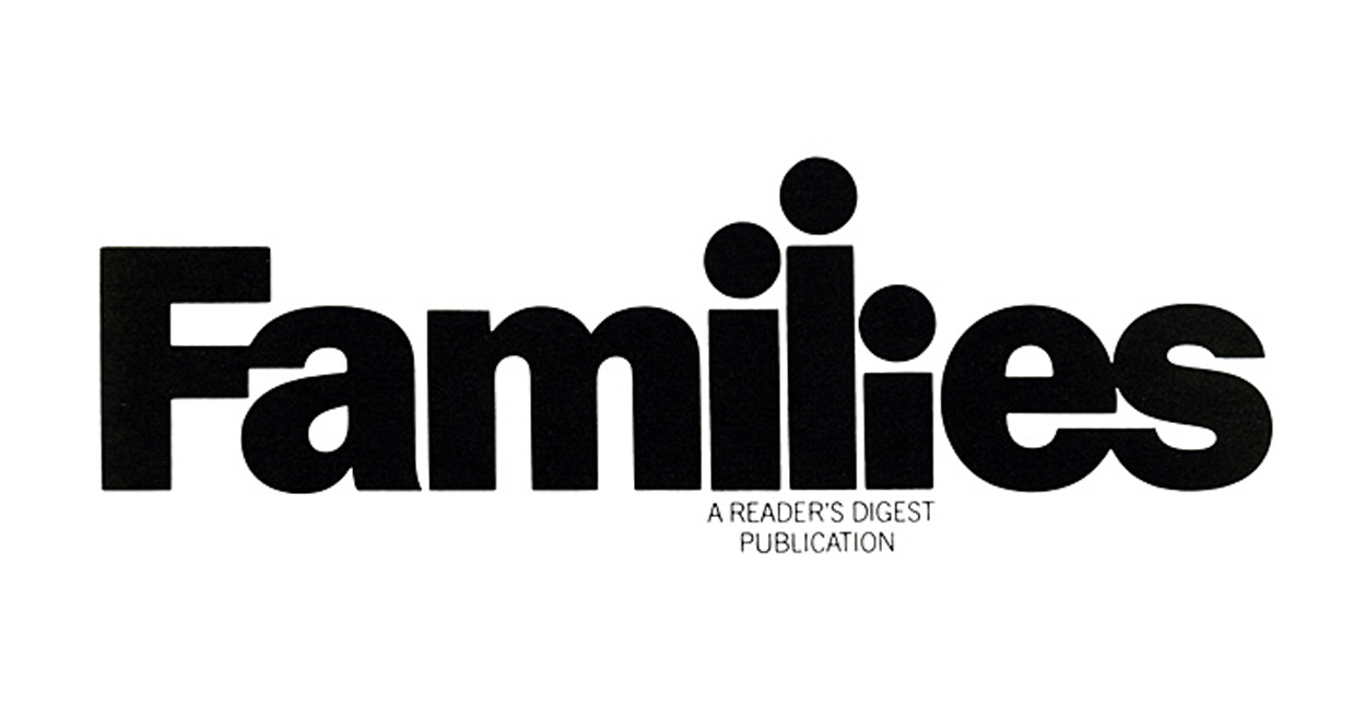
Exactly! And when I was introduced to the work of Herb Lubalin—his Word As Images like “Families” or “Mother and Child,” in particular—I was amazed at the simplicity and pure conceptual aspects of how, through typography, he was able to show such a clear idea in a visually simple way. So I really enjoyed studying graphic design.

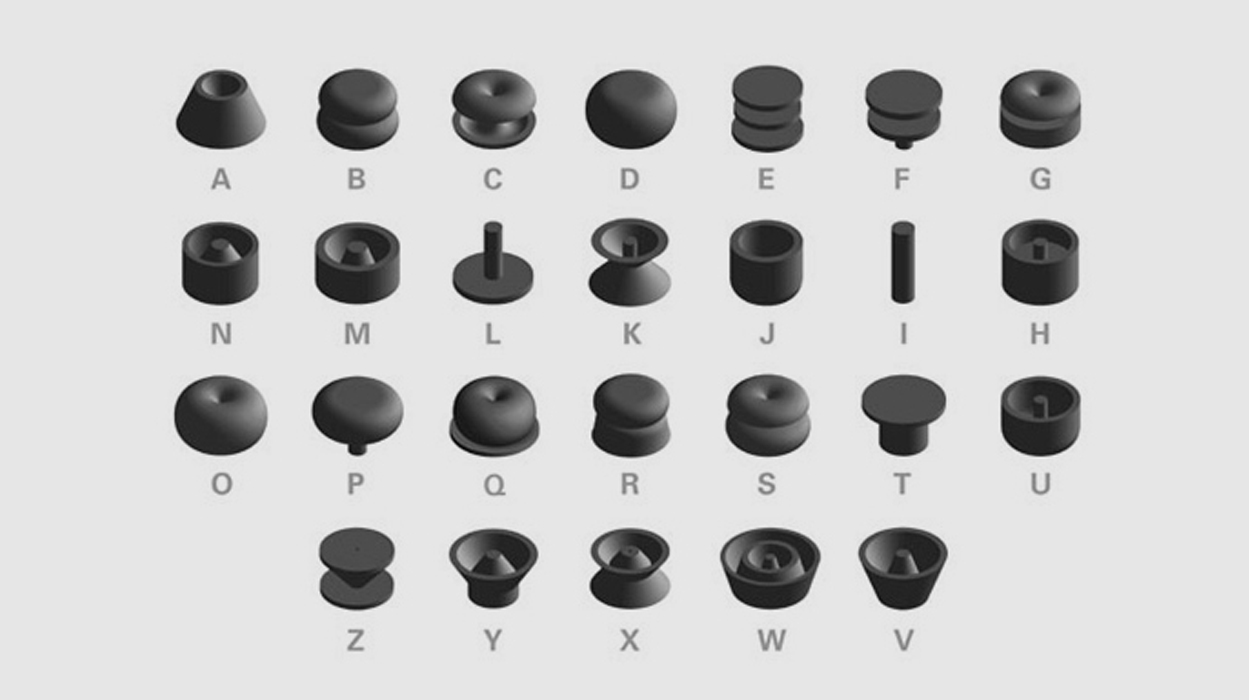
I studied typography, and color theories, and editorial design, and identity design, and packaging design. My school years were really some of the best times. It’s also where I began to experiment in new ways, for example a project called “Universe Revolved: A Three Dimensional Alphabet.” A lot of those typographic projects actually came from my school years.

After I graduated, I was offered a job in a corporate design firm called Frankfurt Balkind. They did a lot of annual reports and corporate identities, but the firm doesn’t exist anymore. It was really interesting because, at the time of my senior show, I had already accepted the job with them. However, Stefan Sagmeister [who was featured in Open Manifesto #2] had also came to my senior show and was interested in speaking with me. He was already a well known designer then and said: “I really love your work and I’d love to talk with you. Why don’t you come and visit me in my studio?” Of course, I went to see him at his studio. It was a small studio in 14th Street—and he offered me a job.

I respectfully declined his job offer because I had already accepted a job. And that’s where Stefan became my mentor throughout all these years. He has been an amazing inspiring mentor and that was the beginning of our relationship.

After graduating Stefan Sagmeister offered me a job, but I respectfully declined because I had already accepted a job.

Wow! You turned down the job. Why?

I don’t know why. I know I could have gone back to Frankfurt Balkind and retracted my acceptance so that I could work with Stefan. But, I didn’t. The fact that I had already said yes to the other guys meant I felt I was already committed to them. It was like: I should honor that commitment. But, in retrospect, I think it was really the best thing I could have done because I learned so much from working with lots of people in Frankfurt Balkind. I think if I had stayed with Stefan, perhaps I would have stayed under his shadow, sort of not being able to flourish on my own. But I guess it’s funny; the things that happen when you’re in New York, when you’re meeting up with all these amazing designers.

So anyway I went to Frankfurt Balkind and some of the best designers I know came out of that firm. Todd St. John was a really amazing designer, and still very much doing amazing work here in New York. He’s the principal of HunterGatherer.

I also met my best friend Jeff Greenspan there, who [at the time of this interviews was] the Chief Creative Officer at Buzzfeed. He has also done some amazing products on his own—personal projects. I met Arturo Ronda there, who I still work with today at Facebook and who was also the Creative Director of the Digital Department at BBDO.

And they were all originally at Frankfurt Balkind?

Yes they were all at Frankfurt Balkind. While there I was working mostly on annual reports. I worked on annual reports for LG, I worked on annual reports for NCR (National Company of Registry). I worked on identity projects for Sony. And although these were not the most exciting creative projects, I learned a lot—how to present the work, how to work in a group, how to be professional. However, by the end of the first year I felt I knew the environment was a bit too corporate and a little too dry and boring for me. And I ended up quitting the job to freelance at Abbott Miller’s studio which was called Design Writing Research.

He really loved that my portfolio contained lots of conceptual typographic work including Word As Image and Universe Revolved: A Three Dimensional Alphabet. It so happened that, at the time, he was publishing a book called Dimensional Typography, which is kind of a seminal book on 3D typography.

At the time, that was a really interesting book, because it was the first platform to showcase computer generated 3D alphabets and he included the Universe Revolved. I did lots of interesting book projects for Abbott while I worked with him. During that time I also worked in other firms like Tsang Seymour Design, where I did lots of editorial design and museum catalogs for Metropolitan Museum of Art.

I imagine most people would have thought, after leaving Frankfurt Balkind you’d be thinking: OK, I’ve done a year in this firm. I’ve learned all the rules. It’s a bit dry and boring, but it was good discipline. Now, I’ll go and knock on Stefan’s door, because he likes my work. But you didn’t do that. I know in hindsight it was a good decision but, at the time, what stopped you from immediately going to see Stefan?

I don’t really know why I didn’t do that. It just never crossed my mind. I always kept in touch with Stefan and showed my projects to him, but for some reason I never really thought about asking to work with him. Actually, I didn’t go to Abbott Miller’s studio, either. I went to a small firm called Tsang Seymour Design first, where I did a bunch of museum catalogs. I have no answer for why I didn’t go to Stefan’s studio. But, at Tsang Seymour Design it was pure editorial work on museum catalogues. It was fun. But, I started to feel the limitations of what the design required; I was really interested in concepts. Designing annual reports and museum catalogs, they weren’t necessarily conceptual.

I tried to get as conceptual as possible, but they were mostly aesthetic projects. I grew up in Brazil from the age of 10 to 20, and Brazil is famous for amazing TV and print advertising. I grew up seeing these ads, and I remember being amazed by some of these really funny ads, which became part of the cultural conversation. If there was a famous ad, it would become part of everyday conversations with Brazilians. Advertising creative directors were almost like rock stars.

I really like the fact that conceptual work had huge impact on the society and culture—and on a massive scale. I was interested in the scale and conceptual side of advertising. As a result, I really wanted to find my way into advertising, but I had no connection to the advertising world. So, I kept doing design work.

When I quit Tsang Seymour Design I ended up going to Abbott Miller’s studio to freelance; while there the 3D Dimensional Typography book came out; and, at the same time, there was a New York Times Sunday Magazine issue dedicated to innovation in technology. The editor of the New York Times saw Dimensional Typography and liked my Universe Revolved font. She contacted me and asked me if they can use the font for their issue. I said “Of course!” They ended up using the font for that issue. It’s really funny how one thing leads to another in your life and how the universe has this way of guiding you—opening a door which you least expect.

It’s really funny how one thing leads to another in your life and how the universe has this way of guiding you—opening a door which you least expect.

It’s a really interesting example of how these threads—going to Abbott Miller’s, being part of Dimensional Typography, being part of the New York Times magazine—can connect. And at the same time, Saatchi & Saatchi was organizing their first Innovation in Communication award, which is something Bob Isherwood [former Worldwide Creative Director of Saatchi & Saatchi] initiated. They had invited a bunch of famous people, like Buzz Aldrin and Laurie Anderson, who was one of the judges. Laurie saw my font in The New York Times Magazine, and she loved it. She told the Saatchi people that they should contact me to enter this work to the award, which they did. I was thrilled, and I spent three days preparing this book about the 3D alphabet. I submitted and I became one of the 10 finalists for the innovation award.

That’s how I met Bob [Isherwood] for the first time. I remember going to a dinner for the finalists. There’s a funny story where I was sitting next to this gentleman who was probably in his 70’s. I thought he was one of the Saatchi brothers, because he was in a suit. I even asked if he worked for Saatchi’s. Since he didn’t I obviously asked what he did do. He said he was an astronaut. I replied: “Oh, that’s incredible. When was the last time you were in space?” He said, “1969.” It was Buzz Aldrin! That’s one of my favorite stories of being in the industry.

And that was my first experience of being exposed to the world of advertising. Bob wanted to see my portfolio, which he loved. He introduced me to the Saatchi people, and I ended up getting hired by Saatchi & Saatchi. They doubled my salary and gave me my own office. I thought it was my dream come true. I always wanted to work in advertising, and now I was at one of these famous ad agencies—which I had only heard of when I was growing up. So, I thought: “Wow, this is it. I’m going to do amazing work and be happy and make a lot of money.”

But when I started working at Saatchi & Saatchi I was working projects for Procter & Gamble, General Mills, Johnson and Johnson—really huge corporate clients. I realized to produce work was not as easy as I thought.

At the time, it was the height of political correctness in America. Any idea that had any innovative or different angle was getting killed simply because the client did not want to innovate or try new things. They just wanted to do formulaic things, which they knew had worked in the past. Every idea went through testing. And in the testing stage, every idea got watered down and ended up becoming dull and boring. They always looked for the lowest common denominator. Lawyers were always involved to make sure there was nothing that could be potentially offensive or troublesome. I worked at Saatchi & Saatchi for about four years. During those four years I was able to produce one TV spot for Head and Shoulders shampoo. One!

I know you left after those four years, but during that time it must have been increasingly disillusioning because of the perception you’d had of Saatchi & Saatchi—because the reputation Saatchi & Saatchi has; because of the industry you wanted to get into. You were doing more creative work on your own than you were doing being in an ‘advertising powerhouse.’

It was disillusioning. And it was a slow process. I always believed that if I worked hard there would to be opportunities and I would be able to produce work. But ideas got killed. One idea after another—they started getting killed. I began to slowly realize: “Wow, there’s no way that I’m going to be able to produce work here.” Even that one TV spot I mentioned earlier, the one I was able to get out the door. It was for Head and Shoulders and was targeting a teenage audience. The TV spot had this guy with his hair on fire, and he was skateboarding down the streets. He jumps into a pool and when he came out it was revealed that the pool was in the shape of Head and Shoulders.

It was supposed to be a fun visual spot. The client spent hundreds of thousands of dollars. We shot it in Vancouver. We spent a month shooting it and it was finally aired on TV. The moment it got aired, a few mothers from Texas called the TV station to complain that their kids had told them that they wanted to set their head on fire. It was enough to have one mother to complain for Procter & Gamble to cancel that spot. That was it. That was the end of the spot, which we had spent hours and hours, and hundreds of thousands of dollars producing. This is an example of what was happening.

Another experience—which I give in my talks and which is one of my favorite examples—is Cheerios. The client was General Mills and in the brief they reminded us that Cheerios is famous for its classic yellow box. American audiences know the Cheerios’ yellow box; it has been part of their childhood; it’s been an iconic product throughout a generation. In recent years, they had started making other Cheerios flavors like ‘Honey Nut Cheerios,’ ‘Multi Grain Cheerios,’ and so on. They had five different flavors, all housed in the famous yellow box and they wanted us to communicate that Cheerios comes in five different flavors—which is the worst kind of brief. It means they want to show all the products. Our job was to create a billboard to communicate that Cheerios comes in five different flavors.

I ended up bringing Jeff Greenspan—my friend from Frankfurt Balkind days—to Saatchi & Saatchi to work with me as a partner. He’s a copywriter. We came up with an idea that showed the five Cheerios boxes with the headline: “Only their holes have the same taste.” When we presented that idea, the client loved it!

When we presented the TV spot, everybody laughed. The clients and agencies were saying: “This is such a funny idea, we love it.” We were very surprised that a meeting could go so well because we knew how meetings usually went: a really difficult process! But they had such a positive reaction to our idea. We thought: “Wow, this is amazing.”

As we talked about producing the idea one of the clients raised their hand and said, “Actually, our corporate term to describe our product is to use flavour instead of taste. We don’t really use the word taste to describe our product, we use the term, flavour. How do we turn that into flavour?”

Our feeling was that: “Only their holes have the same flavours,” didn’t sound as nice as “Only their holes have the same taste.” This discussion went on and on for 20 minutes. By the end of the discussion, we were so frustrated about the final outcome—the idea ended up being killed.

That’s a classic example of what was happening all the time. The clients or the agency just seeing from their own perspective and not realizing that it doesn’t matter. The consumers and the audience don’t care if it is the flavour or the taste. The clients and agencies? They’re just talking to themselves.

Those type of experiences just chiseled my excitement away from being in that agency. At the same time, it was very frustrating for me to see the kind of ads that were being produced: they were always hitting the lowest common denominator, always boring, and always unimaginative. They weren’t even pretty or interesting to look at!

I saw those ads being part of bus stops, subways, and billboards in New York. And it was just a terrible reminder of being part of this agency, this machine, which produced ads that I didn’t really appreciate. The worst part was that I was part of this machine.

Which is very different to Brazil.

Exactly. Right! Yes. In Brazil, I remember seeing amazing ads that took risks, potentially offended people, and were funny. Brazil is not politically correct. People have a great sense of humour. You can talk about sex in a way that’s not offensive. America is a very prudish country, so we can’t talk about sex, or race—you can’t talk about anything. In the end, you end up having this really watered down boring stuff.

It’s interesting when we look at it from different cultural perspectives. If we consider America and Europe—actually, lets just take America because you’re pretty disillusioned and critical of the traditional advertising agency model there—what do you think the future of the advertising agency looks like?

Thankfully, I think they’re now being forced to adopt a whole new mechanism if they want to be relevant because of what is referred to as “Social marketing” via Facebook, Twitter, and Instagram. The traditional method of one-way broadcast doesn’t work any more. The content agencies are creating has to be retweeted, liked, shared, and pinned. This gives consumers the power to make the message heard, to be shared and broadcasted on the agency’s (or client’s) behalf. Traditionally, you were basically forced to look at an ad, to watch it in between a TV program. Traditionally, you were forced to look at the ads in a magazine. Nowadays, a lot of people are spending time on their social media. The way it works with social media is people have to share and spread the message on the brand’s behalf. There’s a fundamental shift in the way these messages are created and shared.

A lot of the agencies are adapting and some of the agencies are more successful than others. But it’s a completely different way of presenting content. It has to be real time. You don’t have as much time as before, where you could have months of planning for your TV spot. Now, brands like Oreo are reacting in real time. For example, when there was a Superbowl blackout, they were publishing on their page about the blackout because they want to be part of the conversation with people—in real time. That’s why a media platform like Buzzfeed is so successful. Now, brands have to be part of that conversation.

If we go back to your original desire to get into the creative field, you were interested in art. Then you went into design, and then advertising, and so on. Initially, I guess there was an art versus design question for you, so do you see your personal projects as art or design? For example, the [American] ABC News report covering The Bubble Project described you as an “artist.” Then, there’s your Delete Billboard project, which could be classified as “street art.” And, of course, your miniature models have been exhibited at MAD [Museum of Art and Design]. Considering your personal work, do you see them as art, as design, as ideas? How would you describe them?

I talked to Stefan about this and asked him this specific question: “Do you see yourself as an artist or a designer?” He’s adamant about calling himself a “designer.” He doesn’t believe he is an artist. I disagree, I think he is an artist. I consider myself as an artist, too, but I use the technique of design, street art, and simulation through the different kinds of media. I think I’m all of it: I’m a designer, an artist, a street artist, an instillation artist, a web designer—a little bit of lots of things.

This new breed of creative we’re seeing in advertising and design have a tendency to be multifaceted. When I used to work at Google Creative Lab we hired people who were multifaceted. They had to know how to work in video format, be a great designer, be able to create their own content, and they should be able to code—because that’s how we communicate nowadays. You’re not only doing TV spots if you work in advertising, you also have to also come with an idea for a website; you have to come up with an idea for Facebook page posts; you have to be able to create an app, or a game. It’s all of that. And it’s a good thing.

When we consider your experience in the advertising world, particularly the politically correct advertising world of America, your personal work is the extreme opposite. One could argue it’s even subversive—humorously so. Even right through to your “White Feed” project, it’s humorously subversive in a nice way. Is that a direct response to some of the experiences you’ve had, or is it simply a personal approach?

Perhaps, yes. ‘Subversion’ is a word I hear a lot from other people when they’re describing my work. Again, I never purposely tell myself: “I want something subversive.” I think there’s a part of me that always enjoyed being a little bad boy.

[Laughs]

I don’t know where that’s coming from, but I like to be provocative and I like to be subversive. Some of it is a reaction to my experience of being in a corporate world, my frustrations of not being able to create great work that I believe could benefit the brand, the consumer, and the agency. So yes, I think part of it is a response to what I’ve experienced. And I love using humour as a method of disguising, or softening a subversive message because once people smile and laugh, their guard is down, which means they’re more susceptible to new ideas.

As a matter of interest, because The Bubble Project was quite subversive—and described by many as being illegal—have the authorities knocked on your door, considering your identity is now pretty well established?

Yes, I plastered over 30,000 stickers and I continue to do so. Not in the massive scale that I used to—back in the day. Over the (many) years I’ve been bubbling, I got caught by police on the streets and in subways. They stopped me and gave me violation tickets directly.

Were you in disguise?

I never walk around disguised because that would be counterproductive and would draw more attention to me. I’m only in disguise when I’m giving interviews. If I walked around like that everybody is going to look at me.

[Laughs] Of course!

You don’t want people saying: “Who’s that weird guy?” The disguise is just for interviews, but it’s also about being theatrical because anybody is able to find out who’s behind this project. The most threatening thing that I experienced through The Bubble Project was the very serious letter from a lawyer representing the media agency, Clear Channel. They own lots of the billboards and bus stop space where they advertise. The lawyer’s letter was pretty threatening and called for me to stop bubbling or they’d take legal action.

I was scared, and I didn’t know what to do so I hired a lawyer. In a way, this goes back to your original question about making projects participatory. One of the many benefits is you’re not the sole person who’s responsible for this project. A lot of people were bubbling. They took the template, cut it out and pasted it on their own, or made their own bubble spheres.

In the end, I wrote to the Clear Channel lawyers and said I had personally stopped bubbling, but there are other people who are still bubbling and I have no control over that. I never heard from them again.

That makes sense. Even when you yourself were bubbling, you’re also collaborating with the public. You’d paste a sticker and then the public would essentially graffiti on that sticker. I guess if they were going to sue Ji Lee they’d have to also sue everyone that wrote on a Ji Lee bubble sticker—and that would be impossible.

I think they were mostly concerned about the act of putting the stickers on top of an ad. The fact that some of them were removable stickers-—when you rip it, some of the sticker stays, but it’s not spray painted graffiti you might see on a wall, which is harder to remove. That is seen as a more serious crime.

I imagine you didn’t approach The Bubble Project with any of this in mind. I assume it was fortuitous that stickers was the medium you were using.

Yeah. I’m very thankful that I went through this very frustrating experience of dealing with the corporation. If things had gone more or less well in the [Saatchi & Saatchi] agency, I don’t think I’d ever be focusing on my personal projects. One of the things I like to focus on in my talks is that frustrations are the best motivation, the best inspiration to do meaningful work.

Another project I was working on at the time at Saatchi & Saatchi was for General Mills. They wanted to come up with some kind of social awareness campaign to fight child obesity, and I was briefed to open this project. I came up with this idea: what if parents and their kids could communicate about the issue in a different way? For example, we would make magnetized bubble stickers they could use on the refrigerator.

They could then each write fun messages to one another about food, for example: “Hey, Billy don’t forget to eat your vegetables today”. We would use this fun graphic device—which kids are familiar with in comic strips—as a platform for parents and children to communicate to each other about healthy eating.

Then, of course, that idea got killed, too, because… I don’t know why, or whatever the corporate reasons were. I had really thought there was no way they’d kill this idea because it was for a social, positive awareness program. But they killed it! It was at this point I realized: I can’t depend on the client, I can’t depend on the agency to produce any good ideas. So I have to do everything myself. I’m just going to take on this project and do it on my own!

It was at this point I realized: I can’t depend on the client, I can’t depend on the agency to produce any good ideas. So I have to do everything myself. I’m just going to take on this project and do it on my own!

I decided to make the bubble stickers and, somehow, made the connection of putting those stickers on the ads in the street—the ones I hated so much. I spent around $3,000, produced 30,000 stickers and started to put them on ads in the streets.

At the time, it was a really therapeutic thing for me because for every ad that got killed, I didn’t mind anymore. I could just go out and create hundreds of new ads because bubbling transformed the boring ads into really fascinating things. Those speech bubble stickers completely changed the way people saw those ads. It became a real therapy for me.

Going back to the original question, that’s when I realized the power of opening up to participation with others because a lot of people started writing amazing things inside the bubbles. After a few months, it blew up and it’s all because of the Internet. Without the Internet, I think The Bubble Project would’ve been a quarter of the project it became.

This was also the first time I truly realized the power of the Internet because, in the beginning, I set up the website and I posted, maybe, hundreds of pictures. From this I was getting 30 to 50 visitors a day. But one day, I went to check the number of visitors and it had gone up to 50,000 visitors!

Did you promote it in any way, or did that shift in response just sort of happen by itself?

I didn’t promote it at all. I shared it with my friends, but that’s about it. I actually thought the increased number was some kind of mistake. But the next time I checked the website it had crashed because there were so many people visiting it!

And I realized it had happened because boingboing.net—which at the time was the biggest blog—had featured a small, tiny story about The Bubble Project. Because of that one little post, it really (and completely) changed my life. Tons of people started coming to the website: newspapers, and TVs and everybody wanted to make a story about it. I had no idea this was going to be such a big deal. But from the response I realized I can create a project—on my own—which can touch millions of people around the world. I can do everything myself. I can come up with an idea. I can finance the idea. I can market this idea. And I can put together a website.

The thing is, at the time I didn’t know how to design a website so I went to Barnes and Noble and bought a book on Dreamweaver. I read it and, step by step, built this website.

It was such an empowering and liberating experience for me. My perception before was that, in order to produce an idea and get it out there, I needed a client, I needed money, I needed an agency, I needed the publishers. The Bubble Project was such an eye-opening experience because it proved I can do everything myself—with the help of the Internet.

That would pretty much be the antithesis of your experience at a big agency like Saatchi & Saatchi where, as you said, you’d spent months doing an ad, with a budget of hundreds of thousands of dollars, with lawyers involved, with numerous people you needed to keep happy, as well as needing to secure media placements. Essentially, with the The Bubble Project you simply used one of the foundation stones of advertising—the power of an idea…

Exactly…

And then just put that idea into the world, but in an incredibly economical, efficient way. And in a participatory way, as well.

Yeah, and I think more and more people are realizing the possibilities of this. It’s wonderful to see so many amazing projects. Are you familiar with the project “Humans of New York”?

It’s a Tumblr blog and also a Facebook page developed by a New York photographer who put together the project. He simply goes around taking pictures of interesting people in New York, and talks about their story. It really blew up. I think he has hundreds of thousands of followers, and he was interviewed in all kinds of TV stations. Again, it’s just one person going around, taking pictures, and just showing interesting stories about New Yorkers. Anyone can do that. You don’t need a publisher. You don’t need an agency or a client behind it to fund the project and make it famous. Any individual today can make that happen.

If we go back to your earlier point about how conservative corporate clients are in America and the experience you had at Saatchi & Saatchi, this is in stark contrast to the small risk you took to do The Bubble Project. Yet, you received immense participation from the public. And within a relatively short space of time you received significant media coverage, which those agency clients would kill or die to get—but they’re simply not brave enough to take what I refer to as a ‘considered risk,’ which is pretty much what you’ve done…

Yeah, because they live in fear. They are afraid to experiment with anything new because of the potential negative consequences. This is such a negative mindset—a very fearful mindset—and is the exact opposite of the mindset expected of a creative agency or an innovative brand. The ironic thing is that, because of The Bubble Project, a lot of agencies wanted to hire me to work as a freelancer or full time. And these were agencies who were making the ads that I was defacing in the streets!

My stance on The Bubble Project has always been that I was not destroying their ads. Through The Bubble Project, I truly believe I was helping those brands, simply because people were now actually looking at their ads. Otherwise they would have been ignored, but now people are participating and commenting on the ads that they see. I felt it was a win-win for everyone. For the brands: because they were getting more eyes looking at their ads; for the consumer: who had the opportunity to talk back to the advertisement (and the brand); and for me: who is having a lot of fun doing all these things on the side.

This is another extremely important thing for me: the idea of having fun. I think a lot of us who are in the creative field, we’re doing this because we have such a passion and get so much fun doing what we do. We didn’t go to law school, we didn’t go to business school, to make money. We went into the creative business because we feel we have passion and we love doing what we do.

It’s all about having fun. That was the reason for me joining the advertising industry. From the outside, it seemed to be such a fun job. You’re traveling around, going to places, coming up with ideas—and these ideas get produced, and lot of people love it. It just seemed like a lot of fun to be doing this. But the reality was very different: it really wasn’t fun. In fact, it was the opposite of fun.

If we look at The Bubble Project, and how you just described the win-win scenario for everybody involved, and helping those brands. There’s something that I find really interesting, and which I’ve heard you speak about before: it’s the idea of hacking. We generally associate negative things with the term hacking, but if we take The Bubble Project it’s a constructive, humorous, participatory hacking of an advert, which ultimately provides the brand with information they could never really find if they hired a marketing company tasked with uncovering honest feedback. The idea of hacking, in a positive way, to something that is already there, is this a central part of what you enjoy?

Yeah, I think hacking or hijacking is a reoccurring technique in the work that I do. I also feel at home right now working with Facebook because the entire culture of Facebook is also based on hack. In the world of Facebook the word Hack is plastered everywhere because Mark Zuckerberg is a hacker himself. It’s our mission to really change the perception of what ‘hack’ is because, for the most part, when people think about hackers they think about those people who steal your bank account, identity, money, and spam you—stuff like that. But hacking, or hijacking, is really the simplest way of taking what already exists and turning it into something new, making it your own, but in a very simple, ingenious, creative way.

Hacking, or hijacking, is really the simplest way of taking what already exists and turning it into something new, making it your own, but in a very simple, ingenious, creative way.

Like when you copy a line of code, and change a couple of things, then paste them to make it your own code. You save a lot of energy, and time, and resources than if you had to create your line of code from scratch. It’s an extremely efficient way and people either use that for good or bad. If you think about the terrorists of 9/11, they didn’t have the bomb because to produce the bomb would take a lot of time, and technology, and energy, and money. So they hijacked an airplane and used that as a bomb, which is an extremely efficient way for terrorists to achieve their objective. Of course, it is terrible, but it is an example.

But also, from a creative standpoint, you can take what already exists. In my case I took advertisements in New York City, and then I just used this little sticker device which completely changed the meaning of these ads.

If you look at a lot of the editorial art I do for The New York Times, for example I did a cover for Time Magazine which depicts the Statue of Liberty holding surveillance cameras. The concept was in response to the Boston bombing: we have to give up our freedom for protection, for security. Other examples are where I created the dead Wall Street bull and the fat Christ. A lot of the stuff you see in my editorial art has to do with hacking.

I take really well known, iconic images—those which are universally well known—and I just change something, which completely changes the meaning. That’s so much more efficient than if I created a whole new message and try to communicate that idea from scratch.

Perhaps this echoes what the legendary Bob Gill [who featured in Open Manifesto #3] passionately believes: in order to do work that is meaningful and has impact, you need to have something interesting to say first.

Absolutely!

This seems to be a recurring theme with you, too—from the Time Magazine covers you just described right back to The Bubble Project. They are fun. They are participatory. They are driven by self-interest, but in an enlightened way because others benefit from the work. They are humorous. They’re a bit subversive. They’re based in an idea. But, above all, you’ve got something to say. That’s probably the most critical point to highlight for anybody who wants to go out and make an impact.

Yes, you’re absolutely right. I think what you are referring to is content. The message and concept. In fact they are very similar things. The Bubble Project was borne from my frustration of seeing ads and I wanted to say something about it. I wanted to highlight the fact that the ads were bullshit. We never asked for ads to be in public spaces. Why is it we’re forced to look at these horrible ads? I wanted to have a discussion around that. That was my message.

I wanted to highlight the fact that the ads were bullshit. We never asked for ads to be in public spaces. Why is it we’re forced to look at these horrible ads? I wanted to have a discussion around that. That was my message.

It’s great when I’m doing editorial art for The New York Times or Time Magazine, because they already come with a strong message. They have a point of view. I use this as a vehicle to communicate a message. Sometimes I inject my own personal view on the subject.

But I’m only interested in doing something that has an idea. Even if you look at the Parallel World project, which is an upside down miniature world. For some, this might seem like a delightful piece of art. But for me, it also has a message. For me the interesting point is that we, sort of, live in the The Matrix. I don’t think we’re very different from what is portrayed in that movie, where we’re just programs made by a machine and we’re just living our lives mindlessly and meaninglessly to produce energy for the machines.

Although we’re not products of machines, I believe that perhaps most of us are products of societies. We’re products of our parents. We’re a product of our educational institutions, where we’re told to live in a certain way, and we don’t really question those things. I mean, why does the alphabet have to be two dimensional? Why does it have to be read from left to right, top to bottom? Who set those rules? Why don’t we ever question these fundamental things? Why does art have to be always hung on the wall? Why don’t we ever hang stuff on the ceiling?

We live in this matrix of rules and conventions, which we are told about at a very early age. So much so, that we simply don’t question them. For me, my side projects are an exercise in breaking those conventions. In the case of the Parallel World project, the hope is that people might look at the ceiling with completely different eyes. Maybe this will prompt people to look at the alphabet and realize: “Hey, I don’t always have to read from left to right. I can read stuff from right to left and letters can be unconventional. Letters can also be set in motion. They can be stacked from bottom up.”

I’m always interested in this idea of breaking out and—through humor and through delight—encouraging people to realize we don’t have to look at the world with a conventional kind of viewpoint.

Taking your point, and in terms of typography, there is a wonderful quote from Zuzana Licko of Emigre where, in the 90s, she commented on the legibility wars: “We read best what we read most.” It comes down to conventions and the mainstream. Whatever we read most is what we are familiar with and anything else is usually not accepted. Whereas Licko is simply saying we can challenge things, because the more we challenge them, the more mainstream they become—and the more acceptable they become. In terms of new thinking, I guess the message is: Get it out there; Challenge things; Help it become mainstream. In some ways, this kind of sums up what you’ve just been saying.

Yeah, absolutely. I agree with that. There is a fascinating project by the really famous violin player, Joshua Bell. He’s world famous and he played his Bach sonatas in a Washington DC subway for an hour. Literally, nobody stopped to listen. The following day played at Carnegie Hall, and people paid $200 to come and listen to him—using the same violin and playing the same music. That just shows that we’re not awake. We don’t really pay attention to what’s around us, because we are just so trapped in our own matrix.

So I like to create projects like The Bubble Project and Parallel World as a means to create a little crack in the matrix, as a means to stop a person—even if it is for two seconds—to stop them and to be in the moment, to get them out of the mindless zone.

As a matter of interest, we’ve been talking about your projects and your experience in advertising, etc. But what was the transition like from Droga5 to Google Creative Lab and then to Facebook, where you are now Creative Lead? It must be a very different experience to that of an advertising agency.

When I joined Droga5 it was, for me, the epitome of the creative scene. I really had an amazing time working with David [Droga]. I think I was something like ‘employee number seven’ at the time.

Really? [laughs]

He had just opened the Droga5 agency. It was essentially a startup. Things were chaotic and fun. I worked on some of my best advertising projects, including the New Museum.

I really had a great time. There was certainly no corporate fear. David is a fearless leader and we believed in our ideas and would not take on a client who didn’t understand the creativity. It was really as good as an agency can be.

The irony is that David comes from the Saatchi & Saatchi stable…

Exactly.

It’s almost the antithesis—with Saatchi & Saatchi being the finishing school for both of you, if you like, to then set up Droga5 and be the absolute opposite of what Saatchi & Saatchi was doing at the time.

Yeah. Well, he was more fortunate in creating amazing work because for several years he was in Saatchi & Saatchi offices in Asia where things are a little less rigid, and there are opportunities to do great work. He was producing all the best work for Saatchi & Saatchi while he was in Asia. I think he also felt limited by corporate policies and he wanted to do things his own way. I was very fortunate to be able to be part of his response to that. He hired me on the spot when he saw The Bubble Project. It wasn’t because of my advertising work, because I really had no advertising work in my portfolio. Again, another benefit of doing personal projects!

So I worked at Droga5, but there were a couple of things that I was never able to connect with in the agency world. First, the whole emphasis on winning awards. That’s very strongly present everywhere, including Droga5. I never really cared about winning awards. For me, it was more important to do work that really helped a client sell his or her products. That’s my job. But to do so in a way that is creative, in way that’s motivating, in a way that’s engaging to the consumer.

I never really cared about winning awards. For me, it was more important to do work that really helped a client sell his or her products. That’s my job. But to do so in a way that is creative, in way that’s motivating, in a way that’s engaging to the consumer.

I thought things like creating puns or creating jingles were extremely effective and you can do it in a way that’s also creative. These things aren’t highly regarded in the award’s world. There are certain formulas people use to win awards. I never really understood people’s interest in creating work to win awards.

Also, I had a very tough time working for a brand that I didn’t really believe in. For example, certain sodas [soft drinks], which I didn’t drink but had to spend hours and months trying to crack a creative solution for. I had to do it, because that’s my job. But I had a hard time really pouring my heart into it because I either didn’t enjoy the product or I didn’t believe in that brand.

I think, I was getting a little disillusioned about what it meant to be working in advertising industry in general. At that stage I’d been doing that for almost 10 years. Then I got a call from Google. It was Robert Wong, who I actually met at Frankfurt Balkind when we both worked there.

It’s sounds like Frankfurt Balkind was an amazing company: the best kind of finishing school! [laughs]

I know. Working there was actually an amazing blessing in disguise. In retrospect, it was actually a great decision not to join Stefan’s studio.

So Robert Wong called because he had just joined Google and he had just started Google Creative Lab. He asked if I wanted to join him. For me, it was a no-brainer because I believed in Google, and I used their product—and it was free. The mission of the company is to make information free and accessible to everyone. Here was a company that I really believed in. So I joined Google in a heartbeat. Again, I was really fortunate to be one of the first employees at Google Creative Lab. It was an amazing experience. I worked there for three years with some of the most talented and brightest people I’d ever worked with before.

One thing about working at Google Creative Lab, which was really liberating and wonderful and which was very different to working at an agency, was that everybody was working together towards the same goal, regardless of whether you were from the account side, if you were an engineer, if you were the manager, they were all amazing and talented—and they were all working together towards the same goal.

Whereas, in an ad agency there is a huge split between the creative department and the accounting department. There’s antagonisms and often a lot of friction. There’s a mistrust. The two sides don’t really like each other. Creative people usually despise account people and account people think creative people are spoiled divas.

Not having that kind of division was, for me, an amazing experience. And just in general, to work for a brand that did amazing things for the world and which I truly believed in from my heart, made my world easy. It was just a pleasure for me to go to work every day.

It was a big transition for me, and a blessing to be part of that experience. I learned a lot about technology and the impact of technology, to really understand about how to be ‘scrappy’ because, at the beginning of Google Creative Lab, we didn’t have the same kind of resources that ad agencies have.

For example, when we did the Chrome campaign, I went to Times Square with an intern to interview people. We asked one question: What is a browser? That resulting video got almost 800,000 views. I would never have thought to do this if I were in the creative agency side because there is a producer, there is a film maker that you hire, a videographer and you hire an editor…

But because Google Creative Lab was new there was no such thing as a creative department. We had to do things on our own. We had to go out there, take our video cameras, find an editor or we edited it ourselves with iMovie and just learn everything, right down to how to upload to YouTube.

For me, that was an amazing and enlightening experience; allowing me to understand that the best way to do things is to do it on your own. And by doing this thing on your own, you’re learning the most.

It reminds me of something I read about Facebook, which stated all of the executives, including Mark Zuckerberg, aren’t seen as executives, they’re seen as ‘entrepreneurial thinkers’ who actually get involved with the work, who get their hands dirty at ground level—they’re not removed from the process. It sounds similar to what you just described with Google Creative Lab, where you weren’t removed from the process of producing the actual work. It seems there’s a correlation between the philosophy of Facebook and the philosophy of Google Creative Lab. Everyone gets in, everyone gets involved regardless of your position in the company. Would that be true?

Absolutely true. Which is also very different to the advertising world, where there are ranks and hierarchies. The creative directors are mostly approving the ideas. They’re not really getting their hands dirty. Oftentimes, they’re not even coming up with ideas themselves because they’re so busy managing the accounts. They have teams of art directors and copywriters who are coming up with the ideas. Whereas, at a place like Google Creative Lab, at the time I was there, and now at Facebook—especially Facebook—it’s a very flat organization. Physically, if you visit the office there are no separate rooms. Everybody’s sitting on one giant floor. Mark Zuckerberg is sitting amongst engineers and product designers. And Sheryl Sandberg will be sitting there, too. It’s really a culture of entrepreneurs.

As a manager, you have to ship stuff. There is a huge emphasis on people shipping things. You see this word ‘ship’ appear in lots of internal communications—in posters, in emails, etc. In fact, your performance is only measured by what you ship. I really fit right in because I love to make stuff, I love to ship. If I don’t, I get nervous.

That’s part of the reason why I was having such a hard time at Saatchi & Saatchi in the beginning. It’s very seductive, because you have a high salary, you have a great office, a very supporting…

And a prestigious business card.

And a prestigious business card! You can get easily sucked into that… comfortable life. When you have kids and mortgage to pay, it’s very hard to leave that kind of seduction and security. But, at Facebook, it’s a completely different way of working. You really have to get your hands dirty and ship stuff. I like it. I feel most liberated, useful, and alive when I’m making things and shipping stuff.

Let’s talk about the entrepreneurial attitude of Facebook, and considering the trajectory of your career. A lot of your side projects have been hugely successful and internationally recognized. They’ve led you to other jobs—jobs you feel you’d never have had otherwise. Yet, you continue to work for other companies, rather than creating your own studio or agency, which would turn your side projects into a business. Is there a particular reason for the decision not to do this?

I’ve thought about doing that. Maybe starting my own design firm, doing my own thing, having my own startup. Those thoughts have always been present. But the experience of working at Google Creative Lab and the experience of working with Facebook has been so rewarding. Also, I learned so much by being part of these organizations. I work with some of the brightest people, whom I learn from every day. It’s all fine as long as I can maintain the balance between my personal projects and professional projects. I’m a big believer that these two worlds complement each other.

Things that I learn doing side projects—meaning I’m doing things on my own and making things—I can bring these experiences into what I do with Facebook, because now I know how to make stuff and ship stuff, which is valued by the company.

Things that I learn at Google Creative Lab and Facebook—with regards the power of technology and the latest tools on how to amplify your message, how media works, how to collaborate with people from different disciplines—I bring this to my personal projects, which end up becoming these amazing self-fueling systems. I see the benefit of being part of these two worlds.

Fortunately, both Google Creative Lab and Facebook have no issues with me doing side projects or personal projects. They even encourage it. I got hired by these two companies because of my personal projects. So, obviously, they see the value in that. They see the value in their employees being entrepreneurs.

I don’t have to be at work at a certain time. There is trust that I’m doing my work. As long as I’m delivering and shipping, they’re cool. This gives me more flexibility and freedom to do things that I need to do. It really works well. For now, I’m pretty happy.

Perhaps you don’t see it this way, but considering your personal projects—which have attracted companies like Droga5 and Google Creative Lab and Facebook—these side projects and personal projects have helped you develop your own personal brand. Is that something that you’ve intentionally tried to do or is it a by-product? Would you even encourage other people to look at their side projects or personal projects as a means to perhaps create a personal brand?

It’s definitely a by-product. It’s not something that I’ve intentionally tried to do when I started doing these personal projects. As I did personal projects I realized: “Wow, I’m getting calls from agencies. I’m getting calls from great companies to join them to work with them.” When I started doing The Bubble Project, I didn’t even think about naming it as personal projects. I just did it because I needed to do it and I wanted to do it. The more projects I did the more I realized there’s a benefit—not only a personal benefit, but also a professional benefit.

After a while I realized I can actually focus on—as you said—branding this as my personal branding tool, for my personal activities. I go around the world giving speeches and presenting at conferences, which I love to do, and I also work for companies that I love and believe in. That’s why I make a clear distinction on my website between personal projects and professional projects, which is a way of helping me position myself to the market because the personal things I do also help professionally.

I see a lot of examples where people are doing this. People like Jeff Greenspan, my partner at Saatchi & Saatchi together with Ivan Cash. Justin Gedak, Christoph Niemann; these are people who really have branded themselves doing lots of personal projects. And they’re also extremely successful professionally.

There may be a simple reason why they are successful. If you put talent aside—and even if you put profile aside—something you talk about quite a lot is that you can be more successful in a project when you’ve got total control over it. This is where the side projects allow you to create a personal brand, which is specific to how you want to be portrayed. It’s having that control.

You’re absolutely right. It’s very hard, as you know, doing a professional project where you can’t have that level of control, because there’s so many chefs in the kitchen. There’s a client. There’s a creative director. There’s a lawyer. There’s an account manager. They all have their opinions, and they’re not less important than your opinion. But, as soon as you involve so many people who want to control the project, it becomes something completely different from what you envisioned. Yes, you’re right. When I’m doing my personal projects I have complete control to do things exactly the way I want to do things, so that’s hugely important.

When I’m doing my personal projects I have complete control to do things exactly the way I want to do things, so that’s hugely important.

Just a couple of final questions. On a more serious note, the wider role of social media is increasing. We’ve seen this with the Arab Spring. We’ve seen this with the horrendous Boston bombings where social media, particularly Twitter and Reddit, shaped the news channels’ narrative, because it focused on immediate reports from people who were on the scene. Of course, this is good in some ways but it’s a hindrance in other ways. For example, the FBI had to respond to people who were incorrectly identifying the bombers. Although those accusations were incorrect, the FBI still had to investigate because people on the ground were tweeting or posting.

With this in mind, does this increasing influence of social media in any way influence how you would approach your position at Facebook, even at a creative leadership level?

That’s a complex question. Anything that’s powerful has both good and bad; has both the potential to be great and awful. That touches on what we talked about earlier, the power of hijacking or hacking, right?

Now the Internet is accessible and available for anybody, you can use that tool to do something great like start a revolution. But, you can also use it to steal people’s identity and go into their bank account. It’s the nature of anything that becomes powerful. I believe in the goodness of people. I’m a positive person. I am an optimistic person. I prefer to see—and tend to see—the positive before I see the negative. When I work on a project on behalf of Facebook, or on my personal projects, I never really see the negative things. My mindset is positive; my mindset is that this is going to turn into a positive project.

Obviously, you cannot be naive and ignore important things to protect people’s privacy and stuff like that, but there’s something about that mindset that attracts positive energy around it. The best thing I can do is to be informed about the tools and technologies that could potentially be used for negative purposes. That’s what I do: I try to be as informed as possible about things that happen in the news.

I try to be as informed as possible about things that happen in the news.

In terms of the power of social media platforms—even the very name we give them, ‘social media’—they’re moving out of the social side and moving into influencing the news media cycle. Could you ever see Mark Zuckerberg say: “Social media is growing up, into another form of media, which is not necessarily social.” Although social media is participatory, is it possible that Facebook might become more of a media power player rather than just a platform for people to participate?

Facebook’s stance is that it is a medium—and it is a media platform. Our goal is to be the most effective, fastest, and most efficient tool for people to build on top of this platform. That’s why we want to stay as neutral as possible when it comes to having an opinion on content. Our goal is to build the best product possible. It’s really up to people to decide whatever they want to do with this powerful medium and powerful tool. You can also see this with Google and others, like Reddit. You know the theory of singularity? It’s where the technology is evolving at such a rapid speed that we actually don’t know what’s going to happen.

One can say the same about where social media is going. In fact, we really don’t know where this is going, because it’s so fast. It’s evolving so quickly. As someone who works at Facebook, I can feel things are constantly changing within the company. In a way, it’s the most unstable workplace, because the product is constantly changing. People are moving from one group to another.

But it’s also extremely liberating, because it’s not rigid and resistant to change compared to places like the corporate creative agencies that I used to work in. That’s all about stability and status quo. Now, I work in the exact opposite environment to that—an environment that is all about change, speed, innovation, and constant iterations in real time.

There are two sides. It can be extremely liberating and extremely innovative and creative, but, at the same time, there is acute uncertainty, an instability that comes from working in an environment like this.

Which I imagine is both exciting and scary.

Yeah. It’s both exciting and unsettling at the same time.

I’m going to finish by hacking my own question. I was originally going to focus on two of your philosophies which I really love: “Ideas are nothing, doing is everything” and “Ship, ship, ship”, because inherent in these is a belief that one must have the courage to produce things, rather than just simply conceptualize them. However, instead I’d like to go back to your very first firm—Frankfurt Balkind—where many of the people that you now work with or associate with came from. Obviously, as we discussed earlier, there’s a tangible benefit in creating your own personal brand. In the same way, there is a tangible benefit in fostering a really valued and collaborative network of people, which in your case goes right back to the beginning of your career. Is this something that you continue to consciously foster, having had the benefit of that initial group of people? Or, is it something that’s just simply organic and natural?

I’m increasingly more aware of the importance of ‘the network’ and connections with people. In fact, my job at Facebook is really to help. I have two roles: the first is to help some of the biggest brands in the world with marketing on Facebook. In doing so, I work with the brands directly as well as their creative agencies to publish and create apps, because they all need help in these areas. The other side of my role is to communicate the constantly changing, evolving—and sometimes confusing—tools and messages about Facebook to creative agencies, in order to show the amazing potential these creative agencies will have through understanding and working with the Facebook platform.

I’m increasingly more aware of the importance of ‘the network’ and connections with people.

You mentioned earlier that creative agencies often talk about, or think about Facebook, in terms of putting it in the social media bucket, alongside Twitter, Pinterest, Buzzfeed, and so on. However, I believe Facebook is the defining medium of our time. Over one billion people are tuned into it, and over 700 million people in the United States alone are logging in every day, spending hours on Facebook. Yet, still, the vast majority of creative agencies are just scratching the surface, in terms of the potential of using Facebook as a platform.

I work closely with agencies. I’m constantly in contact with Creative Directors, Art Directors and Executive Creative Directors of agencies—just engaging with them and really sharing what can be done, discussing the potential. These connections are really important. And it’s extremely important to be humble. It’s vital to really listen to what they’re looking for and what they’re confused about, what their point of view is, and why they may not be considering Facebook. A lot of this is just connecting with them and having a general interest in what they’re doing—and then humbly sharing my view of what can be done with this platform. It all goes back to the original point of having meaningful connections with people.

Throughout my career, there were times that I was arrogant and cocky, simply because I felt frustrated. In some cases, I didn’t really respect the kind of work the agency was doing. Now, I’m realizing that kind of arrogance and cockiness is only self destructive. It doesn’t really create anything positive or meaningful, or constructive. These days I spend a lot of time and energy even writing an email—being a little more caring. I try to put myself in the receiver’s position and try to be as warm and personal as possible.

I’m so busy. I’m constantly juggling stuff. It’s easier to hit that reply button as soon as possible. But because I see the value of a personal connection with everybody, I really try to put extra effort in connecting with people in a more meaningful way. In the end, that’s the most important asset: friendships and the connections with people.

Image Credits:

Images sourced on Ji Lee’s personal website Please Enjoy

Families, 1980, by Herb Lubalin sourced on The Red List

Stephen Averill:
Collaboration, identity and design
—backstage with U2

Designer and Art Director Stephen Averill takes us backstage on his intimate 30 year career working with Irish rock legends U2. This interview was featured in Open Manifesto #5 which focused on the theme ‘Identity’.

Kevin Finn: It may surprise readers to learn that Bono hasn’t always been a fan of the name U2. Equally, it may surprise readers to hear that it was in fact you, Steve, who suggested the name U2 in the first place. How did this come about and has Bono grown to like the name more over the years?

Stephen Averill: Well, yeah, interesting. [Smiling] No, he still hates it. But the first time I actually heard him voice this was in the book ‘U2 by U2’, where he said the band name was based on a pun, and he hates puns. But that’s fine.

The genesis of the name came from Adam [Clayton] really, and from talking to him about various names. One week they wanted to be a certain kind of band, and the next week they wanted to be a different kind of band. Our conversations led to names Adam liked, for example XTC, which means nothing and can mean everything at the same time. It’s a name that can be interpreted in many ways.

So really, I just thought about that for around a week and after various options I came up with the name U2 because it has, among other things, connotations with the American spy plane. It’s also a pun, in the way people say: “Have a good day” and the reply is: “You, too”. So it was part of common language. But I also knew that, graphically speaking, a single letter and a single numeral together would look very strong on a poster—it would be very identifiable.

There was a Manchester band around at the same time called V2, but it didn’t bear any relation at all to the naming. For me, U2 was by far the stronger and more meaningful name. And afterwards, I looked around and it was everywhere. My tape deck was a Sony U2. The popular battery of the day was Eveready and their most popular battery product was the Eveready U2. So it just seemed to be everywhere and, to me, that felt like a good sign.

So they took the name and played a talent contest in Limerick [City], Ireland, which they won under the name U2. I think had they not won they may well have changed the name.

I should say I have no problems with them not liking it, I don’t think it is a great Rock ‘n’ Roll name, and never did. But it fulfilled a need for them at that time. But they have grown into it. They couldn’t be anything other than U2 now.

U2 don’t actually have a logo like The Rolling Stones do, for example. That said, do you approach U2 as a branding project or is it an amalgamation of ongoing related U2 projects that have developed into an established broader band identity? Does U2 even have a cohesive identity, as such?

I think they do. With the process, when we’re talking about a cover project, we tend to refer back to The Stones album covers or The Beatles album covers. But the fact is if you look at U2’s work over the years they have created their own language; there are certain colours, certain styles of photography and certain ways of doing things that we introduce and continually update as we go along.

The most important thing for us is to sit down and listen to the direction the music is going in. We talk to the band to see where they might want to go with the album and then in some way bring the graphics in line with the way the music is going. And that can change quite dramatically. We have had situations where we have started an album cover going in one direction to follow the music and by the time we have finished the project the music has changed quite dramatically and so the graphics have changed to suit where the music has moved towards.

So, it is a branding exercise in that we are continuously trying to reinvent how people perceive U2. For instance, if you think about the first few U2 albums and then consider [the album] Achtung Baby [1991], where we introduced multiple coloured images of the band, something which hadn’t been seen for U2 before, this gave a very different perspective on how one might view the band. And I think their next album cover, if it follows a direction that we would like it to go in, will again be quite a different approach to how people view the graphics for U2.

From personal experience [having worked with you], I know the design process with U2 is very collaborative. But the band also have strong views regarding what the graphics should look like. For example, on the first album cover—Boy [1980]—Bono had very clear ideas of what that album cover should be and what it would represent—the idea that [cover model] Peter Rowan as a 6 year-old boy was presenting the naivety and innocence of a band at beginning of its life. Even at this early stage, Bono was very determined about his intentions to create a narrative for U2. How do you recall this particular album cover design and do you think it was successful in starting a narrative or an identity for the band at this early stage?

It’s quite unusual in that most people wouldn’t put a person who is unrelated to the band onto their debut album cover and also have the band’s logo buried very deep in the model’s hair. People often say that, in comparing the first two album covers, though October [1982] is the second U2 album it looks more like a first album cover.

I mean, [Bono] had an idea—and not just Bono, all the band members had an idea, to a degree—of what they wanted the Boy album to be. But the choice of that picture and the way it was presented was really down to the way I wanted to do it. There were quite a lot of other pictures that people were talking about and that could have been on the cover but I just thought it was the intensity of the eyes in that picture, which to me suggested the innocence and, in a funny way, was repeated when War [the third U2 album] came along. It wasn’t a difficult choice for me, or the band, but it was a brave choice.

With any designer working on a project, you have to have the strength of the band behind you. If they aren’t convinced what you are doing is the right direction then it falls apart very quickly and you get taken over by marketing departments telling you the way it should be.

I’m sure Island (the record company) didn’t want to go along with it. I mean, the record company has been against some of the sleeves U2 have done all the way through their career. But much to their strength, U2 have always lived with their convictions and backed up what they did. For instance, I know the record company was very unhappy with the October album cover, which is probably the weakest cover we’ve done. I had certain ideas that I wanted to pursue but which weren’t used. But Bono had a particularly strong vision of how he wanted it to be, and when the record company started to complain about it he stood by it and said it was what he wanted the cover to be, so that was the cover the record company were going to get.

With any designer working on a project, you have to have the strength of the band behind you. If they aren’t convinced what you are doing is the right direction then it falls apart very quickly and you get taken over by marketing departments telling you the way it should be.

You mentioned that October, being the in-between album, was quite different to Boy and War. The narrative seemed to carry on between the first and third album covers, whereas the second cover—October—was quite separate. Was there a reason why you, or Bono, or the band opted to move back to an image of Peter Rowan on War, perhaps continuing a narrative of sorts?

I think, to be honest, and with any young band, there is no long-term thinking like “we will bring back a certain person for the third album and we’ll do something else for the fourth.” In the case of October, they weren’t even sure there would be another album after that and so weren’t in a position to worry about any future album cover. They weren’t thinking “this might be an album in a sequence.” What they were working on was just the next album.

At the time Bono was fascinated with early Bob Dylan covers, where the song titles were listed on the front cover and in particular The Freewheelin’ Bob Dylan [1963] which featured a picture of Bob walking down a street in a very natural way. So the idea was to walk around the studio where the album was being recorded, which is exactly what happened; we walked around the area and shot the pictures in that area.

And then of course with the album title October there was a certain sense of thinking about Russian graphics. I tried to bring a little bit of that into the end product. The choice of typeface was a compromise between something that would be strong and easily read and a vague Russian-esque feel—although not as strong as it could have been because the band didn’t particularly want to go too far down that route.

And then there was the back cover. The album was originally supposed to be a gatefold sleeve and for the back cover we had another shot of the band on the pier. When you opened the gatefold you were supposed to see the band in the foreground, then the band in the background. This was intended to suggest where they were at that moment but also where they were coming from. But the record company said: “No, we can’t do that.” And they gave me some particular reasons, which I knew were bullshit, for example a concern that the images wouldn’t line up. Of course, I knew it could be printed perfectly with the images lining up. It was simply down to the record company hating the album cover.

It was simply down to the record company hating the album cover.

As I said, October is probably the weakest cover we’ve done. But bringing Peter [Rowan] back for the War cover was not a plan that was there from the very beginning. I mean, the title was so evocative that we considered a number of directions to pursue.

For instance, we talked about using [British photojournalist] Don McCullin imagery. And we talked about various war imagery that I had been researching. But in the end, after thinking about it for a while, I had a specific picture in my mind—whether I had seen it on TV or in a book—of a young boy in a Warsaw ghetto who had been rounded up with his hands behind his head, and he was up against a wall. You couldn’t see anything else but you could see the absolute fear in his eyes. And that was really what I wanted to capture. We weren’t looking out at a war, we were looking in at a war. The war could be anywhere in the world. We moved away from focusing on Belfast, or whatever particular struggle we had talked about. The idea was to internalise this through a person’s eyes. And again, Peter was great at that.

We did actually consider other people for the cover but everyone knew from the first album [Boy] that Peter had great expressive eyes so we used him again as the model. We also got a variety of props from an army surplus store, like helmets and gas masks. While we were taking the photo of Peter for the front cover, I felt we were missing something so I went out into the garden of the photographer’s studio and found this huge piece of rusted corrugated metal that he was using on top of his coal bunker and I brought it into the studio and stood behind Peter holding this piece of corrugated metal. The effect of the metal, the rust, etc, just added to what I was trying to achieve with this image.

It’s funny, when we think of a band like U2 we assume the images are created in far more controlled and contrived ways so it’s refreshing to hear an image as famous as this album cover was actually quite low-fi, with you literally standing behind the model with a coal bunker cover…

The work is very gut reaction. We need to be spontaneous. To leap forward slightly, it’s like the Achtung Baby cover where a lot of people began to read so much into the patterns and what we had put on to the front cover. With us it’s a much more gut level feeling. We are trying to balance colours while also allowing for an even number of the pictures of the band members, and all those practical elements, and putting them together to work. So, what it becomes at the end of the day is a totally different thing. And you get people saying: “Well, we know why you put that picture next to the other one because it represents East verses West.”

But I actually like covers that allow people to read something into it themselves. I find this to be much stronger than having a cover that is so literal you can’t have any other interpretation of what’s presented.

I actually like covers that allow people to read something into it themselves. I find this to be much stronger than having a cover that is so literal you can’t have any other interpretation of what’s presented.

I believe Bono once said—of an October single designed by the record label’s in-house designer—it was “a beautiful sleeve that communicates… absolutely nothing about the band.” 1 Again, it is obvious U2 are interested in communicating a narrative through their record covers. Does this make your role in the process easier or harder?

It’s instinctive and in a way it’s a result of our relationship with he band and knowing what might appeal to them. But that’s always changing, since they are also maturing and changing as people, and you’re changing with them. But yes, ultimately, most decisions when it comes to covers are your first instincts when you hear the music. The ideas that you actually end up following through on, and you try a lot of other things in the process, are the ideas that tend to go back to that first instinct and feeling when you heard the music. So yes, it is very gut feeling and instinctive.

To go back a little to the Boy cover, since we are talking about people reading into the cover images, am I correct in believing there was some controversy over he U2 debut album cover image? It is my understanding that this image was seen, by some, as an explicit use of a naked young boy. Was there a conscious decision by you and the band to use such a controversial image for the time, and was it an intentional marketing ploy to help make people more aware of the band?

I suppose we were all young enough and naïve enough living in Ireland not to make any conscious decision like that. It didn’t strike us in any way as being provocative in that sense. It was simply the strongest image of the young boy.

In America it became controversial. Without any reference to me—I knew nothing about it until it actually happened—the record company there decided to use a different cover and the art director at Island Records came up with another image, which was four stretched portraits of the band members on the front cover of the American release. And it was only six months after this happened that I even discovered there was a different cover in America.

You weren’t even consulted?

No. There was no consultation whatsoever. I heard nothing about it until way after it was done.

That seems strange considering you have such a close relationship with the band and which is obviously critical to the success of the design. This proximity has given you a rare insight into how the band has developed and how their identity needs to be expressed in design projects. But has access to the band decreased over the years, due to their incredible fame and busy schedules and, if so, how has this impacted your ability to interpret the next U2 project?

No. I don’t think there is any less collaboration with the band and [the design team]. In many ways that relationship is stronger, in that U2 have the ability to spend more time in the recording studio. Obviously, when you’re a young band you get less time in the studio and you have a smaller budget to do these things. But now, these days, like on the current album that we’re working on, we have met the band three or four times already to talk about where we’re going with the whole project.

And again, it is developing from some very early ideas myself and [design partner] Shaughn [McGrath] had, particularly Shaughn. In this instance the direction has come more from conversations than the musical direction, although the music did play a part. It’s really about defining where they’re going with the music and what influences that. From this, we can tap into a particular vision of where the album cover might go and that’s simply what we try to do.

You mention that, when it comes to design, you are almost in partnership with the band and that you try to keep regular collaborators to maintain a kind of consistency and familiarity, for example photographer Anton Corbijn. Is this continuity and regularity critical to creating a unified U2 identity or narrative?

Well, it does help that obviously Anton is such a wonderful photographer, probably one of the best photographers ever, in terms of rock photography. I mean, I had been a fan of his long before we ever worked with him on a U2 project—I loved his work with the NME [New Musical Express—UK music magazine]. And I think he has defined U2 in as much as he has defined other bands that he has worked with on a long-term basis, for example Depeche Mode. He has a very individual style of doing things.

But that can be positive and negative because after a while people could say: “Well y’know, his imagery is so iconic in one direction that it doesn’t allow you much flexibility to go in other directions.” And I think he is as conscious about this as we are, so we are always trying to approach the photography and the design in a fresh kind of way.

But it does help, in the over all sense of the things to have the same design team and to a large extent the same photographer to be involved in an awful lot of projects together because everyone is redefining how the band will be viewed. But I think it is unusual; there are very few relationships that I know of where a band and a design team have worked so closely together, for such a long time, because, in truth, record companies don’t like partnerships of any strength because they want to control the image. Most record companies won’t have the same design team working with a band for any length of time because they want to put their foot in and say: “This is the way it should be, we want it to go in this direction.”

There are very few relationships that I know of where a band and a design team have worked so closely together, for such a long time, because, in truth, record companies don’t like partnerships of any strength because they want to control the image.

Do U2 have a say in that? Is it due to them that…

Pretty much so. If it wasn’t the band supporting this relationship the record company could easily say they want to use a particular designer or design team other than us. The trendy designer of the month, or the year, would be the one getting the work.

It’s interesting because, as you mentioned, this is a very unusual relationship. The relationships between some designers and particular record labels have been well documented, among them Vaughn Oliver with 4AD and Peter Saville with Factory

That’s a different situation because there you have a direct link between the person who owns the label and the designer. None of the work we create for the other bands we work with would have the same clarity as U2 because they are usually one-off projects and are often dictated by the record company, so you don’t get to develop the relationship.

Probably the only other band we achieved the same kind of relationship with was [mid 70s to 80s Irish band] The Virgin Prunes. Here again there was a long-term relationship where we worked directly with the band and the record company got the finished product without much input to the process.

But for the most part, when you are working with the record company, and you know this yourself [Kevin], the record company wants a very strong say in how they think things should be. But then, I’ve had sleeves that the band and the A&R person have loved and then the marketing people come along and say: “No, no. We want a much cleaner picture and we want the type up here…” and they attempt to dictate how the whole thing looks. As a result, the sleeve starts to look a lot less interesting.

But in this day and age, the more interesting sleeves are probably being done in areas that aren’t hugely monitored by marketing departments, for example Jazz record covers or parts of the Indie sector, can have a lot more flexibility than mainstream Rock and Pop.

I guess it’s harder in the more mainstream areas…

It is. And it is interesting when you see the process. I often got annoyed when I saw a Factory Records sleeve and I’d see they were using tracing paper and other special techniques. But then I was told I couldn’t use that for a major label project. They’re process doesn’t really allow for things like this. They need to stick to conventions so if there is a reissue of a release, if it is to be successful, they need to be able to reproduce or reorder the release very quickly. And this affects creativity in terms of the options available to make the sleeve under these circumstances.

For example, on a smaller run of say ten thousand you might be able to use something like sandpaper on the cover. But when you get into printing one hundred thousand or more, up to several million copies in some cases, then you find they want the design in a much simpler way, even though they are making more money on the release.

Undoubtedly you, and the design team, have a strong relationship with U2. But do you ever worry the band will move on to another design studio for future projects?

They have always reserved their right to consider other design teams. In the early days, when I worked with them on posters and stuff, which I basically did for free, my one request was that I got to do the debut album cover, which I did. Since then there has never been an unwritten agreement that we will get all the design projects. If we don’t come up with something that U2 think is strong and is as good as they could get anywhere else, then they reserve the right to go somewhere else.

There has never been an unwritten agreement that we will get all the design projects. If we don’t come up with something that U2 think is strong and is as good as they could get anywhere else, then they reserve the right to go somewhere else.

And we know for a fact that on two or three of the recent projects U2 have had other people working on the projects, as well as us. But we feel that, with our relationship and our experience over the years, we have learned how they interact and we have an inside track on this. Plus, we have a genuine love for their music, and we like all the people involved in the band. And we all have similar backgrounds. All these things are a help to us.

I remember one time when I was told The Unforgettable Fire [1984] album cover was going to be done by the record company. We knew the record company had been pushing to do covers for a long time but on this occasion the band was going to let them do it. [The U2 manager] Paul McGuinness asked me if I minded this. What could I really say? [Both laughing] I wasn’t about to say: “No, they can’t do it!”

At the last minute [Paul McGuinness] called me and said the record company people were coming down to the office with the album cover design and would I be able to pop down as well, have a look and give my opinion? I was kind of reluctant to do this. But anyway, I went down to the office. When I saw what was presented I knew immediately that, even though the design sense was good, the sense of what U2 are about was completely wrong. It was so far off what the band were about that everyone involved in the band also knew it was wrong. A few minutes later Paul called me outside and asked: “How quickly can you have a cover ready for us?” I then had to think of an idea overnight and come back to him the next day with suggestions for a cover design.

I guess it’s twofold; on the one hand you completely understand the identity of the band, as four individuals and as a group, which as you mentioned earlier gives you an inside track. On the other hand, the threat of potentially not getting the next project puts extra creative pressure on you and the team to keep on the cutting edge, within the parameters of mainstream music.

Yeah, I think so. I mean, you’re trying all the time to progress your own skills and work as a designer but at the same time your always trying to figure out how you can slot that into the bands consciousness as well.

Although I said it before, most of the U2 covers that get printed hinge on the point when all four band members agree one particular cover is the one they are comfortable to go with. If we follow the direction of any individual member it would probably go in quite a different direction. So with all four band members involved there is already a certain level of compromise: there is myself, as well as [design partner] Shaughn [McGrath], Paul McGuinness and the four band members who all need to say: “Yes we can all live with this cover, this is strong, this is where we want to go.” But it may not be as graphically extreme as Bono might want to take it, or as Edge might want to take it, for example.

So that’s really where the compromise is—and it’s a very good compromise. It reins us in a little and it reins the band in a little, but in a good way. And there have been cases in the past where the band has said that if I can argue my point they will listen. And they do listen. Other people I have worked with have no intention of listening. They have decided what the design is going to look like, and that’s it! But with U2, if your argument is cohesive and strong, they’ll listen to your point of view and can often go with your suggestion.

With U2, if your argument is cohesive and strong, they’ll listen to your point of view and can often go with your suggestion.

A case in point is the inner sleeve of War, where the band really didn’t like the Anton [Corbijn] image of the band—and this was the first time I had worked with Anton. I felt it was the only band picture that had the emotive force to suggest war; they looked like German soldiers on the Russian front. They looked uncomfortable in the image and this suggested to me what war was going to be for these four people.

But the band didn’t like it and wanted four individual pictures. I asked what was the point of having a gatefold sleeve if you’re only going to have four individual portraits, and this argument went on until the early hours of the morning. But I had to bring the artwork to the record company early the next morning so we were under time constraints. We argued and debated for several hours and then they said: “If you feel so passionate about it, then we’ll go with your feeling on it.”

That shows an unusual amount of—not so much humility, but—respect for your opinion.

Well, we were just young people. We’re not that far apart in age and you have to be passionate about what you do. If you’re not passionate you won’t fight for it.

On a slightly separate note, each album is like a U2 product, individually branded. You mentioned earlier, every album has a particular sense of what the music is about. But it is also marketed under the master U2 brand and extended into all sorts of related product branding. For example, Zooropa and Pop were enormous live shows with vast quantities of Zooropa and PopMart products, tour programmes and merchandise. Is it difficult to sustain a coherent U2 identity amid these goliath-sized branded album projects?

Not really. You have an overall sense of where things are going. And this goes back to a point I made earlier. The ‘record company’ tend to view the album from their particular perspective in that they’re thinking: album cover, single. Whereas from our viewpoint, we have to think of a bigger picture; about how something as small as the tour passes are going to work, or how the signage backstage will look, the t-shirts, the tour posters or how the tour program might work.

Usually, most bands don’t have that kind of design continuity. By working with U2 in the way we do, and knowing their history, we can police the brand as is required. So there is a ‘design bank’ that can be called upon to see if other suppliers have done things the right way. And also, if the band is away on tour and something is needed, they can rely on us to put things together that will fit the overall look.

Each album or tour has a specific identity: the typography, the photography, etc; everything changes to suit this. We also try to keep the singles within the framework of the album packaging. But when we get to items like the tour program, the band has already signed off on the overall look and feel, so there is a lot more freedom, which allows more space to expand the ideas into other creative areas.

For example, I feel some of the tour programs we’ve done are graphically—and in a design sense—more exciting and allow a greater creative expression than even the album covers allow.

Of course, the digital revolution has undoubtedly created new opportunities for bands but how has this affected the design and packaging of music. I mean, vinyl was reduced to CD, and that has been superseded by iTunes and downloads, and the CD format seems to be declining. Has this opened up new opportunities for your work, particularly with U2?

[Pause] Not specifically. In the case of U2, we’re still doing vinyl for pretty much every album. In fact, we’re doing more formats and special packaging than we’ve ever done because there has been a realisation in the download culture that a lot of those who download don’t have a great deal of interest in packaging. If you go into any young person’s room, one who downloads a lot, there tends to be a stack of CD’s piled up on a desk—some without even a title on it, some with just handwriting. The music has become more of a background to a particular mood or a particular week and then they move on.

But there is still a very strong and conscious market for people wanting to own something that expands their knowledge of the music. Therefore the packaging has become even more important. It may be a shrinking market but there is hardly a release that comes out now that doesn’t have additional packaging or that doesn’t have an expanded edition or a box set or something where there are even more graphics than there ever has been. So from that point of view, there has been no decline in the print side of the design.

There is still a very strong and conscious market for people wanting to own something that expands their knowledge of the music. Therefore the packaging has become even more important.

But we’re also considering other things, for example when Apple did the U2, campaign we came up with lots of graphics for that (which were downloadable). But I don’t think there are too many people who would download a booklet and make it up by hand and put it into a CD case. You either go out and buy the CD to get that information, or you don’t.

So, I don’t think this has affected us too much. It may well change over the coming years, but how it will really affect graphics I’m not sure. People will always want to relate to the band through lyrics and photographs and I don’t think this is ever going to lessen—it’ll still be there. But how that will be transmitted is going to be interesting, whether it’ll be digital, or print or some other medium, there will always be a want for people to see a band, to get closer to a band through its imagery and stuff like that.

Didn’t U2 do a special edition iPod as well?

Yes, there was a dedicated edition of an iPod. We worked with Apple on this and they came up with the black design and we worked on the graphics with them for this. I mean, there is always going to be new mediums. It’s the one thing we all know very well, that the industry is always going to come up with new hardware. They can’t afford to stop at one particular new invention. They want to keep moving forward; we’ve had everything from 8-track to cassette to the Mini-Disc to iPods and it’ll carry on developing to some other format as well.

One has to move with the medium, but you’re always expressing something about the band in a creative way regardless of the medium.

Even if it comes down to: the next release is going to be on a USB memory stick. Well, when you plug that into your computer you’ll want to see something. So a designer is going to have to come up with interesting ways to do that. And it’s always interesting to come to terms with new technology and make the most of it.

On a bigger scale, do you think U2 have retained a sense of their Irish identity or have they simply become too big and too global?

In a funny way, we were never, ever conscious of bringing a sense of an Irish identity to the band. I don’t think they ever saw themselves as an Irish band. I think they always saw themselves as being much more and in a wider context than that. We never sat down and said: “How can we make this more Irish?”

Now, quite obviously we have done photography in some Irish landscapes but there has never been an attempt to integrate a sense of an ‘Irish consciousness’. Though, I think it is there because [design partner] Shaughn and myself are both Irish and are extremely aware of that identity. We are aware of movements within that identity as well, for example [Irish music and theatrical show] Riverdance and particular Celtic themes that have developed. This is especially the case in the American market where there are a number of other acts who very much want to trade on their Irish identity and you have to go back and look at Celtic patterns and Celtic forms. And when you are researching this, you suddenly realise they also fall very much in line with North African patterns as well. So even the Celtic identity in itself is far more universal than most people would probably realise.

But with U2 there was never a sense of wanting to establish them as an Irish band. We wanted to establish them as ‘a band’.

To finish up: where to now for U2 and Steve Averill and the design studio?

Well, we are currently involved with work on the new album [No Line On The Horizon] and there are other people involved in that packaging as well, so we have to see what’s happening with it. But we are in the middle of this project and working towards finalizing the packaging.

Musically, it is very exciting because I think this album is probably one of the most exciting that I’ve heard them do. They are working very closely with Brian Eno and Daniel Lanois, who aren’t just involved as producers and as writers, they also play on the album and have a say in how the songs sound.

We’re also trying to make a shift in how the graphics will relate to the music. For this album design, it has largely been Bono led, in terms of how he wants the direction to go, with the rest of the band coming very closely behind, so we’re quite excited about the whole thing. It’s that question we always get asked: “What is your favourite U2 album?” I always say: “The next one”. It’s exciting and an honour to be involved at the periphery of what U2 are doing and to be putting together the design of all this.

Reference

1. Stealing Hearts at a travelling show: The graphic design of U2 by Four5One Creative, published by Four5One Creative, Dublin, 2003, p.18.

Image credits

Stephen Averill portrait provided by Stephen Averill

The Freewheelin’ Bob Dylan cover from personal collection—photographed by Don Hunstein and featuring Dylan’s girlfriend Suze Rotolo

Books! poster by Alexander Rodchenko and Varvara Stepanova, 1924

U2 Boy (Alternate cover) by Island Records provided by Stephen Averill

U2 in the snow from personal collection: photographed by Anton Corbjin

Popmart stage photograph courtesy of U2

U2 albums from personal collection in order of appearance:

– Achtung Baby

– Boy

– October

– War

– The Unforgettable Fire

– No Line On The Horizon

Michael Bierut:
How to approach design

Michael Bierut—influential partner at Pentagram, the world’s largest independent design firm—talks about his approach to design, including his identity design for Hillary Clinton’s Presidential campaign. This interview was featured in Open Manifesto #8, which focused on the theme ‘Change’.

Note: This interview took place in late 2016 and refers to specifics from that time.

Kevin Finn: I know the Clark Forklifts logo opened your eyes to graphic design—and changed your life. But it was your Dad who pointed it out to you, and who appreciated the thinking behind it. Considering he brought your attention to graphic design, how has he reacted to your success in this profession?

Michael Bierut: I’m really glad you brought that up because I tend to downplay my Dad to a certain degree; because it interferes with this myth I’m trying to build [laughing] where I was in the middle of nowhere and—entirely on my own—miraculously stumbled into this thing called ‘graphic design’. In fact, my Dad sold printing presses for a living, so he knew that world. Although, what he knew of it wasn’t something he was necessarily eager to share with me. He thought I was smart; he wanted me to go to college to preferably become a doctor or a lawyer, or something, rather than an artist.

[Laughs]

And that’s probably true with so many people. Part of it was because—in his capacity as a printing press salesman—most of the people he saw doing something resembling commercial art were doing it in the back rooms of printers, you know? They were essentially doing mechanical artwork for church bulletins or bowling alley score sheets, things like that. Not really high level design.

Once I expressed an interest in design he got much more alert to his advertising agency clients, to whom he was selling things like photostat cameras. He would see they had magazines on their waiting room table; he even started bringing home paper samples and ambitiously designed books, which were selling paper to printers. He would say: “Hey, my kid would like that. Do you have an extra copy?” God bless him, he was really great. So he had that great combination of knowing just enough about what I did that he could be an informed fan, an informed enthusiast. Not so much that he could be a real critic, you know, but he was a really good cheerleader.

Sadly, he died very young. He died at about the age I am now; in his late 50s. And coincidentally—and kind of horribly—on my 30th birthday. That was 28 years ago.

So, I miss him a lot. And he’s a guy who I think had this nearly infinite capacity for pride in his kids’ achievements. I have two brothers, and he would’ve been proud of all three of us. I know that having a book with his name printed in the back of it would’ve just rocked him beyond words. It’s a regret that he wasn’t around to see it.

And I’m not the only person to have made that observation. My two brothers both knew he was like that. I once had a story written about me in our local newspaper back in Ohio, and my brother’s said: “Dad just sort of like, freaked out!”

I don’t want to go in a completely depressing direction here, but my Mom died in March [2015]. She had Alzheimer’s disease for years. And something interesting happened towards the end, where she consistently forgot that my Dad had died. She’d always be asking about him: “Is your father coming back? Wasn’t he just here?” [Clears throat]

I don’t know if you have ever experienced anyone with Alzheimer’s. Your first reaction to a question like the one Mom asked about my Dad is: “Oh my God!” My brother, Ron, would just say: “He’s dead, Mom. Dead, dead, dead! Dad is dead. It’s easy to remember, they both begin with ‘Ds’.” And then, three minutes later, she’d say: “Well, what about Dad? Where is he?”

But I remember her also saying: “Why do I keep forgetting? Why do I keep forgetting that?” But when you think about it, there’s actually a reality that we’re experiencing in the moment. I know you’re alive [Kevin] because I’m talking to you right now, right? And I know Paula [Scher], Abbott [Miller], and Eddie [Opara] are here [in the studio] because they’re right over there. But everyone else are just people I have in my mind. My daughter, Martha; she’s been in Uganda since August 2015 so I haven’t seen her since then. And I said that to my Mom: “Dad seems real to you, because he’s in your memory. He takes up part of your mind, the way I do when I’m in New York, and you’re here in Ohio.”

And so to a certain degree, I think even when something sad like that happens, that someone you care about is not alive anymore, I think they’re still capable of exerting a really powerful influence on you. Just your idea of them in your head can really dominate your thoughts. I mean, to an extent that people go to psychiatrists to relieve themselves of that particular issue.

[Both laughing]

I think when it comes to my parents, my Dad and Mom, they’ve both been a really positive influence.

Did your Mum see the rise of your career, considering your Dad didn’t?

When Dad died, I had been working for Massimo [Vignelli] for just a little bit more than seven years. He knew that I’d gotten a really good job in New York. And Dad was one of those guys who would clip things out of a newspaper so, occasionally, his ad agency clients would say: “What happened to your kid? Wasn’t he going to art school?” And he’d say: “Yeah, he works in New York for Massimo Vignelli now…” And there’s a possibility that they may have been impressed by that, so he got to partake in that a little bit. But I don’t think I had done any really notable work that he could’ve taken to the golf course with him to brag to his buddies, like redesigning the United Airlines livery or the Hillary Clinton logo, or stuff like that…

[Laughs]

Or the Verizon logo, all that kind of stuff. None of that had happened yet. But he would have loved all of it. He was just an unquestioning enthusiast. In contrast, my kids forget about it. Particularly my youngest daughter in Uganda. She’s like: “Well, that’s that thing you always do, isn’t it?” So, you know…

[Laughs] I think I remember, or read, that you once said being a famous designer is like being a famous dentist. It’s like…

Actually, I think [Stefan] Sagmeister [who featured in Open Manifesto #2] said that. But I fully endorse it. Yeah! I fully endorse it.

You mentioned Massimo earlier. With that in mind, another seismic change in your life probably wasn’t joining Vignelli Associates but deciding to leave.

Yeah, yeah, it was.

You thought you’d stay for 18 months, but ended up staying for 10 years. So what changed in you to want to run your own practice, which actually became being partner at Pentagram?

It’s an interesting question. I didn’t become a designer with a vision in my mind of an office door that said: Michael Beirut Design Incorporated, you know? Somehow, I wasn’t interested in the idea of being a sole practitioner—which I think a lot of people actually have as a ‘thing’ in their mind. Oddly enough, it’s not what led me into design.

When I look back on it, the more I think about my childhood, and the decisions that I made when I was very young, I didn’t know any people who had become designers. Some people don’t even decide what they want to do until they’re full grown adults. But I sort of knew I wanted to do this—when I was 15 years old.

I think one of the reasons is that I like the idea of design being a way to be around people, to be with people and interact with people. I somehow sensed that the person designing the record sleeve got to hang out with the band.

[Laughs]

It wasn’t so much that I wanted to hang out with rock musicians. But, in contrast, the notion of being an artist and just painting canvases, exhibiting them in galleries, and going back to paint more canvases alone in a room just didn’t appeal to me at all.

So when I learned there was a type of art that involved participating in a larger world, and being with other people, that’s what really appealed to me. And so, when I got to New York, the family that I acquired at Vignelli Associates was really important to me. And I mean that quite literally because Massimo and Lella were a married couple, who were very much perfect mother and father surrogates, if you were in the market for that.

They ran the business, with probably a dozen people then, whom you got to know and those people would become your own brothers and sisters or aunts and uncles. So it was a very tight knit little group. And I came to really like it. So, as the months turned into years I enjoyed the work, and really liked working with them. I really respected them. And I also couldn’t really imagine a phase two after that.

A phase two still seemed like this weird thing where I’d end up saying: “OK, that’s enough. Now I’ll find a small office and put my name on the door.” That always seemed like the thing you would do, if you had to. But why would you…? I just couldn’t figure out the appeal of it, actually.

Unlike other people, I didn’t find the notorious restraints that Vignelli would put on the practice as being so inhibiting that it was making me miserable.

And unlike other people, I didn’t find the notorious restraints that Vignelli would put on the practice as being so inhibiting that it was making me miserable. Oddly enough, I had figured out a way to both accommodate his aesthetic point of view, but also do things that I found personally satisfying.

And I realize in retrospect, he was indulging me. He trusted me, and would let me do freelance jobs, or after hours work in between my other work; things that were just for me and which weren’t even necessarily his aesthetic. He was patient with it. He might have actually thought it was terrible, but he understood that it was me—and he let me do it…

So why did you leave after 10 years?

I started working there in June 1980 and passed my 10 year anniversary in June 1990. Right around then, I really started thinking, there was something about the landmark of 10 years where you think: “Well, if you’re gonna leave…” I had never said to myself: “Yes, I like this so much I’ll stay here forever.”

So I challenged myself; called my own bluff. I started thinking: “Well, look, if you’re not gonna stay here forever there’s got to be a good plan.” So I started having conversations in a number of different categories. There was another designer in town then, with whom I had become friendly. We started talking about the idea of each of us leaving our firms and doing something together, or even me just switching to another firm.

I mildly entertained that idea [of switching firms]. But it didn’t seem like progress to me. It just seemed like a change and I wasn’t sure that would be enough. Then again, I thought, maybe a change would be good. So I was just entertaining those questions. At that point I already knew a lot of the partners at Pentagram socially or through design events, conferences, and lectures here and there. One of them—Woody Pirtle—who I perceived as being like Massimo. Massimo was more than twice as old as I was when I started at Vignelli Associates. I was 23 and he was 49 going on 50. But Woody was maybe 10, or a dozen years older than me. So he seemed like my equivalent, closer to my age.

Of course, no one is quite like Massimo. Woody was completely eclectic in terms of his approach. A brilliant illustrator as well as a designer. A real maestro. He was able to use dozens of different typefaces without it seemingly going wrong. So, I figured, it’s somehow possible. And that’s why Massimo liked and admired him—quite a bit, oddly enough. He was a real fan of his work. Woody had a kind of virtuosity that was completely different from the Vignelli approach, where he could do something that looked one way one day, and do it beautifully—and yet another way another day, and also make it look beautiful. I was in awe of him.

In fact, he represented a model: I could certainly do Massimo’s style, but I couldn’t do what Woody did in those days—no one could. At any rate, Woody and I went out to dinner and he raised the idea of me joining Pentagram. Of course now I know, being on the inside, how the partners talk about people. They think: “Gee, I wonder if, you know—this guy—I wonder if he’d be interested in joining?” Because at that point, in 1990, the partnership was a little bit more than a dozen years old. And it had already grown from being just a five‑person partnership in London to having three different offices including San Francisco and New York. Woody had come up from Dallas, Texas, to anchor the New York office, along with Colin Forbes, who was one of the original five partners in London.

They always felt they needed to expand their American base somehow. And the way that Pentagram expands has very little to do with deciding, for example: “We need to do interaction design”; or “We need to do some other design discipline.” They don’t think like that. They just want someone who they perceive as being talented, who seems fun to be with, and who has some confidence, who can actually grow into the position somehow.

So Woody raised that question. And I have to admit, I had never thought of it before. But it miraculously represented precisely what I was looking for, what I yearned for a little bit, which was more autonomy and more control of my own fate to a certain degree. But at the same time I still liked being part of a bigger thing, surrounded by people who are doing interesting work and whom I can be inspired by. And Pentagram just delivered that perfectly. I mean, it was as though it was invented for me.

I actually think I’m the one partner who joined without any trauma, or bruising, or regrets. Every other partner had this grieving process along the lines of: “Oh, it’s so great, but maybe I shouldn’t have left my own firm?” Or: “These people are driving me crazy. I can’t stand it. What have I done?” But it was perfect for me.

So that was in the summer of 1990, and I learned they were also talking to Paula Scher, whom I knew better than Woody and who I admired for all those reasons—and then some. And so, the two of us got together and started asking: “Well, should we do this?” But Paula had an office and was finally making a reputation. But we decided to do it together…

I’ve heard you say you’re constantly trying to impress Paula. I love that notion of continual respect…

Yes! We had those conversations in the late summer and I was in Pentagram by October. Paula had to wrap up her business, so she couldn’t join till January, I think. She didn’t join till early ‘91. But we both joined at the same time. But having made that decision it was really, really difficult to tell the Vignellis. It was terribly hard and I felt really bad about it.

I bet all the people that have worked for me have thought, you know: “That bastard. I can’t wait to see the look on his face when I tell him “I quit!” You son of a bitch…” You know? [Laughing] But I swear, I just never had a bit of that in me. I had nothing but affection for the Vignellis. But I was also quite realistic. I knew that it wasn’t about an ambition, it wasn’t about an ultimatum: “Either put my name on the door and make it Vignelli & Bierut, or I’m going to leave!” It wasn’t anything like that. I really thought I wanted some sort of situation where I was unencumbered by any of that.

It was actually hard for Massimo to understand it, but because of the way Pentagram is organized; I could get that. I wasn’t going to go work for Colin Forbes, or another, you know, very senior, eminent kind of designer. I wasn’t trading the ‘Italian guy’ for the ‘English guy’. Instead, I really felt I was joining a confederation of people whom I admired, a place where I would be challenged to just make my own way in that—not get assignments from them and not adhere to some Pentagram style. But just to really make my own way. And that was really, really exciting for me.

I assume Massimo would have been both devastated and delighted for you…

He was more devastated at first. And then pissed. Actually, I was thinking just today; I heard second‑hand that he referred to Woody as a “Texas horse thief” for what he had done. He felt they [Pentagram] were scoundrels.

[Laughs]

Of course, I was blissfully unaware of it, as one is, you know? But I know that Massimo was very close friends with [Pentagram founder] Alan Fletcher and Fletcher really didn’t want Massimo to be mad at him about Pentagram stealing me from him. It took a couple of years, but we ended up being really good friends in the end. I had some beautiful, beautiful moments with Massimo after I had left the office. I had at least a couple of occasions introducing him on stage. One memorable time he got an honorary doctorate at the Rochester Institute of Technology, and I got to give one of the speeches as part of the ceremony. So I was really able to say what he had done for me and, in fact, in the back of my book I reiterated that really quickly, too.

Switching gears a little, relatively early in your career you came to the conclusion that knowing how to read is much more important than knowing how to draw. Can you expand on that?

I grew up at a time—and I was trained at a time—where no one used computers to do anything resembling design. It was all done by hand. So motor skills and hand‑eye coordination, those were considered really important attributes. So you could argue that knowing how to draw was either a way to express ideas, or some demonstration of an ability to control things with your hands and the hand‑eye coordination meant you could see clearly, too. All that was seen as being able to design well.

But I think one of the things that led me into design wasn’t so much how things look. The resolution of abstract form, as a thing in itself, is a beautiful thing. But it was more about the interplay of form and ideas. And a lot of times those ideas are expressed in words: those words are written as letters, those letters then become words, and those words become ideas.

So even though the Clark Forklifts logo might be over‑inflated in my mind—it was just the name of company that manufactures a certain kind of thing, and there’s some idea about that thing. But look, the miracle of that thing happens to resemble what the letter L can do to the letter A [lifting it]. That interplay of lettering and a word, and what the word stood for and the idea behind what it stood for… It just seemed like a really powerful thing to me, and that’s just five letters!

Around that time my uncle James subscribed to Esquire magazine in the ‘60s. And so, when I was at his house I would see that the magazine had great pictures of girls. I came for the girls, but those were the years when George Lois was designing the covers.

And I remember, my Mom signed me up for art classes at the Cleveland Museum of Art, which is one of the best collections in the United States—indeed in the world, to a degree. So I sort of knew who Andy Warhol was, for instance, and I remember seeing at my uncle’s house the famous cover with Andy Warhol drowning in Campbell’s soup, with the headline: The Decline and Collapse of the American Avant‑Garde. I don’t even know if I knew what avant‑garde meant exactly, but I could sort of tell it was about the kind of soup-can art Andy Warhol was doing and that it was somehow collapsing. And I understood someone had come up with an image to express it. I remember that was just so thrilling.

Clearly when you’re looking at that cover, even I knew there was a whole story on the inside about this image. Someone wrote that story. Someone had this idea about Andy Warhol, which they wanted to convey. It got blown up into a headline, which landed on the cover. And then someone else had to figure out how to make a visual thing to relate to that headline. [Clears throat]

So, where does drawing come into that? Well, if you ask George [Lois], he’d probably be able to produce at least a tissue paper from his archives that had a pretty accurate drawing of Andy Warhol drowning in a can of soup. He would have given it to [photographer] Carl Fischer and said: “Here’s what we’re going for.” Carl and his re‑touchers, and all those people, would conspire with the art department at Esquire to create a cover that looks like George’s idea, right? But, on the other hand, I’d say you don’t need a drawing at all to understand this idea.

In fact, for an artist like George Lois you might say something like: “Known for the Esquire covers, including the famous one showing Andy Warhol drowning in a can of Campbell’s soup.” You don’t need to know how to draw to appreciate that idea.

It has nothing to do with the drawing. It has nothing to do with photography. It has to do with the precision of the concept.

That’s how we communicate ideas to a mass audience. Writing and reading is how ideas are communicated at a mass level, whether it’s a Stop sign or an Exit sign, or whether it’s the Declaration of Independence. Ideas can be reduced to pure form.

At that point, everything I knew about Andy Warhol was based on something I had read. I couldn’t decipher who he was [as a person] just by looking at his paintings but I could understand the Pop Art movement through other things. When I was growing up in the middle of nowhere, reading made me smarter—made me more informed—and I stored what I had read in my mental bank account. This has built up over the years and when I’m working on projects now, I get a lot from firsthand observation, firsthand conversations, talking to people, interviewing them, watching, listening. And so, listening is important, too. I would take reading and listening above any kind of drawing…

Listening is important. I would take reading and listening above any kind of drawing…

What about writing? If you consider your American Institute of Architects manifesto, that particular writing restored passion within a community of architects. It became a powerful communication tool. So, along with reading you’ve got writing. How important do you think it is for a designer to be able to write?

I think it’s important. Almost all the designers who have worked on my team, and have done well on my team, are good writers. Sometimes their style of writing actually works from a design point of view. Sometimes I can have an idea that’s half‑cooked and they might suggest: “What if we changed it to this?”

Right now [at the time of this interview] we’re in the throes of the run up to the presidential election. Someone over at the Hillary Clinton headquarters put out a really simple message that says: Love Trumps Hate. Of course, if you ‘trump’ something, you overcome it, like playing a trump card—a winning card. So this beautiful thing was circulating this morning and a few people thought perhaps I had done it, because of the meaning, and the colours and the type face. But, someone over at the Clinton HQ realized you could actually deliver a nice kick to someone’s ass in this completely indirect way, while saying something completely positive. To me, that’s just so deft and so beautiful, the fact that it can be a hashtag—it doesn’t have to be designed at all.

So, it’s the manipulation of words, whether you’re writing them or reading them. Writing is useful in that it helps you understand readers better. What I’ve learned about writing and working with writers—as well as writing, myself—is the effect that words have on paper before there’s been a chance to influence—or be influenced by—the design; that it has a communicative effect. And then understanding what the effect is by getting responses back from readers, you really understand what makes a powerful bit of communication. I’ve learned this from working with really good writers, as well as by being an avid reader, myself.

We’ll come back to the Hillary Clinton campaign, but before that: you co‑founded Design Observer which led to the book 79 Short Essays on Design. But I was surprised to learn that you found writing a book about your own work challenging. Why was that?

It was slightly challenging. I think the hardest thing about it was coming up with a tone of voice that was appropriate for it. I think a lot of people will sidestep that by having someone else write the book, or edit the book, or ghost write the book. This happens with a lot of monographs.

When I was talking to the publisher, they asked: “Well, what writer do you want to work with? Do you have an idea about that?” I responded by saying: “Well, I was planning on writing the whole thing myself. Is that OK?” They had a moment of surprise but then said: “Oh, sure… If you want do that, of course, you could do that, too.”

It never occurred to me to enlist a writer. On the other hand, I know from having been involved with conferences and presentations, there are certain people—I could name a half dozen of them—where if you asked: “Will you come to our conference and give a 45‑minute speech in front of a thousand people?” They would say: “No, I can’t do that!” But if you say: “Can you come to our conference, and sit in a chair next to a sympathetic questioner and answer questions for 45 minutes?”, the response is: “Oh, of course. I can do that. That sounds great!”

So, I’ve been on stage in that questioning role with people. The last time I did it—I won’t name names—in the course of an hour and 15 minutes I probably only really asked five actual questions. I’d ask a question and would get a perfect 10‑15‑minute monologue, basically. So that person would’ve been perfectly capable of standing up at a lectern stringing together three 15‑minute monologues and delivering a 45‑minute speech. But, I think what inhibits them from doing that, is a sense of: “Ooh, you know, I don’t want to seem like the kind of a person who gets up and gives speeches at people. I like talking to people, but I don’t wanna get up in front of them and lecture them.”

So when I was writing the book, I was self-conscious in this same way. I had to ask: why would this be worth reading? I think those are all really hard questions. When I was just getting started this had me in a bit of a panic, because I just couldn’t decide what voice I would use to talk about my own work. With all my writing for Design Observer, and the subsequent 79 Short Essays on Design, I had a rule that I would never, ever, ever, talk about my own work. I just wouldn’t do it. The few times I broke that rule was where I was simply talking about my personal experience, with how work is credited, for example. Or, I would talk about office culture or things that had happened as I was working as a designer. Essentially, anecdotes about things that had happened, but I would always ask: Is that interesting? However, in terms of calling attention to something I had designed—purely focused on the work—that was something I just never did.

So, figuring out how to do that and coming up with the tone of voice was challenging: Do you use contradictions? How personal do you get? I’ve worked with a lot of architects who have produced monographs and it’s amazing how they’ll revert to this passive voice. For example, they’ll describe the site, and they’ll say, like: “The Finn residence is situated on a bluff overlooking the south Atlantic, and it’s approached by this or that. It required a complex series of setbacks and the use of…” Anything to make it sound like no-one sat down and asked: “What the fuck am I gonna do? How am I going to design the Finn residence?”

So, it took a while to figure out the tone I would use and, frankly, I more or less stole the tone from Milton Glaser and the first book he wrote back in, I think, ‘74 or ‘75. I was very self‑conscious about the fact that monographs had been done and people seem to be contemptuous of them. The ones that were coming out, which were deemed cool, and which people seemed to like, always had this ironic post monograph attitude to them. And I like those books.

Michael Rock did one a couple of years ago, which I thought was fantastic. It has an elliptical way of talking about the studio’s work. I thought it was fascinating. Experimental Jetset published a book, too, and it’s very episodic. The work is always reproduced in this kind of casual, unstudied, haphazard way.

It’s a good reflection of them, where the tone of voice is genuine…

Yeah! So, finally, I just figured I’m simply going take a project and describe what happened. I figured I’d just try to actually explain it, as if someone asked: “How did you do that?” And, that’s basically why it’s called “How To…”

The tone of voice is very up-front and practical. You regularly refer to times when clients challenged your thinking or changed the circumstances. Initially, it seems these situations were frustrating moments where you tried to fight back or stand your ground. Examples that stand out are the International Design Centre invitation and the New World Symphony. Earlier you said that listening was a really good skill to have. Why do you think designers find it hard to listen to clients and accept that a client might, unknowingly, have a solution? Isn’t a designer’s job to identify the solution, no matter where it comes from, as opposed to exclusively generating it?

I’ve come to really feel like the solution is somehow always present in the problem. Michelangelo described his way of doing a sculpture; you just start with a piece of marble, then you take away everything that’s not the sculpture. Obviously, I’m not Michelangelo, but, in a way, it’s the same approach. The best solutions are the ones that give you the pleasure of inevitability, in some ways, a feeling like they’re almost already there. Sometimes, it’s hard to see what’s there. It’s hard to hear the clues that would tell you where to look. As I’ve gotten older I’ve become more trusting of the process, trusting that, if you have a solution that’s been rejected, there’s always a reason and it is a meaningful reason for being rejected. And that somehow you can learn from that. But not just learn resilience or learn grit, or learn that art is 99 percent perspiration, or whatever the poster [phrase] says.

I actually think rejection is more interesting than acceptance because you learn more from what’s rejected than you do from what’s accepted.

In a way, I actually think rejection is more interesting than acceptance because you learn more from what’s rejected than you do from what’s accepted. A lot of times, people just accept something. In my experience, people are more inclined to accept things blindly around trust. I like that sometimes. But I think rejection is much more specific, if you really ask questions about it. And so you can learn things from it.

We’re in a phase now, where I have a lot of work that’s struggling as it comes down the birth canal stage; where we’re going through a lot of rejection. But I no longer despair or panic. I always think, if you just keep working at it you arrive at something. And that just happened. I’m working on a project, and we thought we had it solved. Our client took the proposal around and people there pushed back. At first, I was mad. I thought: “No, I did my part. Now, you sell this internally. You said you could do that.”

[Laughter]

“I trusted you, so, please—can you do that?” That’s what I said under my breath—to myself, not to them.

But then I asked: “Tell me what you’re hearing?” What they heard was interesting enough to send us off in a slightly different direction. We ended up with something that was better, which is actually kind of scary because you realize that you should be thanking your clients for pushing you harder, for rejecting the first easy thing, or the second easy thing.

There’s been a couple of instances—not many—where I haven’t been able to come up with something that I feel confident about. In those cases, my confidence, and my client’s confidence, is so shaken that I think, you know: “You should just start over with someone else. Here’s your money back.” I actually did that the last time it happened. It was about a year and a half ago, or two years ago.

I guess it’s like reading a book. You want to read it, but then you just realize you don’t like the book and you know you don’t have to finish it. No one’s making you finish: I’m not gonna finish it, right? It’s about giving yourself permission to just close the cover and put it away. That’s a nice thing, sometimes.

And granting your client that permission can be helpful to you, too. I don’t do it that often, and it has different and interesting results when it does happen, as you can imagine…

[Laughs] So, you’re talking about the struggle between enthusiasm and fear…

Yeah, yeah, yeah, yeah.

The fear of not being able to do the project. So, to overcome doubt, do you now just go with the flow or do you have a process to move forward? Some might call it iteration; one step at a time. How do you overcome doubt?

I need to have confidence that there is a solution, you know? For example, I have a client right now who I actually think is trying to do something that’s almost impossible. They have a marketing challenge, where they’re trying to sell something to a market which, in this current state, is very difficult. And, I’m not sure that a new headline, a new design, or a new anything, is gonna change that basic fundamental equation.

But I think, for the most part, things actually do have some kind of answer. If you’re doing a very difficult crossword puzzle and you just cannot solve part of it, the one thing that keeps you interested in it is the idea that there is an answer. It’s not like every few weeks they throw in a crossword puzzle that’s just fucked up with nothing but random letters. They’re not saying: “Hey, fooled you! There are no clues and you just bought it!” Or that you have to spell these five words completely wrong in order for it to work. So, what actually keeps you engaged with the problem is your bedrock conviction that there’s a solution to it. That can actually sustain you as you’re doing the work. And sometimes you just need to give yourself permission to do something completely different.

Sometimes you give yourself permission to re‑read the brief, to go back and revisit the comments you were given, to fixate on a couple of things you may have overlooked before. What if you built the whole thing at a different point focusing on different information, instead of trying to build it where you’ve been trying to build it?

Solving a design problem happens like so many other things: slowly, then all at once.

I love your quote: “Solving a design problem happens like so many other things: slowly, then all at once.” So, how do you reassure your clients with that process?

I think, for me, it’s more about how you reassure your designers in that process. My designers are much more prone to panic and despair than I am…

Really? [Laughs]

Oh, yeah. I mean, we might do a really great presentation and it gets rejected. The designers might get mad or frustrated, and want to give up. They start to think: “These people won’t like anything!” So I just say: “Look what just happened, though. We thought it was solved but it wasn’t. Then we all got mad and did this other idea. And now, it’s even better, right?”

So, in theory, all the clients are rejecting everything all the time—just to see what else we’ve got.

[Both laughing]

And thank God they don’t all do that constantly. That would be distressing. But I have to admit, I’m really blessed for the most part with the clients I have, whom I really like and trust,—and they really like and trust me. We don’t have that many really big corporate clients. We don’t get involved with really complicated political situations too often. It’s not because we don’t want to, or we turn up our nose at those things, but those kind of clients don’t tend to hire us, because we’re not structured that way. There’s a reason why ad agencies have armies of account supervisors and account managers, and account executives and junior account executives, and assistant account executives. We just don’t have those people, you know.

I mean, it’s just me and a couple of designers, and clients want us to design something, and we’re gonna keep trying until we solve it. That’s how we present it to people who want to enter into a contract with us. The people who tend to get really scared in those situations are middle managers, whose job is on the line, who might have—and often do have—unpredictable bosses. Yet, they pride themselves on their ability to anticipate their boss’s every decision. And then we introduce the arbitrary and capricious elements of design into the mix: shapes, and colours, etc. They often find themselves out of their depth. I mean, everyone’s out of their depth, and people start panicking and fear that kind of stuff. But their type of fear is really unhealthy. For the most part, I’m an unfortunate necessity for them.

Of course, we now also have Design Thinking. I know in a Harvard Business Review article—in a feature on Design Thinking—you said: “Underlying it all, I think, is this constant quest, which is quixotic, and, or doomed to failure, to convince a number of people to be comfortable with ambiguity, and to somehow be patient with an iterative process that could have mistakes.” Isn’t this simply the design process?

Yeah! Yeah.

Does giving the process a label help communicate or normalize that process to the uninitiated? It also moves design from artefacts to include systems and processes?

It does, it does. But sometimes my regret with design thinking is that by focusing on the process—and I think you said it really well, Kevin— it normalizes it, gives it a name and makes it something that people feel comfortable with. I’ve noticed it tends to create the illusion that the process is more important than the outcome. I bet there’s people out there who would say the process is more important than the product. You could probably even put that on a poster. It’s almost as if the artefacts are ‘yuck’, because physical things get old, or become tiring or become fetishized in a way that’s just not mature or thoughtful.

Sometimes my regret with design thinking is that by focusing on the process—and I think you said it really well, Kevin— it normalizes it, gives it a name and makes it something that people feel comfortable with.

But by defining the product as some sort of end point you’re deluding yourself that things have a fixed state in a world that’s so dynamic, it’s not just bits and atoms, right? At the end of the day, people are reacting to specifics. But it’s a mélange of specific things which are creating an overall, much bigger effect. They are seeing the product of strategies. We’ve seen the product of design thinking, that which is made manifest in the world and which we communicate with.

It’s like a great novel. The idea might be compelling but you could write it, or the Clark Forklifts logo might be so good but you can do it in a bunch of different typefaces or a bunch of different colours, and it wouldn’t matter. You could describe George Lois’ Andy Warhol cover for Esquire over the phone, but it’s still an idea, an idea fated to live a life in our world as the cover of a magazine, or something on the side of a physical truck parked on roadside. Or a website, or whatever. What I’ve noticed about design thinking is that it tends to neatly avoid committing to what that thing is. It’s really about avoiding commitment.

Somehow making a decision that requires comfort with ambiguity, not just comfort with iteration, but confidence that you can point to iteration number 73 and say: “This is what we’re going to do.” It’s the difference between a battle plan and actually shooting.

It’s interesting, along with the Design Thinking trend we also have an increase in mainstream commentary about design over the past decade. There’s the Brand New website, and there have been public push-backs on logos, like the Gap logo, and the extensive commentary on the Airbnb logo, etc. You previously said: “I’ve declared a temporary moratorium on commenting on new logos in the press. I find that my first impressions are too often superseded.” And your colleague Paula Scher is also very much against the short‑term style of commentary on Brand New. It’s a blessing and a curse, isn’t it? A blessing that people are interested and talking about design and a curse because it can be so damaging. How do we tackle this as a profession?

Having been subjected to a couple of these things this year, I’ve been asked that question a few times. I really feel that in the end, when it’s all said and done, I would much rather have more people interested in—and talking about—design than not. I mean, I really appreciate the fact that people think things like logos or packaging or graphic design or design in general, is an interesting thing.

We can’t pretend it’s important, that it’s worth paying for, that it’s worth going to design school for, that it’s worth going through all this effort that we go through, if we’re then going to say it’s important but no one should really talk about it because it’s none of their business. We’re designing it to be their business. I think it’s very disingenuous to try to have it both ways, as you implied with your question.

That said, you know, much of—or even most of—the commentary about design, particularly at the public level, is naive and frustrating. I think that, in many ways, it’s early days. It took me decades to come to a point in my own work, and the work I see other people doing, to be more measured, to be more patient. I used to love having opinions about logos and stating them as quickly as I could. Recently, I was really pleased that I had boiled down something which I’d been trying to say for a while: People think it’s a diving competition, but it’s a swimming competition. And Paula [Scher] said: “It’s like judging the play by the cover of the program.”

I’ve spent a lot of time trying to figure out how something like the Target logo works, or the Nike swoosh works.

I’ve spent a lot of time trying to figure out how something like the Target logo works, or the Nike swoosh works. I’ve certainly encountered enough clients who seem to want the Nike swoosh logo and I’ve thought: “OK, what is it that they want?” You can say dismissively: “Oh, these poor fools want me to give them a logo that mysteriously already has millions of dollars invested in it, something as powerful as the Nike logo, or the Nike swoosh”.

Still, if you want something that will work that way, how do you do it? To me, a lot of it has to do with the way it appears at the moment of its inception. It isn’t necessarily the way it’s going to be fated to live in the world and how it plays out. And more frustratingly, you can’t actually predict or control exactly how it’s going to play‑out, right? You have to be able to accept that, particularly when it comes to identity design. The general public can understand that, to a degree, and have come to take pleasure in it. In time, they may temper their reaction, at least.

But for now, I’ve actually been really heartened by my clients, who are amazingly patient and mature about it, even in the initial launch period if it’s getting shot down. You just dig in and acknowledge people ain’t seen nothing yet.

You mentioned the Nike and the Target logos, which we would classify as traditional static logos. And I know you’ve got a view on dynamic identities, that multi‑logo approach. In your opinion, is it a phase, or a fad—or is dying out? I believe you have a preference for moving back to that single static logo. So how do you reconcile that with the dynamic Mad and MIT Media Lab identities, and the work you’ve done in those spaces?

Well, the MIT Media Lab specifically, was an attempt to have it both ways, in a sense.

[Laughs]

We had really great, almost laboratory conditions for that identity, because we did the work in the shadows of two preceding identities, which I admire tremendously. Specifically, the one that Richard The did for MIT Media Lab’s anniversary. That was the famous one which had something like 80,000 permutations. I thought it was brilliant. The MIT Media Lab is one of the few places that can really take that approach and legitimately claim it’s who they are. It’s like MIT Media Lab can justifiably say: “Only we can do all that stuff. Only we can come up with the logo that is so dynamic that it has this many algorithmically generated versions.”

Of course, the absolute opposite of that was the MIT Press logo, which the MIT Media Lab’s co‑founder Muriel Cooper designed in the early ‘60s. Her design, which is a classic black and white minimalist logo, has really more than stood the test of time. What’s interesting is her logo was dynamic, in that it has an unstable meaning. It’s not explicit in its meaning; it’s open ended. It’s hard to decipher if you don’t know what you’re looking for. You can’t see the letters MITP from IT press. You could say it looks like books on a shelf, except it’s not really. Or you could try to say, at the time, they somehow evoked the kind of perforations and punch cards that were probably all over MIT at that point in time. But that’s not really relevant now.

It looks kind of lo-fi now, but there is an enduring quality about it, the fact that it is attached to so many different interpretations and so many different kinds of messages and still works well against all those backgrounds. It acquires a sense of dynamism by osmosis, or by association.

Whereas in the anniversary logo for MIT Media Lab—the one with 80,000 permutations—each one was finished: what you saw is what you got. Yet there was always another, and another, and another. They were all different, and they were all the same. They did all the work for you. As a viewer, you didn’t need to do anything in order to complete that puzzle or to participate in it.

My understanding of that is the MIT Press logo is so open to interpretation, that’s where the dynamism exists. But with the MIT Media Lab you created, that’s less of a logo and more of a system—a visual system.

Yes. Exactly! We were trying to incorporate the ‘60s Muriel Cooper aesthetic and create a system that could combine the kinetic quality of the MIT Media Lab. At the same time, we wanted to reflect the energy of Richard The’s identity and, in fact, Jackie Casey’s identity, which was done previously to The’s.

So we came up with a system where any one of those versions look like a finished black and white minimalist logo. When you see them all together, you realize there is just a simple set of rules that can be applied to make your own. If someone just joined the MIT Media Lab that person could set up their own group, which would have its own name. And one of the things they’ll get to do is create their own glyph-like logo within that system. For me, that’s really great dynamism, as well.

Let’s return to Hillary Clinton. I only recently became aware you did her campaign identity. When we spoke in New Zealand I actually didn’t know you’d designed it. Of course, in recent times presidential campaign logos have really stepped up, particularly with Sol Sender’s Obama logo. That was a turning point. So how did it come about that you designed Hillary Clinton’s identity and was it difficult to design?

They just called me, partly I think acknowledging what you just said. In the last eight years examples like the Obama logo have highlighted this, but also because of platforms like Facebook and Twitter, these distributed affiliation based logo systems are now something every campaign understands. It’s something they have to accommodate for one way or another, or at least they should understand they have to accommodate it one way or another. There are lots of examples currently where people mysteriously don’t seem to have realized this fact, even though it doesn’t seem that mysterious to me…

The public also seems to be picking up on this notion, that a strong identity or logo for a presidential campaign is a good thing to have.

Yeah, and now we have so much news coverage. Plus the presidential campaign literally starts nearly two years in advance—half way through the term leading up to campaigning. All these people are hungry for news stories and a candidate’s logo, particularly in the early days, becomes a news story in its own right.

I think, in the case of Hillary Clinton, the campaign team is extremely smart, very experienced. There are a lot of Obama veterans; there’s a lot of Clinton veterans; there’s just a lot of very smart people. And they knew this would be an important element to work with. They asked us whether we would volunteer our time, which we did. Everything was done on a volunteer basis. They didn’t “buy an expensive Pentagram logo,” as some have suggested.

From the start we looked at a lot of different elements, and a lot of different aspects. Unlike some of the Republican candidates, we had a candidate who is extremely well known, who arguably has 100 percent name recognition, but who has a disadvantage of this sense of inevitability. Of course she’s going to be the candidate. And the competition is using an increasingly gruesome type of entertainment strategy. It’s so awful to watch.

The [Clinton team] realized the combination of things permitted them—or challenged them—to look for certain aspects in the way they handled the candidate’s messaging. That made for an interesting challenge. It gave us the freedom to make variations of it over time. In the case of the Obama logo, that aspect wasn’t embedded in it at the outset, this idea that it could be adapted for different purposes. But that really became one of its fundamental attributes.

So, the Clinton logo is the simplest thing in the world: straight vertical and straight horizontal lines, and then the arrow that points forward, which is just created by adding two 45 degree diagonals. Of course, it’s been criticized because a four‑year‑old could draw it. But I have a beautiful picture of a girl, who looks about four years old, and who wrote on a piece of paper: “I can be president.” The image has our logo drawn with a red and blue crayon. It makes me makes me think: Hell yeah! Go for it, four‑year‑olds!

So, when someone says a four‑year‑old could draw that logo, I say: “Thank you very much!” You know?

So, when someone says a four‑year‑old could draw that logo, I say: “Thank you very much!”

Isn’t that part of the power of remembering a symbol—that a four‑year‑old can draw it?

You’d think. But on the other hand, people tend to distrust simplicity. They say things like: “That one looks like it was designed in PowerPoint.” I often feel like saying: “No, no! I went to Switzerland and used the Large Hadron Collider to design it. Now what do you think?” Or: “I did it with a pencil. I dipped my fucking finger in some ink, and I did it on a dirty paper towel.”

I mean, it doesn’t matter what it was designed in. Should I say: “I used all these software programs, so now do you like it?”

People want it to look complicated, they prefer complicated things. They prefer things that look like all the cleverness is already built into it. They like things that have what I call “preemptive cleverness.”

I mean, the Target logo is the most boring thing in the world. And the Nike swoosh, it didn’t even quite mean anything in the very beginning, you know? But, in both those cases and for decades, they provided a canvas for creative ingenuity in the way that they were manipulated and their meaning was permitted to expand. I think when we were collaborating with the Clinton campaign team one of the things we wanted to do was just provide an arena for things that could then evolve and grow. And so that’s why today—out there—you’ll see that symbol with lots of photography inside it.

When gay marriage equality was argued in front of the Supreme Court—making it legal for gay couples to get married—the Clinton logo changed from being just red and blue to having the pride rainbow stripes in them. And it made headlines: “Hillary Clinton Changes Logo.” It’s a way to show your support for a position. It ended up being this really startling thing she could do to show her own capacity to embrace positions, her own capacity to broadcast messages, in a way that I’m very proud of. We just provided the barest outline, and Jennifer Kinon [Clinton campaign design director] and her team just do amazing things. They did a series of customizations which were just flabbergasting. For Thanksgiving, they turned it into a turkey.

[Laughs]

For Small Business Saturday, which supports American small businesses, they turned it into this beautiful little shop front. For Hanukkah, they turned it into a Hanukkah candle. It’s amazing.

What strikes me is that you designed a logo, not a presidential campaign logo. And I think there’s a difference because all the presidential campaign logos that we see—from this side of the world—are embedded with this nationalistic, stars and stripes, American flag approach…

Yeah…

But when you look at the Hillary Clinton presidential campaign logo, it’s a logo. I mean, you’ve got the colours, which obviously represent the flag and America, but it’s not blatantly screaming presidential campaign. It’s saying: “Here’s my logo.” Was that intentional?

It was intentional on our part, and with the full support of the campaign, as well. I think they were confident that the candidate’s patriotism was beyond doubt. Or that those who doubted it wouldn’t be persuaded by seeing a logo. There’s a kind of deadening predictability in that language of waving stripes and stars. It really is difficult.

In doing that work we generated lots and lots of different options. And it was amazing how quickly people moved away from things that fell back on those clichés of patriotism and nationalism, the type of symbolism where it’s preloaded already. One of the reasons people resisted this was because it’s a predictable approach, and it’s clichéd. But also, the more you load the logo with that symbolism the more it inhibits what you can ultimately do with the mark.

So, in working through the idea, and proving it, we did this whole series of: “You could do this, you could do that, you could do this other thing.” But we didn’t come anywhere near what has been done. We just scratched the surface, which is great to see.

In one of the early days, like in the first week, I was trading emails with someone on the campaign and I said: “Don’t worry. All the haters eventually get bored and move on to the next thing.” But the reply was: “I don’t want them to move on. I want them to love this thing—and they will.”

And I think it really is happening. I see it out there. I mean, it’s still a very polarizing campaign and people take these national political symbols very personally and assess them critically. They think: “That’s something of mine you’re messing with, there!”

That makes it a much more complex challenge. But I think it’s also a really interesting and exciting one, too. If I was asked to do it again, I’d need to deeply believe in the candidate. One hears of these political guns for hire, who move from campaign to campaign, or even cross party lines, and I just can’t fathom that.

I don’t intend to do this project again for anyone. But it was certainly really interesting to do and very interesting to watch it play out in real time—in real life. And particularly watching all the other candidates who have made a concerted effort to do something purposeful with their campaign mark. In some cases, they tend to wallow in the stars and stripes approach …

The clichés…

In other cases, they do things that just don’t seem like they’re properly thought through, in my opinion. But compared to eight years ago, certainly Obama’s logo stood alone. It was like he was the only guy who actually seemed to be living in the 21st century, or seemed to have seen a graphic design book published in the last 40 years. Every other candidate just had some shitty default typeface with stars and stripes, literal drawings of flags behind them. But Obama did something transformative.

But there was something even more impressive about Obama, because obviously it wasn’t just a symbol. I think people tend to get overly focused on logos, in general, and the Obama logo is another case in point. But it was his ability to fill an entire auditorium with people holding up signs that were all in perfectly right‑left justified Gotham Bold! And I remember thinking: “Wow! If he can do that, you know, surely climate change, peace in the Middle East…”

[Laughing] Yeah, it’s all possible…

“Economic prosperity, etc. All that can’t be too hard of a challenge, right?”

On the flip side, in your opinion, how damaging is Donald Trump likely to be for Brand America?

I think he’s just a truly terrible idea, a terrible brand representative. I mean, leaders are polarizing figures and almost none of them are unscathed in their lifetimes, or while they’re serving. You can see this with Obama, whom I deeply admire. But there are people in this country who really hate him. There are people overseas who don’t like him. There are progressive, liberal people in the United States who are profoundly disappointed in him, who had high hopes for him and feel that he’s betrayed them. And they actually feel more alienated than people who are just merely racist, who just hate him because he’s black.

With any sort of demagogic figure like Trump, the part that’s scary isn’t the demagogue themselves, it’s looking at the crowd. To me, that’s actually much more alarming.

So I think political figures are potentially polarizing. But with any sort of demagogic figure like Trump, the part that’s scary isn’t the demagogue themselves, it’s looking at the crowd. To me, that’s actually much more alarming.

He’s got a bunch of people who actually don’t care if he’s just making stuff up, who don’t care if what he’s saying has any relationship to what our country supposedly stands for. But, at any rate, it’s the crowd that’s scarier than the person.

I will say though, we’re at an early stage of the campaign where traditionally a lot of different, fringe characters will get out there and have some kind of appeal. I just read a quote, from People magazine, which sounds apocryphal, where in 1998 Trump said: “If I ever ran for office, I’d run as a Republican because the Republicans are just so stupid they believe anything you tell them and it’s just really easy to get them all riled up.” It’s just one of those things where you feel it can’t be true. He can’t actually have said that. [Editor’s note: Incidentally, the claim that he said this has since been proven false]. But on the other hand, part of what’s amazing about him is…

He’s capable of saying it…

What wouldn’t he say? So, I don’t know. An America that would support a candidate like that is not an America that I’d be proud of—and it’s an America that would not look good on the world stage. But we’ll see how that ends up playing out.

Interestingly, there are a lot of people on the Democrat side who believe a theory that somehow he’s secretly a Democrat and this whole thing is just an attempt to help their cause.

Sabotage?

They think it’s an extremely diabolical plan. The whole thing is crazy. It’s exhausting, actually. I’ll be glad when it’s over.

I’ve only got a couple of questions left, so I’ll switch gears. The Pentagram business model is widely recognized, but I’m not aware of any other design firm who has adopted the model. What are the pros and cons of running a design business in the way Pentagram does?

I think you’re correct, actually, and this has always surprised me because I think it’s really a good model. It really works well. Or rather, I think it’s a good model and it’s really worked well for us.

At this point we have, you know, 40‑plus years of track record. The original guys made it simple enough for art school graduates to follow along with, you know? So, we’ve never really required a managing director with an MBA to come in and sort us out—miraculously enough. There are 21 partners now, and not one of them has a background from anything but the creative fields; no history or experience in anything but the creative industries. It’s really unusual in that regard. And I think there are actually several things that have made it work.

One is that any new partner who comes in has to be unanimously approved by all partners. For example, if us New Yorkers wanted to bring in a ninth partner to this office, that person would have to meet the partners in London, San Francisco, Berlin and be unanimously approved by them. There’s a real discussion around: “Is this the right person? What do you think will happen when they join? What are you hoping to get out of the relationship? What do they feel about it?” It’s a conversation we have with everyone on this level. So we look really carefully at that sort of thing. But when they join it’s not just a business relationship. We’re hoping to build a lasting relationship which will be as much about friendship as anything else, including business.

Not unlike Massimo?

Indeed, yes! Of course, the other part is that we really respect each other’s work. We all might have our creative ups and downs, and whatever, but we’ve never brought in a partner for financial reasons where we’ve thought that person will make us a lot of money. Or that person is based in Hong Kong and China, and that’s a big market so we need someone to be a partner there. It’s always because we’ve met someone who’s work we really admire and find stimulating, who’s company we want to see more of.

I’m really thrilled to be among this group in the New York office alone. My partners are seven of the best designers in America, if not the world. You can tell it’s just like an all‑star sports team. Or like some crazy Rock and Roll Hall of Fame tribute where Paul McCartney’s playing the guitar, and Keith Moon is playing drums, you know? These are all really old guys, by the way.

[Laughs]

But let me point out the way the business model literally works. Every partner is responsible for their own portfolio and clients. I write my own proposals. I send out my own invoices. I collect those invoices myself. I have sole responsibility for the clients that my team works for.

Sometimes partners will share clients and share projects and they just have to work out some way of making sure they are responsible. But there’s no ‘passing the buck’ attitude about that responsibility. Each partner runs a team, runs their own profit and loss record. So you know how much money your team’s made or not. Then, finally, the diabolical thing of it all is that all the partners share the income equally. So even though you kept scores separately, and someone always makes more money than someone else, and someone always makes less money than someone else, we all get paid exactly the same amount.

That’s an acknowledgment that contributing financially to the health of the firm is only one kind of contribution a partner can make. Someone else may be the one person who makes sure the printer on that table over there works, and who will worry about that. Another person just does brilliant, cutting edge work that makes us all famous, and that’s something too. Sometimes one of us makes a lot of money, and that helps because the heat can stay on, and the lights can stay on, and you get paid salaries, and that’s valuable.

It suggests that the structure nurtures mutual respect, where nobody wants to be seen as falling behind? You always want to be…

Yep, correct. And I was going to say, if you’re curious about the downsides…

Yes, I am…

I’m aware of them over the years. One was actually described as a secret advantage because each team is run by a partner and the teams are really small. For the most part, it’s considered there is no glory in being big [in company size] and Partners like to have teams where they can be in personal contact with all the designers, and do a body of work that they can stay personally involved with—all the projects and all the clients at the same time. So that automatically puts a limit around how much work—and the kind of work—we can take in, to a certain degree. So, for instance, I’ve always had this alternate kind of history that I’ve invented which involves a proposal that no one wants. I find it helpful because you can play it out and see where it goes. The scenario is: there’s a managing director here—a person who can sort of say: “OK, we just got this big enquiry and it’s a really important and interesting project. But it would mean that six partners working in three offices across multiple disciplines will have to work on it and I will get it all organized.”

But that level of organization would need to happen at a central umbrella level. And that person would realize the potential of taking on larger projects where you can really exploit the talent in the different groups. In reality, when we actually do something like that it’s simply because one partner will just pick up the phone or send an email to another one and say: “Hey, I think I need help with this one” and they do it together. So it’s much more casual, much less organized. When it works it works beautifully, but you can’t always count on someone to pick up the phone and do that.

It’s nowhere near as purposeful as it would be if there was a managing director at the top calling the shots, right? But, on the other hand, if I were that person at the top I’d be thinking: “I don’t need 21 prima donnas. I need a maximum of six.”

[Laughs]

And so, you’d need everyone to figure out which six people are going to be the most easy to get along with, and then just slowly but surely get rid of the others. But why stop at six? Maybe get rid of all of them and start from scratch. You got a good brand name. All these silly ass partners, with their egos and their personalities and their design styles and their own personal control of the client relationships, a managing director would find that kind of threatening and inconvenient—and too sprawling and difficult to get a handle on.

The interesting thing is though, all of those names inside the business—yourself, Paula [Scher], Angus [Hyland], those names, those individuals are what Pentagram stands for—you’re all designers…

Yeah, indeed.

So, it would be interesting for a general manager to come in and say: “Let’s put a corporate structure around this. We don’t need those big individual names anymore because we’ve got the Pentagram brand name.” It would fall apart.

Yeah. It would turn it into something very different, I would say. Because what Pentagram has done—if we’ve done anything unprecedented—is manage to take a founding group’s mentality, their entrepreneurialism, and sustain it over five decades. Because almost every architecture firm that’s got a human being’s name on it started because someone like Walt Disney or Skidmore & Merrill, or whoever McKinsey was, were all people who evidently had some big idea and garnered trust, and built something that people felt was compelling. They eventually died, or moved on, but somehow those firms all managed to have figured out a way to continue in their stead. I think Pentagram’s unusual just because—as you’ve said—it doesn’t seem to be anything more or less than the aggregate of the talent represented by the partners. To the degree that we have a unifying ethos that has to do with confidence, and talent, and imagination, and hard work, and commitment as a way to address client problems. The partners who join us are all ones who have that confidence, who have those capacities.

I’ll finish on one last question. And it follows on from the previous business related question. Most of the projects you’ve included in your book seem to be—or at least are perceived to be—either for multi‑million or billion dollar companies, or incredibly high profile organizations and charities. If you were to add one last chapter in your book, for example: “How to Attract Large Corporations to Your Business” or “How to Design a Sustainable and Profitable Business,” what advice would you offer?

Uh. I’m bad at it. Actually, I’ve attracted big corporate clients at Pentagram almost by accident. That might side step your question because I can’t really give any solid advice about attracting big corporate clients. I could say that running a profitable business basically has to do with just being certain that you have a unique offer, and keeping your overheads low.

Those are the two things I feel are the most important things. And that works for almost anyone, right? If you think you’re doing what anyone in town can do, and you’ve rigged it so that it’s really hard to make money because you have expensive tastes in office furniture and stuff, it’s not a good way to start.

Design is interesting because you can really do it for a long time if you want. And I’ve been doing it in almost exactly the same way.

However, there’s something interesting, which I discovered as I was writing the book, but didn’t really think about until I was done. And I’ve become much more aware of it this year, I think. The thing is, design is interesting because you can really do it for a long time if you want. And I’ve been doing it in almost exactly the same way. How I approach my day, or how I think about my work, is not that different from the way it was the first year I was working for Massimo Vignelli. When I was doing my book, I was writing those chapters describing what happened in, say, 1983, or 1988, or 1991, or 1992. I didn’t feel like I was talking about a bygone age. I felt like I was talking about something that had just happened that morning. It felt very familiar to me.

What changes though is that you change. Like I said, I was 23 when I started at Vignelli, and now I’m getting closer to 60. I used to think people my age were really, really old—like, super old. I remember when Massimo turned 50, I thought: “Jesus, he’s old.” And now I’m much older than he was at that time. Of course, your first impulse is to ignore it, you know? I feel young and I feel the same. Why can’t I be the same? But you actually learn that when the designer walks into the room for a meeting, it’s different if he or she is 23 versus 43 versus 63. And we tend to be in denial about that. I like to be in denial about that.

Let’s take the Hillary logo as an example. There are lots of designers who I think could’ve done a good job. And I think somehow the client made a determination—rightly or wrongly—that they wanted someone to come into the room who had a certain amount of gravitas and experience, who could communicate not just with some kind of wisdom coming out of his mouth, but with lines on his face and a lack of hair on his head. If you’re in denial about that, you have to at least be conscious of it while you’re taking the ride.

I was so accustomed—for years—of being like a ‘boy wonder.’ I mean, to go from suburban Ohio to working for Massimo Vignelli was like a whole culture shock that I can barely describe. And it cast me in the role of this star‑struck farm boy who was blessed with some sort of talent. A feeling that: “Oh, look. He really can design.” Or like whenever I say anything intelligent, I could tell people were sort of surprised. I’d never been anywhere. It was all stuff I’d read in books, basically.

[Laughter]

But I realised recently that people don’t think that way about me anymore. I’m just too damn old. Now they think I’m old and potentially out of date—perhaps irrelevant or something. But then you have to have something else to offer when you come to the table. That’s what Vince Frost would call designing your life to a certain degree.

And maybe he means it in a solely different way, but I think it’s really interesting when you think about that as a design problem. It’s almost like a branding problem, you know? It’s like when you’re working with a brand; you identify the existing characteristics, something you can work with, that we either have to accommodate or we can leverage. And if you look at yourself, it’s who you are at that point. But it’s also how long you’ve been around, and all this other stuff.

I used to go for decades at a time without ever thinking about aging. And now I’m about a millennia older, that’s all. So maybe the last chapter will be about that. It’ll be appropriate—and kind of depressing—but appropriate.

[Both laughing.]

Image Credits:

Michael Bierut portrait provided by Michael Bierut

Clark Forklifts identity—designer unknown

Esquire magazine covers: Designed and Art Directed by George Lois, (Andy Warhol cover, 1969; Muhammad Ali cover, 1968)

‘How to…’ published by Thames and Hudson, 2015, written and designed by Michael Bierut

MIT Media Lab identity system by Richard The (2011)

MIT Press identity by Muriel Cooper (1962)

MIT Media Lab identity system: by Michael Bierut (2014)

Hillary Clinton Presidential Campaign logo by Michael Bierut; Applications developed by the Hillary Clinton design team.

Photograph of young girl provided by Michael Bierut

Anne Miltenburg:
Branding for change
(Part 1)

Part one of a two-part interview with social enterprise branding expert Anne Miltenburg, a Dutch brand director on a mission to leverage the power of brand for social and environmental causes. Based in Nairobi, Kenya, she is the founder of Brand The Change, an independent learning organization that trains change makers in brand building skills. In this part of our conversation, she discusses the nuances of working in the social enterprise sector and the rise of the African tech start-up scene.

Kevin Finn: You’ve worked at various world‑renowned design agencies, including Lava, Studio Dumbar and Interbrand, among others. In those roles as a designer, strategist and Creative Director, you’ve worked with different cultures across Europe, the Middle East and Asia. It’s an enviable career path. So, what made you decide to leave all this and set up Brand The Change?

Anne Miltenburg: Well, I was working at Interbrand as Creative Director, and I also had my own clients. I was teaching at the Design Academy in Eindhoven. I was on the board of the Association of Dutch Designers and I was writing articles for Works that Work and various other design magazines. I was just incredibly in love with design and branding. But at some point the love started consuming me. [Laughing]

Work started consuming my life, and I got to a point where I weighed about 52 kilos and found myself going to dinner with a friend—being way too late—and needing to lay down on the floor, because I could no longer stand up. I was burnt out. I realised something needed to change so I went to a school in Amsterdam called THNK to see if I could redesign my practice in a way that felt more fulfilling because trying to move forward on eight or nine different things is really great in terms of challenges, but it also means that you’re not making a dent in anything—not a serious dent, anyway.

I’d always been quite socially engaged, at least very interested in social and environmental topics. And I’d graduated in 2005 on a project focusing on design for ‘visual illiteracy in non‑Western cultures’. That was a really interesting project for me and I missed how branding could help in the world.

I felt that, in the field of branding, it was very much pigeon-holed into staying away from ‘bad’ commercial clients. It seemed to be more about doing pro-bono work for ‘good’ causes. I didn’t feel that either one was the right way forward.

Of course, there’s obviously a very rich history of graphic designers being socially engaged. But I felt that, in the field of branding, it was very much pigeon-holed into staying away from ‘bad’ commercial clients. It seemed to be more about doing pro-bono work for ‘good’ causes. I didn’t feel that either one was the right way forward.

So, I started thinking about what kind of world I wanted to see—if it was totally up to me—in terms of what branding could do. And I came up with this creative question: How can I create a world where a family who wants to start a lemonade factory in Sierra Leone can build a brand that’s as strong as a company like Coca‑Cola?

How can I create a world where a family who wants to start a lemonade factory in Sierra Leone can build a brand that’s as strong as a company like Coca‑Cola?

I really like that creative question because it has several factors. ‘Family’ already implies it’s not a huge organisation. As a result, it’s potentially not very well funded and they will have around 12 different challenges to deal with, from logistics to financials to HR and operations. Branding is just one of them.

And I chose Sierra Leone, not necessarily as a target market but more as an indicator of a country that has a lot of different challenges to solve. One of them is getting access to broader audiences, because there are so many other problems in the world, which are stacked against them.

I basically worked my way from there. That was four years ago and I’ve just prototyped my way forward since then. [Laughter]

In your book, Brand The Change—and also in our previous conversations—you point out that large organisations and enterprises have access to the best branding agencies and tools in the world. However, smaller businesses generally don’t because they usually can’t afford them. This prompted you to find ways to service those businesses through your practice The Brandling. As you stated, you had an interest in social enterprise, which lot of designers do. So, what are the differences between working with social enterprise versus working with any other type of business?

Traditional businesses are very much based on market insights. They are run by people who’ve identified an opportunity or a need that wasn’t being fulfilled. Whereas, (aspiring) social entrepreneurs are usually attempting to address a social or environmental challenge in the world and have to create a business model which would alleviate or improve the situation. Developing that business model requires a lot of crafting—not to mention developing the social impact model—before you get it right, before you have a product or service that people are actually genuinely interested in, and before you then can sell that properly to a large audience.

That makes them entirely different. You have to be far more flexible because the product or service will probably change significantly every few months, and you have to do a lot more research, because the benefit or value to the user/customer is not always so clear cut. When branding or marketing social enterprises, you often see founders or brand experts rely too much on a product or services’ good intentions to carry the narrative, but not enough on creating a convincing value proposition. It’s easy to make one sale based on good intentions, but pretty hard to sustain that over time. We need to do better than that.

Following from this, people might find your location surprising. Why did you decide to base yourself in Nairobi, specifically? Is that a social enterprise hub?

It’s a hidden gem! It’s like the Wakanda [from the film] Black Panther—but it’s in the real world. Nairobi is a hub for tech and social enterprise so there’s an incredible wealth of initiatives here. People are international and local. And they are building scalable services that really provide value for communities and the economy—or the environment. So we work here mostly with tech‑for‑good companies, for example technology for healthcare, women empowerment and conservation.

Nairobi provided a really rich space to develop the ideas in Brand the Change, and became the home base for my learning company. The brand consultancy is now only a small part of my professional practice. Through Brand The Change, we train entrepreneurs to think more like brand strategists. Because there’s so many entrepreneurs here, and they come with such good ideas, it’s a really vibrant place to work.

Another aspect—a more personal one—is that one of our clients became my husband.

Ah, that helps with deciding on the location.

[Laughs] So, that’s definitely the reason why I was able to grow roots here. I’m also a huge part of his company, and he is my ‘Chief Accountability Officer’, who helps me make better strategic decisions about where I want to take my company. So, we are overlapping in life and work quite a bit.

Everything you’ve described about Nairobi may not be common knowledge, yet. We hear a bit about what’s emerging Africa, particularly in the tech scene. However most people might have had some experience—a pretty bad experience—with emails from Nigeria spamming and phishing. Are you seeing a shift from that kind of perception towards the experience you’re having? Is Nairobi becoming more known and accepted as a credible social enterprise tech hub?

Like with any brand, a reputation is built in people’s minds due to the associations they store there over time. Unfortunately, in Western countries, our associations with Africa are based on whatever history classes we’ve been taught, which often gloss over 400 years of colonial atrocities, and embed a very rosy view of the role of Western countries in the world.

[Laughs] Then there is about 60 or 70 years of development aid layered on top of that, which has created this image of poverty and reliance that just add to that preferred Western historic point of view of Europeans (or Caucasian in general) as saviours and saints. And of course, there is the media, which tends to have a huge focus on bad news. For some reason, they seem to love images of stone‑throwing Kenyans [laughs] whenever there’s a protest.

They don’t feature images of people dressed in their Sunday‑best, who stand in line for four hours to vote. I’ve learned journalist aren’t so interested in writing a different story—a story that would change people’s perception. So even the positive stories are often stories of people overcoming poverty. But Kenya has tens of millions of people, a lot of whom are middle class—who go to KFC and who go to the gym. Nigeria has 200 million people and has an incredible tech scene. I think if you don’t want to see it—and no one is there to put you on the right track—you’ll never know.

In a way it’ll be quite a while before people in the West realise what’s going on here. But that doesn’t matter because it’s growing on its own merit and for its own purpose. There are solutions being developed here that I know one day all of us—the rest of the world—will benefit from.

Young Africans, Arabs and Asians could spend a lot of energy trying to change perceptions in the West, or they can invest that energy in building their own future. Why would they choose the first? If the West is hell bent on thinking it’s still the leader of the world, while everyone else has moved on, that is their loss.

In previous conversations we’ve talked about your experiences working in different cultures and different countries. With this in mind, what difficulties can a designer encounter working in these scenarios? In your experience as a designer, how do you navigate those cultural differences?

Australians will understand this analogy: working as a designer in a foreign country, is like being a feral cat. That means that you’re often blundering your way into something you don’t know much about. As a result, you can look totally silly in your new environment, or worse, you could cause a lot of harm. You don’t know a lot about those things a designer needs to know, like: what drives people; what their pains, needs, aspirations around a specific topic are; what solutions they would like to see; or what their reasoning behind rejecting or accepting a solution might be.

Working as a designer in a foreign country, is like being a feral cat. That means that you’re often blundering your way into something you don’t know much about.

There is a romanticised view about exotic problems versus your own culture’s problems which makes some people interested in working in other cultures. But don’t let that romance fool you. For instance, if you think it’s difficult to design for young people in your own country, imagine how hard it is to design for young people who live in a world you have absolutely no idea about. You don’t understand their language, you have no idea what drives them or what they’re facing in their lives. That means you need to be even more of a researcher, to do really, really diligent work and also obviously work with a local team because the danger is that you could be like that cute little girl walking into the room while her Dad was being interviewed live on BBC…

[Laughs]

I find the world of branding—and the world of visual representation—is becoming increasingly homogenised, which is a shame because it’s destroying a lot of cultural vernacular. But on the other hand, [laughs] where previously I might have been worried designing something that’s very ‘Dutch’, no one would find that a problem any more these days.

But I would say that it’s difficult—not just as a designer but as a person—working in different culture. You have to deal with very different hierarchy, different models of working. For instance, in Korea I was the only foreigner on the team. Our team meetings would be in Korean. For two hours the boss talked and the team took notes. While in Holland, [laughs] it would be the opposite; the boss would be taking notes about what the whole team wants to do.

In Korea, I actually found that having a really good leader, with everyone following that leader, makes for a really efficient work ethic. While in Holland, everything needs to be a compromise, you know? “Oh, I hope the junior designer on the team is happy with this direction because, oh my God, what if he’s not?”

I believe flexibility is increasingly important because the industry is changing so fast. If you’re a very rigid person, you’re going to be in for a wild ride for the next couple of decades.

Having those kinds of experiences can teach you a lot about yourself and make you much more flexible. And I believe flexibility is increasingly important because the industry is changing so fast. If you’re a very rigid person, you’re going to be in for a wild ride for the next couple of decades…

[Both laughing]

You mentioned the homogenization of the visual language. With your branding tools, have you found a different acceptance in different countries, or has there been universal acceptance for how branding should be adopted?

Our method owes a huge debt to Design Thinking and tools like the Business Model Canvas, which have permeated the world pretty successfully. There is a global co-creative, sticky‑note culture most modern businesses are somewhat familiar with. So it actually really depends more on the industry than the culture.

For instance, the NGO world is far more jargon‑y and it’s really hard to understand the language and decipher what some of it means. You would almost think they don’t want anyone to know what they are trying to achieve!

Then there are businesses who misunderstand certain elements, like ‘Purpose’, or what a ‘Vision’ is. They often think a vision for a company is delivering the biggest value to their shareholders. But that’s not a vision, that’s a business goal. So the industry cultures are stronger than the local cultures.

In your book you state: “Branding is a tool, and like any tool, you can use it for good or evil. The intention of this book is to democratize branding knowledge to advance the progress of businesses with positive social or environmental impact. Using branding for evil is an extreme application.” With this in mind, do you now frown upon the work agencies you used to work for do?

Not at all. I think we have a simplistic view of what good is and what evil is. For example: a charity is good and McDonald’s is bad. But I think McDonald’s has incredible impact—or the potential to have a positive impact, I should say. It’s just that their leadership, and the way they operate, isn’t tuned that way. But, if they did do that I could be a huge McDonald’s fan.

But, instead they think: “Oh, you know, the world is becoming more sustainable, what should we do? Let’s hire a branding agency and see what they say.” And the branding agency says: “OK, well, if you want to be more sustainable, let’s replace red and yellow with green and yellow. And let’s make the interior of the restaurants look very green—with photos of apples and natural wood accents.”

That’s a simplified example, of course, but it’s a true one, and it’s how things are often approached. But it’s delusional. They must really think I’m a toddler if they believe I’m going to buy that.

However, I am also in complete awe for that kind of creativity. It’s amazing that—as a company—you can come up with that visual solution. In my previous roles, I was sometimes asked to come up with those kind of ideas and I couldn’t. I simply wasn’t good at it—and that’s the thing. So I don’t dismiss that kind of work out of some sense of moral superiority. It’s just a recognition that I can’t sell something I don’t believe in. I just simply can’t do it. I wasn’t at all good at Interbrand. In fact, I think I really sucked.

For example, we had an assignment for a drug store. They sell the same product as everyone else. They have lipstick and tampons at the same price as everyone else and they asked us to give meaning to the brand. And I just thought: “But if you guys don’t know [your meaning], who am I to tell you what your purpose is?”

Of course, there are a lot of people in the world who are great at that type of work. And I don’t think they need to be embarrassed, at all. There’s nothing wrong with it. I just wish those drug stores—as well as the people doing the branding—would think more about where they could actually add purpose, instead of just contribute to the narrative. As you’ve said in previous our conversations, life is short. So we need to ask ourselves: What more could we do?

Is there room for the principles you’re applying with social enterprise to be applied to the design field, to the branding agencies?

I’m seeing a huge trend with brand agencies and designers who want to work with clients who have a purpose. And I think that’s great. But that often results in agencies merely doing the same thing they did before, only now for social impact clients or social enterprises. Branding for social enterprises is an art in itself. Instead of just switching allegiance, it needs some form of extra research and extra specialization.

I actually think a lot of people in the branding space have the desire to build something themselves, not just help do this for someone else, but create their own companies, movements, products. And I think that would be super interesting.

Another interesting area is designers working in-house. I’m seeing this first hand where, about one day a week, I’m the in‑house brand manager for a company. And that really could be a full‑time role, but unfortunately, I just don’t have the time. Building a brand from inside a company is enjoyable because it also allows you to be in a much different position to consultants. It gives you more space, but also much more responsibility. You’re the one who has everything riding on their shoulders and that’s tough. [Laughs]

Image credits

Anne Miltenburg portrait provided by Anne Miltenburg

Nairobi photography by Sopotnicki/Shutterstock

Anne Miltenburg:
Branding for change
(Part 2)

Part two of a two-part interview with social enterprise branding expert Anne Miltenburg, a Dutch brand director on a mission to leverage the power of brand for social and environmental causes. Based in Nairobi, Kenya, she is the founder of Brand The Change, an independent learning organization that trains change makers in brand building skills. In this part of our conversation, she discusses the designer’s role in building brands, some of the pitfalls and challenges social enterprise has to navigate, and the increasing commercial success of purpose-driven businesses.

Kevin Finn: There are designers who often struggle working in design studios because of the type of client work they have to do. Of course, they could try to change the studio from the inside. Or they could simply leave. But everything is so uncertain, they often don’t know which way to look. What advice would you offer designers struggling with the client work they might be doing at a studio?

Anne Miltenburg: I think giving advice to young people is very dangerous. [Laughs] There’s a great Baz Lurhman song about sunscreen, which sums things up nicely:

“Be careful whose advice you buy, but be patient with those who supply it. Advice is a form of nostalgia, dispensing it is a way of fishing the past from the disposal, wiping it off, painting over the ugly parts and recycling it for more than it’s worth.”

[Both laughing]

Obviously, if you’re very unhappy, it’s never good to stay. But I loved working at Studio Dumbar and I learned a lot at Interbrand, which may not have always been close to my heart but it definitely helped me to build a solid foundation for my professional practice, which I could apply later.

If I look around now, unfortunately I see a lot of people have to be hustlers. Those who come out of college or university and have to make it up as they go along in their independent work, or freelance work, or working online remotely for clients. I believe they’re missing a lot of the training you get at agencies, which helps structure your thinking, how to present work to a client, how to manage projects, how to get paid for projects, what happens if you get the conditions for the work wrong. On the other hand, you might also be learning all the wrong lessons and getting a lot of baggage from another era, which you could simply avoid if you started fresh in your own practice.

I was really lucky to have worked at agencies who are very open to the opinions of younger team members. They even put us on the management team. While that’s great, it also means you’re partly responsible for sustaining 30 jobs. You’ll notice how quickly your thinking will change because of that responsibility.

I was really lucky to have worked at agencies who are very open to the opinions of younger team members. They even put us on the management team. While that’s great, it also means you’re partly responsible for sustaining 30 jobs. You’ll notice how quickly your thinking will change because of that responsibility.

I don’t envy people who are just starting out now because it’s such a different economy. And there’s so little job security. Plus, they often have more debt. My generation got a pretty good start in 2005.

You mentioned previously how ethically‑minded you’ve always been and the importance of values. Designers are typically optimistic and ethically‑minded. And while there are obvious attractions to working with social enterprise, and purpose‑driven companies, what difficulties have you encountered working in this space as a branding consultant?

A lot of companies in this space are starting out, so funding is an issue and people always see branding as overhead. Of course, there’s a lot of evangelising around why branding is important and obviously I’m also contributing to that—so everyone can just recommend the book [Brand The Change] if you like [laughing].

So there’s the funding issue, and that also means people want to see a direct return on investment. Obviously that’s not easy to deliver. Another issue is that the product or service is often more complex and could shift, so you have a lot of pivots along the way. That can be really hard if you’re developing a brand strategy and all of a sudden, six months later, the product is different. So you need to develop things in a very lean way. There’s no such thing as settling on a strategy and then doing the whole identity part and then doing the implementation, delivering a manual and expecting it will still live on six months later. That just doesn’t happen. At least not in my experience. And then there are often far more types of audiences than the traditional customer. That also makes it more complex.

You need to develop things in a very lean way. There’s no such thing as settling on a strategy and then doing the whole identity part and then doing the implementation, delivering a manual and expecting it will still live on six months later. That just doesn’t happen.

So I think the designer’s role inside a business is very interesting because you’re the one who will continuously evolve the brand.

Another challenge is simply that clients aren’t so knowledgeable. For instance, a Marketing Director at a large telecom company will be a really good guideline for you, in terms of what the process and deliverables should look like. They know how to brief you and what to brief you on. They know what success looks like. Whereas, clients in the social enterprise space, they just don’t know this because, oftentimes, they’re the inventors of the product or service, they’re not the Chief Marketeer in that particular field.

With start-ups lacking that kind of experience you have to be far stronger in your consultation abilities—your ability to guide a client through the process and explain it clearly and to know the criteria for success. It means building an understanding—in a diplomatic way— an acknowledgement that “a camel is a horse designed by committee.” It just takes a lot more work. And in some cases, that means you have to take a 15‑year step back in the evolution of branding because you’ll have to explain far more.

You will again find yourself saying: “When I deliver a finalised logo you can’t just make it blue and then change it into a triangle next week without telling me.” Because that type of thing does happen. [Both laughing].

Working for people who have the intention of doing something good doesn’t necessarily mean this automatically makes the collaboration wonderful and fulfilling, nor will it necessarily change the way you feel about the work you’re doing.

Of course, as a designer, you could switch to this sector [social enterprise] and be totally unsatisfied. Working for people who have the intention of doing something good doesn’t necessarily mean this automatically makes the collaboration wonderful and fulfilling, nor will it necessarily change the way you feel about the work you’re doing. You could actually end up loving your commercial clients for certain things—simple things, like saying “yes” to an estimate.

[Both laughing]

In my experience, startups or emerging businesses often feel they already have a brand, even though they may not have produced a product or service yet. They tend to think a brand is a logo. In your book Brand The Change, you state: “A brand is not built overnight, but requires years of work.” Is this something the startups you work with generally understand and accept, or is it a surprise to them?

For a number of them it’s a surprise. Many feel they already do have a brand. So their eyes are opened through the workshops we do using our tools, and they realise this is something much bigger. It also depends on whether it’s a first‑time entrepreneur or not, because you have startups run by people where this might be their sixth company and they know the difference between brand and branding.

However, with almost everyone we work with we have to start at zero; we have to start with helping to get the first customer, the first investor, the first press contact. It’s so… I don’t want to say naive, but it just speaks to someone’s inexperience when they think the brand is a logo.

For instance, if I consider how much time we invest at Internet of Elephants, where I’m the brand manager, we decided to follow a lean product development process and open it up to the public as a marketing strategy over the course of two years. That involved building an online following, creating a good user experience and relationship, getting credible partners in the conservation space who have the networks we need, building press networks, etc. It’s been two years now and we’re just getting some traction. We’re beginning to harvest the results. We even became one of Fast Company’s 2018 most innovative companies. Then there was a National Geographic Explorer Grant and we received really good press in Tech Crunch. But that took two years! It’s not like: “Oh, we built something, it works. Let’s send people an email. It’ll be in the newspaper soon, and here we go.”

[Laughs] There’s a myth that: If you build it, they will come. But that’s just not the case. For 99.9 percent of us it’s not and, unfortunately, that means that you’re just going to have to build it one person at a time.

There’s a myth that: If you build it, they will come. But that’s just not the case. For 99.9 percent of us it’s not and, unfortunately, that means that you’re just going to have to build it one person at a time.

You mentioned Internet of Elephants was recently included as one of Fast Company’s most innovative companies. However, there may still be some skepticism around whether social enterprise initiatives can be sustainable and innovative. Building the Internet of Elephants brand over two years—and then getting to this stage with Fast Company and National Geographic—must be great validation for the work you’ve been doing. So, are we seeing social enterprise turn a corner where they’re now accepted in the same manner as some of the more established and innovative businesses we’re traditionally familiar with? If so, what do you think is behind this development?

I think the tech world has had a huge impact on this development. The whole world of disruptive tech has ‘social impact’ written all over it. For all the trouble Facebook is currently in, it also made a huge impact for how people connect, for example the Arab Spring and lots of activist groups. But it can go a bit far… It’s a running gag in Silicon Valley where your pitch will begin with: “We’re going to change the world by… creating a revolutionary newsletter app.”

[Laughs] But the reality is that businesses with purpose are consistently showing really great results versus their competitors. There are obvious examples like Patagonia and Toms Shoes. I often have to check with people—to ask what their definition of social enterprise is because, for me, it’s not an orphanage, it’s not saving the seals, it’s not activism or charity. Social enterprise is very much like business—but with impact. And one doesn’t work without the other.

I often have to check with people—to ask what their definition of social enterprise is because, for me, it’s not an orphanage, it’s not saving the seals, it’s not activism or charity. Social enterprise is very much like business—but with impact. And one doesn’t work without the other.

For instance, Toms Shoes is very well‑known as a social enterprise. But in a way, I’d say it’s a business with a charity. The social impact is not really built into the business model. The companies that I would call true to the definition of social enterprise would definitely fall in the innovative category, because 20 years ago there just weren’t that many people trying to make a difference through business.

A vegetarian corner store, or a hemp t‑shirt maker were the social enterprise pioneers. Now, Whole Foods is a really interesting case study, where a guy started one shop and has built it out to an enormous scale. Considering how well Whole Foods is doing, it’s just incredible!

The more innovative a social enterprise is the bigger audience reach they can have. For me, that’s where the real difference is, compared to some of the more traditional charities or ‘good causes’ because they’re not unnecessarily focused on reaching new audiences. They’re focused on reaching an existing audience—people who are already converted. So, we shouldn’t be selling vegetarian burgers to vegetarians. We should be selling them to meat eaters—and as many people as possible.

That’s when my commercial mind kicks in, and I definitely have a commercial mind. I’m not really interested in creating a difference for 500 people. I’m interested in making a difference for hundreds of thousands of people.

Coming from Europe—which is obviously very set in its ways and a very nostalgic society—Africa is a continent where there’s a lot of progress happening as we speak. I can’t count the amount of insane skyscrapers and apartments blocks that have been built in the two years that I’ve been in Nairobi.

Of course, I’m not suggesting there’s anything wrong with making a difference for one person. It’s great! But we also need people who are reaching 200 million people. I grew up in a city that’s looked the same for 500 years. Very little has changed. When you live on a frontier you’re confronted with that reality—and that opportunity. This creates a very different mindset.

We don’t necessarily talk about the pitfalls of social enterprise. However, in your book you mention Tony’s Chocolates to illustrate how difficulties often do arise. In Tony’s Chocolonely’ case, the issue was trying to avoid slavery in their supply chain, which is very hard for them to ensure 100%. Equally, for Toms Shoes, there have been recent issues with their supply chain. So how can companies use branding to avoid issues like this, if at all?

I don’t think they can. The issues those companies are trying to tackle are extremely complex. For instance, Tony’s Chocolonely initially set out as an interesting activism project—to create one slave-free chocolate bar. That, in itself, was incredibly difficult to achieve because you want to change a supply chain that is influenced by global economic forces. It’s taken them 10 years to get to the point where I think they can now guarantee 99 percent (or thereabouts) of the chocolate bar is slave‑free.

Of course, that’s an ethical issue and can be dismissed into thinking their whole company, or their whole brand, is irrelevant. But that’s short-sighted. They’re actually proving that a business with purpose can become the market leader in chocolate in the Netherlands. They’re showing all the other companies—like Milka and Droste and Nestle and all the big chocolate companies—that ethical is wanted, that ethical makes you desired.

And it can be profitable too, because Tony’s Chocolonely doesn’t spend much money on marketing so they have an incredible return on their products. People just love it. People love everything they do.

I read a great statement on this issue of being overly critical on those companies that are trying to make a difference. Kevin Sweeney, former Marketing and Communications Director of Patagonia, said: “In any entity where ideology is involved, there is a disparity between ideology and reality. A potential pitfall is that this gap will always be the subject of intense conversation. This can be constructive or destructive. A positive vision is much more impactful. What is important is to create a vision: what the country could be like, what a company could be like.”

Imagine if people were as critical of Nike as they are of Toms Shoes. As soon as you have principles, people will take a punch at them.

So it’s really important to understand all these things are a work-in-progress, that we need to constantly prototype things, instead of attempting to only deliver something that is 100 percent ethical all the time. Because if we do that, we will never launch a thing.

So it’s really important to understand all these things are a work-in-progress, that we need to constantly prototype things, instead of attempting to only deliver something that is 100 percent ethical all the time. Because if we do that, we will never launch a thing.

But since branding is communications, isn’t there an opportunity—or a role—for branding to explain these issues and challenges better, sharing the context around why 90 percent or 98 percent is acceptable, ethical and progressive?

I think there is. And I think these companies are trying very hard to do that. But for the emerging businesses and brands it’s a very difficult challenge, especially when you’re talking to people who aren’t as invested as you are in the context that you’re working to help or to solve. For instance, if Tony’s Chocolonely announces a new chocolate flavour they’d probably get 500 likes on a post. Whereas, they’d probably get six positive reactions if they talked about signing a petition to help them pressure Milka to use fair‑trade cocoa butter.

With Internet of Elephants we’re trying to make people feel empowered to do something about wildlife conservation, and we want to do it in a positive way. But people are used to doom and gloom and urgency, and dead animals. They don’t want to think about how their fashion purchases affect climate change and in turn affect wildlife. People want to hear simple solutions, along the lines of: For $10 we can stop a poacher. But the world is not that simple.

These things are really, really hard. If you’re working with a product—which already has significant complexity—and then on top of that the impact model also has a lot of complexity, that becomes a real challenge. People find Toms Shoes incredibly appealing. And a line like ‘Buy one, give one’ has had incredible success. But, in my opinion, they have the completely wrong impact model. There’s a whole complexity issue around the fact we shouldn’t actually be giving away shoes because they ruin a local economy. No shoemaker in the local country will be making money from their trade as a result.

People have a simplistic view that we should be sending free stuff to low income countries, which is the result of 20 or 30 years of misguided development aid and we need to get that out of their minds. But you’re just not going to achieve that with your $5,000 a year marketing budget. So, the communication of complexity is definitely something you try to do—but it’s very hard.

Switching things towards Purpose, Larry Fink is the founder of BlackRock, which as of 2017 oversees $6.3 trillion in assets under management. He recently sent an email to the CEOs of companies in their portfolio stating BlackRock will now be assessing companies based on their purpose, not just their profits. We’re seeing other significant businesses follow suit. Evidently, purpose has become increasingly more important in business—and that’s far beyond the tokenistic ‘Corporate Social Responsibility’ we’ve seen for many years. But these companies might be struggling with how they can incorporate a genuine sense of purpose into their business. How do you think a large complex organisation can learn from smaller, more agile social enterprises when seeking to introduce this genuine sense of purpose in their business?

A lot of companies are struggling with finding their purpose because they came of age a while ago. For example, companies began creating fridges because food spoiled, people were getting sick. So a fridge was a really great solution to help people stay healthier, to feed their kids and to have more prosperous families. But 60 years later, no one can really feel as proud of working for a fridge manufacturer because they’ve lost that sense of purpose and fridges are now a commodity. Thousands of companies are creating fridges around the world. In that sense, it’s really difficult if you have a product that’s basically a mainstream product or service but which doesn’t really affect people’s lives in the way it used to.

Therefore, the innovation process is really high on every company’s agenda because they need to uncover what people’s true needs are again. For a fridge manufacturer, they need to understand customer’s pains around food, keeping food and keeping their family healthy. Then they need to undertake product development from that perspective.

In some cases, companies just don’t get it. Here’s an example: we worked with a traditional bank recently. In fact, my great‑grandfather was one of the original founders. They set up a cooperative because they weren’t getting money from banks. The cooperative ensured farmers could now loan to each other. Fast forward one hundred years, and this bank was recently involved in a scandal so they were trying to get back to their roots of being this ‘cooperative’ bank. They wanted to know how to communicate that heritage. But they weren’t so interested in things like changing the criteria their sales managers were being assessed on for lending money to people. If they genuinely wanted to return to their cooperative heritage they should reward the salespeople on how many loans have been given to community‑based companies. So, if you’re not engaging with economic incentives—and not actively putting your money where your aspirations are—it’s not going to work.

Incidentally, it took me a year and a half to get paid by this bank! [Laughs] During the work, we had a three‑hour conversation about why people hate banks. So, if you’re that thick‑skulled—and if you behave in that way—I’m sorry, but you’re going to go the way of the dinosaur.

[Both laughing]

Building on that, there is a direct link between brand and business, and increasingly designers are working closely with founders and business leaders. As a result, we often find ourselves advising on business models, and business strategy, just like we’ve been discussing here. However, few designers are formally trained in business. In your experience, how can a designer reconcile the fact they are often in a position to advise business leaders, yet may have no formal training or experience in running a business?

Yeah, we keep our fingers crossed, don’t we? [Laughs]

But seriously, first of all designers need to be aware they’re not business consultants. We need to stay true to ourselves because you can come up with an idea, but it’s an assumption. You actually have no idea if it will work in reality and there’s nothing more exciting than an idea that hasn’t been tested, because you’re not the one who is going to implement it. I’ve actually seen that quite a bit from designers as a client myself. They always think they’re offering me this huge gift but rarely have I seen a designer take actual accountability over that idea.

First of all designers need to be aware they’re not business consultants. We need to stay true to ourselves because you can come up with an idea, but it’s an assumption. You actually have no idea if it will work in reality and there’s nothing more exciting than an idea that hasn’t been tested, because you’re not the one who is going to implement it.

The solution might emerge through creating interdisciplinary teams inside a company. One of my friends is a game designer. She was asked to join a fin-tech innovation team at a bank. They wanted someone to think differently. Combining that person with someone who has an MBA, with another person who has a tech background, you can get really great ideas. We shouldn’t be left entirely to our own devices [laughs]. It’s then important to do a good analysis of things together. This is so much more effective than just throwing some nice ideas over the fence. Being actively involved in further development is very healthy.

You get a lot of people who look at business from the outside and they think they know exactly what’s going on, or how you should improve something. But the day‑to‑day reality is very different. Yet, you still need those people to wake you up every now and then. Playing that role is a really elegant way for designers to be closer to business, if they want to do that. I know plenty of people who really feel designers should have a seat at the boardroom table. But I always wonder, what would happen if they really did get a seat at the table. It’s not a responsibility for everyone, and that’s totally okay. We still need people to design something really, really nice. Not every designer needs to be an excellent entrepreneur or an excellent business consultant. But I do think it would be very interesting for a design student to have an MBA and some MBA students to take a design course. I guess that’s why Design Thinking workshops are so…

So popular! [Both laughing]

Following from this, there are numerous design agencies around the world—some of whom you and I have worked in—who claim they build brands. I disagree with this claim. I strongly believe companies build a brand, day-in, day-out—every day. In fact, it’s customers who decide whether the business is a brand or not. Of course, designers help facilitate this process through branding tools and materials, and that contributes significantly to how a company is perceived. But I don’t believe agencies necessarily build the brand. What’s your view on this?

I couldn’t agree more. [Laughs] Can I put that on a poster and put it on my wall? [Both laughing]

Seriously, you’re totally right. And it’s something I’ve just taken as a learning point for myself. After working in agencies for over 12 years and then building my own company, working in-house—working as a client, basically—I’ve realised there’s so much more to this than what we were doing at those agencies. But we were just blind to it. As a designer, if you’ve ever wondered why things have taken so long for clients to get back to us about a proposal, or wondering why things aren’t moving forward quick enough, it’s not because people are sitting on their hands. It’s because things are incredibly complex and you need to build support, justify spending the money and create excitement for something in the team because what you do will affect everyone.

By the time you can define a brand, by the time you’ve actually embedded some of that thinking in a whole sales team, for example, and in the customer experience, and in all the different products, that’s going to take years. And that’s done by the company, not by the brand consultants. As designers, sometimes we suffer from consultancy syndrome. We think we know it all; we think that we make it happen. A designer’s contribution is important but oftentimes it’s small in comparison. But we still like to pretend it’s super valuable.

So, what’s your definition of a brand?

My definition is: “Directing other people to think and feel about you.”

That’s the psychological aspect. The bigger picture is about why the organisation even exists and how that is translated to every single interaction that we experience with them. From how you hire people, who you hire, who you put in the spotlight, through to where you’re located, why you’re located there, how people experience your events, etc. As a designer, you can’t have that holistic view. You can’t define how HR brings the brand to life.

The designer does play a role in defining what the core is. From there, the in‑house team—the client—is going to work on the creative thinking and strategy around what that means for their HR department or for their supply chain, or their communication.

So, the designer’s role is to provide clarity and focus and the client will then run with it? That echoes something you stated in your book, that branding is a mind game—a mindset.

Yes and it has moved away from the industrial revolution mindset where the context is: butter looks like this, or butter looks like that, and now you can make a choice on the supermarket shelf. All that’s changing. For example, consider Artificial Intelligence. We have two clients and their product is basically a chatbot—a virtual person. The brand is a virtual person.

What does that now mean for how they interact and respond, and what they talk about? There are no traditional branding elements; there’s no logo or visual identity. The tone of voice is nothing compared to the entire psychology that needs to be developed around that chatbot.

There is another side to these changes. Recently, Gainesville City, Florida worked with IDEO to develop a brand refresh. Part of that process was to remove the word ‘city’ from Gainesville City. They adopted a human‑centred design approach, which put their citizens at the centre of the brand, which makes sense. This moves away from the traditional approach cities often take with branding. However, they have referred to the whole process as ‘debranding’ even though they use all the tools and assets of regular branding. Are we in danger of getting caught up in brand jargon, which will likely damage the profession in the long term?

I think Gainesville was a very good example of smart branding. I’m sure they were thinking: “How can we spin this so it stands out from other city branding projects?”

[Laughs]

Because there are a lot of people who love ‘brand‑bashing’. They like to think it’s de‑branding. There was another example recently in a Wallpaper magazine article featuring a de‑branded product line. Well, I’ve never seen anything so branded in my life. It’s just totally clean design. It has a great story with a very strong value proposition. Whoever is convincing these journalists to write articles like that must be laughing because those companies are getting their PR time; they’re getting their story in the press without anyone putting critical thought to it.

Naomi Klein wrote a whole book about anti‑branding—No Logo—which was actually just anti‑capitalist. Branding is made the evil main character. But really, it’s the fact that Nike just has a really poor sense of ethics. No Logo simply focused on people who are finding ways to sell a not‑so‑great product with maximum margin.

As a society, we just really love to think of branding as this horrific cosmetic surgery procedure that others fall for—but that we don’t—and if only there was no branding then the world would be a better place. Well those ethics are great, but if you’re going to wait until the world is a level playing field for ideas, and when they will purely be measured on their own merits and not how they are promoted, you’re going to have to wait a long time.

[Both laughing]

When I was reading the article about Gainesville it struck me that cities are social enterprises on a massive scale, when you consider the complexity involved…

That’s true!

In that regard, where do you see cities moving towards in the future? You’re in Nairobi, which is changing massively. We’ve got Gainesville who are looking at a different model by putting citizens at the centre of their brand, which is obvious but few cities are truly acting on this. So, where do you think cities are moving, in terms of branding?

Living in a city with three million people definitely makes you think a lot about cities, especially since this one doesn’t have a master plan.

You can’t manufacture place branding purely based on PR. In the Netherlands, Rotterdam recently decided to position itself as a city of women. Well, I can tell you, it’s not a city for women. Regardless of how the city wants to be seen, things are going to happen in the city, beyond their control, and which will counter the narrative they’re trying to create. As a government, you would need to have such an extreme grasp on everything happening in a country in order to actively guide the plan. So, the only city or country which could do any sort of universal nation branding or city branding is actually a dictatorship.

It’s a compelling point! Similarly, a few years ago I spoke with Helen Palmer, a cultural tourism expert, who believes cities and places shouldn’t have logos or straplines or slogans—just culture. She believes the experience of a city or a place develops what that brand is in people’s minds. That it’s not something to be controlled, but that it’s facilitated and it’s strategic, deciding what the actions are, the activities and what will reflect who they are as a place or as a city. She gets really upset about design agencies suggesting to brand places…

I’m sure! [laughs]

Wrapping things up, you first published your book through a successful Kickstarter campaign under the title Branding Toolkit for Changemakers. This has now been republished through BIS Publishers under the title, Brand the Change. What do you hope this book is going to achieve?

I hope it puts good brand thinking on the map as a really powerful way of looking at the world and looking at things you want to change. It’s really for people from all walks of life, hopefully helping them to be smarter and clearer about what they want to do, understanding who they need to reach and how they can get those people onboard, whether that’s for their personal careers or on behalf of a company. It’s really to encourage people to start looking at branding as a mind game and using this to your own advantage.

Of course, you could argue some people are thinking too much like brand strategists these days. But then some of us can definitely use a little nudge in the right direction, which could go a long way.

Finally, we talked previously about where you think the future of branding is heading. You suggested that will include more in‑house design roles. Where else do you see the field moving towards in the future?

I think a lot more professions will get involved in this space, for example psychologists. There will be a much bigger role for language and writing. And there’s obviously going to be a much bigger role for technology. Other than that it’s hard to predict, and I’m not the person to try to predict it. I mean, I didn’t think people would want to sleep at strangers’ houses in the way AirBnB has developed, or that anyone would shop for a dress online, so I’m not sure if I’m the right person to answer that question.

[Laughs] But you’re optimistic about where it’s heading?

Yes! I think one of the nice things about my work is that I meet various people trying to make a genuine difference. We’re at a very scary moment in time, where people are deliberately promoting a lot of fear regarding certain religions, nationalities, and cultures. When you travel, you realise everyone is similar, everyone wants their children to grow up healthy, everyone wants to listen to music and have a great time with friends. Young people everywhere want a job and want to have a purpose in life.

I meet an incredible amount of like‑minded people, and that has made me an optimist.

Image credits

Anne Miltenburg portrait provided by Anne Miltenburg

Dan Everett:
The language of culture, happiness and hostility

American linguist and author Dan Everett shares his personal story working with the Pirahã people, a remote Brazilian Amazonian tribe, and how they are challenging everything we know about human language. This interview was featured in Open Manifesto #7 which focused on the theme ‘Enlightened self-interest’.

Kevin Finn: Over 30 years ago you went to a remote corner of the Brazilian Amazon as a Christian missionary to convert the Pirahã, a tribe of around 400 people. Remarkably, they converted you. How did they manage to do this? What was so powerful, so compelling about their beliefs and way of life that it made you an atheist?

Dan Everett: The first thing you have to do as a Christian missionary is tell people they have a saviour. But in the case of the Pirahã, it just wasn’t clear that they had anything to be saved from. Of course, one can talk about the problems of sickness, etc, but I’ve described the Pirahã as a very peaceful people, and that’s correct. But everybody has exceptions, every society has exceptions.

Overall, the people were just very laid back, self-sufficient and happy, and it made very little sense for me to start telling them they were lost, except from the theological perspective. But as I thought about it more, there were two things that really profoundly affected me. The first was this contentment and happiness, which I witnessed, but also their demand for evidence. If I told them something about Jesus, they expected that I had actually seen Jesus. That I had real direct evidence from the things that I was talking about. Otherwise, I wouldn’t talk to them about it, right?

They came to me once and asked: “Hey, Dan. Is Jesus brown like us or is he white like you?” I said, “Well, some people say he was brown and some people say he was white.”

To which they replied: “But you saw him, so what was he?” I said, “Well, I’ve never talked to him.” They said: “Well, your father must have seen him.” “No, my father never saw him.” “Well, who saw him?” The answer, of course, was, “I know of no one who’s ever seen him.” For them, it just didn’t make any sense.

As I thought about that, and considering I was not a Christian all my life, these things really made me reflect on the people and on the mission that I had gone there to carry out. It just didn’t seem to make a lot of sense for me to continue to try to ‘missionize’ them. More importantly, as I looked around and saw a lot of Christians—in churches in the United States, in churches in Brazil, in the missionary group that I was with, and many other contexts—I really didn’t see anybody that was living a life I thought was any better than the Pirahã. These things all made me eventually go down a series of questions and answers that led me to abandon my faith.

From an objective point of view it seems to suggest you were somehow enlightened by their questions. And, on the other hand, the Pirahã are actually quite scientific about how they approach things, that they look for the evidence.

Yes, they are very empirical.

Was there a long time frame in which you changed, or was it a very abrupt change?

It was a long time frame. It started in the early 80s. It took about 20 years for me to come around to say that I, really, don’t believe anymore. If you’re a missionary, the consequences of saying that you don’t believe are unemployment and loss of relationships. It’s not something you do lightly. 20 years may seem like a long time, but whenever I would doubt, I would try very hard not to doubt.

That’s self preservation, I guess?

Yeah.

Many would argue that language preserves culture. Although the Pirahã have recently begun to learn Portuguese, they generally only speak their own language, which I believe is unusual among Amazonian tribes. You’re one of the few people who speak Pirahã fluently. One of the most fascinating aspects about the Pirahã language is how it can be communicated; their language can be spoken, hummed, sung, or whistled. How is it possible to sing and hum a language?

The reason that it’s easier for the Pirahã to do this is that their language is tonal. The pitches on the vowels, whether the vowel is a high pitch or a low pitch, are very easy to whistle. When you combine that with the syllable structure of the language, and the general intonation and a number of other characteristics that use pitch, and length and loudness, you’re able to whistle an entire phrase. They can follow you fine without context. They can communicate anything by whistling, or humming or these other ways that we can with consonants and vowels.

They can communicate anything by whistling, or humming.

Amazing! Can you yourself hum, whistle or sing the Pirahã language, or just speak it?

I speak it well, but I don’t do those other things very well. If I do, they laugh. They think it’s funny that I’m doing this. If they start whistling or humming, they can lose me very easily, very quickly.

[Laughing] I believe the Pirahã don’t have any words for colours or numbers, and they don’t have any words for past or future tense. Research from MIT (Massachusetts Institute of Technology) suggests the Pirahã are the only culture in the world without numeracy. Aside from being a fascinating fact, is there a deeper significance to those findings?

Yes. I’ve tried to explain all of this based on a single principle that I’ve called the, Immediacy of Experience Principle. There’s a very long, and involved and technical explanation of how this works. But the simple form of it is that they don’t generalize more than they absolutely have to. Numbers are generalizations. It’s not crucial to generalize like that so they simply don’t. It goes beyond the things they experience.

For example, lets take white. White is an abstraction. Black is an abstraction. We call lots of things white: if you put all of them next to each other, they’re not exactly the same colour. For the Pirahã, they describe things as they see them. “This is clear.” “This is clean.” “This looks like water.” “This looks like a leaf”—in terms of colour.

In terms of numbers, it’s also an abstraction to say three potatoes versus three fish. In other words, you’ve got this characteristic, “three”, which goes beyond my experience. It applies to a range of possible circumstances they haven’t yet experienced.

That said, they can generalize. They have the word dog, which refers to all dogs. That’s a generalization. It’s not that they don’t generalize. It’s that they don’t generalize more than communication absolutely requires of them.

It’s pretty efficient, and pretty economical.

Yeah. It’s a very economical language, in that sense and in terms of the range of things they talk about, and the shortness of their sentences. Things are more concrete in some senses.

Of course, spoken language is integral to identity, but how important is visual language, considering the Pirahã have no words for colours? Do they have a particular visual language?

They have gestures, but they don’t represent things in two dimensional space except for stick figures. They don’t do drawings. They rarely do things like diagram maps on the ground. “You go here and I’ll go there”—they don’t represent things that way.

Their spoken language is very important. Their gestures are very important. Everything around them is mapped to an internal map. They not only know the jungle very well, but every part of the jungle has names. You wonder how they give can each other such precise directions to go places when they can’t say: “The third turn at the third path, or turn at the second river you come to.” They don’t say things like that. But everything: every body of water, every path, all of these things have names. They can tell each other, with great precision, where to be. But it requires that their local environment is almost completely memorized and mapped in everyone’s head.

Everything: every body of water, every path, all of these things have names. They can tell each other, with great precision, where to be. But it requires that their local environment is almost completely memorized and mapped in everyone’s head.

Again, that’s pretty amazing. One of the most unusual aspects of the Pirahã language is its grammar. It seems to challenge what is believed to be a fundamental rule of human language, which is recursion. Can you explain recursion in brief detail?

Recursion is a mathematical computational concept and one could get quite complicated with it. If you see a matryoshka doll—a Russian doll where one small doll goes inside a slightly larger doll, which goes inside a slightly larger doll—then that’s recursion. That’s putting one thing inside another thing of the same type.

In essence, it relates to taking a word and putting it with another word to form a larger word. Take the word “truckdriver.” “Truckdriver” is made up of the word “truck” and the word “drive.” But it’s bigger than that. Putting the two words together makes this third word. I have a word “truckdriver” that has two smaller words, “truck” and “drive” inside it. That’s recursion.

Equally, I can say: “John’s house.” That’s a noun phrase with a possessor and a thing possessed. I can say: “John’s house,” or I can say: “John’s brother’s House.” Or: “John’s brother’s, sister’s, mother’s, father-in-law’s, cousin’s house.” Those are all putting one noun phrase inside of another. Those are all recursion.

Another example, I can say: “John spoke,” or I can say: “John said that Mary spoke,” in which Mary spoke is a sentence inside the larger sentence: “John said that.”

The ability to do this enables us to pack a lot of information into single sentences, when you start getting nouns that are recursive, inside phrases that are recursive, inside sentences that are recursive.

In a 2001 paper, Noam Chomsky [who was interviewed in Open Manifesto #4], Marc Hauser and Tecumseh Fitch said that recursion is the fundamental biological foundation for language that only humans have. However, Pirahã doesn’t seem to have any evidence for recursion in the grammar like this. They can think recursively, which is an interesting story. And it’s possible to see this when they tell a long story; you’ll get one idea inside of another idea. That’s thinking recursively, but it isn’t grammatically recursive.

They could say something like: “Once upon a time,” and then everything that follows is part of this larger story. But it’s not part of the grammar. The fact that Pirahã lacks that characteristic drew a lot of attention to the language. And there have been a lot of experiments done.

The experimenters-—who feature in the film The Grammar of Happiness—Ted Gibson and Steve Piantadosi, both at MIT, are actively, finally, finishing a paper to prove this. It should be out before too long.

This paper will be backed up with over 200 pages of text, the very text that they were analyzing in the film. This will be presented publicly. Why is that important? This is independent confirmation—if, of course they agree with me about the things that I have been arguing for, which is that recursion cannot be the basis of human language. In all my work over the last couple of years, I have argued that language is created in part by our culture. You can never understand any grammar unless you understand the culture in which it’s embedded.

Why is that so radical?

For the average non-linguist, that’s not radical because it makes common sense. And I think that it’s right. People would say things like: “This culture raises cattle, therefore their language looks like this.” Or: “This culture eats sushi so their language looks like this.” They put the object before the verb.

But there are a lot of silly claims out there. And linguists spent a lot of time showing how these weren’t really precise claims and that they didn’t make a lot of sense. The received wisdom, after a period of time, among all linguists and even many anthropologists, was that it had been decisively shown that culture and language were entirely separate except for words. Sure, there’s a word for haggis in Scots Gaelic. But there’s not a word for ‘haggis’ in Portuguese unless you use the actual word ‘haggis’ because Brazilians don’t eat haggis. Nobody denied that. But many people, most people even, still deny that there’s a greater link to culture in language than just the words.

I’ve just tried to show that, sure, those original arguments and some of things that people say were slightly left field. But there are a lot of other ways to look at this, not just in terms of the words, but in terms of how we talk. What do we talk about? How do we relate to one another? How long do we expect sentences to be? All of these things can be shown to link to culture, and it does give you a picture that language is partially shaped by culture. And at the same time, language shapes culture.

Language is partially shaped by culture. And at the same time, language shapes culture.

I’ve called it a ‘symbiosis’; each one forms the other. It’s not a chicken or egg problem. You start learning language on its own, you start learning culture on its own. Babies learn culture from the time they’re in the womb. At some point, the learning of culture and learning of language come together. When you go to school, you’re taught a lot about your culture through language.

You’re also taught it through the ways that your friends dress, the things that they eat, the way they smell, the way they relate to one another, how much they touch one another. Those are all very important parts of culture. How long does one person talk? How long is considered polite for one person to talk? What are the kinds of relationships that determine how conversation will be structured? These are just things that are absorbed in their cultural values.

One of your greatest frustrations is the lack of scientific attitude towards your work. There doesn’t seem to be a proper exchange of ideas in this particular issue, which one would actually expect from universities and science. What are they afraid of?

There are two things. On a personal level, people are irritated that anybody gets any—or a lot—of publicity. That seems to be some human issue, because everybody thinks their work is important. And it is! But they wonder why you get publicity, and they don’t. Although this is one reason, it has nothing to do with the scientific debate. But it’s a real factor in some of the anger.

The other issue is the significance [Noam] Chomsky has with a lot of people, because of his political and linguistic views. Chomsky said: “All people have X,” in recursion. I come along and say, “These people [the Pirahã] don’t have X.” There are two conclusions you could draw from that. One, Chomsky is wrong, or I’m wrong—or I’m saying that the Pirahã aren’t humans. Since Chomsky says: “All people have X,” therefore, I must be saying the Pirahãa are not humans. This is where it can get sensitive and people would prefer to believe there’s no debate here. I’m either lying, or a racist. They just dismiss me for any number of personal reasons. I’m very pleased to know researchers like Ted Gibson and Steve Piantadosi aren’t going to believe my arguments just because I say it. But they think it’s worth looking at. They’re undertaking this long research project that’s finally coming to fruition with a paper.

I find it very difficult to understand how you can be accused of being racist simply for proposing an idea about linguistics that may be radical and contrary to mainstream thinking. How is that racist?

Well, it can be interpreted that I’m saying: “The Pirahã language is somehow primitive because it lacks recursion.” Of course, I’m not saying that it’s primitive. I’m saying, through structural values, they’ve determined to structure their language in this particular way—and it’s a fairly sophisticated way of structuring your language. I’m not saying the language is primitive or that they’re cognitively deficient in any way. People just have this knee-jerk reaction, that if the sentences of the language are simpler the people must be stupider. But that doesn’t follow at all.

Considering Noam Chomsky is a professor at MIT and clearly your most staunch critic, it’s ironic that the MIT researchers you’ve mentioned are helping, or looking to prove that your claims may be valid. It’s entirely possible that they will find recursion may not actually be the foundation of universal grammar.

Well, they’re not in the same department as Chomsky. Chomsky is in linguistics and their primary base is in brain and cognitive sciences.

I believe the initial research that the researchers have done has been dismissed outright by Professor Chomsky. Yet, now you’ve got what I would assume to be a credible, clear document being published. So, is Professor Chomsky dismissing this research out of self-interest, or do you think there might be a credible reason for his skepticism?

Chomsky has made a statement and he believes that language is this way. Perhaps in his mind, if I’m saying that it’s not actually this way, I can’t possibly know what I’m talking about. Chomsky doesn’t believe that culture has any effect whatsoever on grammar—as he defines grammar. He doesn’t believe that there can be a language like the one I’m describing, even though he’s never done field research or anything remotely like field research. Chomsky has been through a lot of debates in the last 50 plus years, and he’s won most of them. I don’t think he’s inclined to take critics particularly seriously. I’ve known Chomsky personally for over 28 years, not that well, but my office was very close to his at MIT when I was a visitor there and we talked frequently. He’s very convinced that he’s right and that’s the main motivation.

Will the publication of this paper change things for you?

I don’t know what they’re going to say in the paper. I have a sense of what they might say because they’re using data that I know very well. The main thing is that people believe this is turning into a scientific debate and ceases to be name calling.

Whether Chomsky and his closest circle agrees or is convinced is hard to say, but it’s unlikely that they would be. The interesting thing about the reactions from Chomsky’s side is that when this first came out they said that I had to be lying. Then they tried to say that I’m completely wrong, so they published articles criticizing me. The third thing they’re saying is: “He’s right, but it’s totally irrelevant.” Now there they are saying something new: “Even though all languages are built on recursion there can be exceptions, so Pirahã is just an exception.”

But that doesn’t really follow because, if you say: “Every swan is white” and then I present a black swan, that’s not just an exception that’s a counterexample. That means not every swan is white. They’re trying to get away from the consequences of the clear claim that Chomsky made when they said: “It’s irrelevant.” They remove it from all empirical foundation.

One of your Brazilian linguist colleagues suggests that the reaction against your work will be described as: “Science becoming religion, where believers will not listen to an alternative proposition and nothing can be questioned.” This is ironic considering your own past with religion. How can you overcome this fervor for support of Chomsky’s initial claim on universal grammar, because you must be acutely aware of the power of religious belief?

Absolutely. The fervor comparisons with religion are, indeed, very strong. One of the reasons I’ve accepted so many invitations and traveled so much, when I would rather be home with my wife, is that by doing this, talking and answering questions from anybody—even the severest critics—people can start to take this work seriously. Not that they believe it, but they say: “This is a scientific proposal. This isn’t silly. We have to think about this.” It’s irrelevant what they think of me as a person. But scientifically, it needs to be seen as an important lesson that this language brings for our understanding of what it means to be human. For people to ignore this is to pass up an opportunity to understand the world better.

It’s irrelevant what they think of me as a person. But scientifically, it needs to be seen as an important lesson that this language brings for our understanding of what it means to be human. For people to ignore this is to pass up an opportunity to understand the world better.

Your work seems to go well beyond a self-interest because of its wider impact and potentially the benefit that science will gain from this new query, questioning, finding, and fact. It seems that your approach is far beyond your own interest.

Yeah. It was beyond my interest when I first wrote the paper. I found these things out and I could have written on any number of things. My view was: “OK, I’ve been here long enough now. I need to set all of these things down that make Pirahã seem so different to me from other languages that I know of as a linguist.”

So I published that in the journal Current Anthropology and The University of Chicago Press—who operates the journal—determined that it was an interesting paper, so they issued a press release. All authors would like to think they could control interest in what they do, but nobody in fact does. You have no say over who’s going to take up your story and talk about it. That there’s been publicity about this issue is simply a reflection of the fact that some people think it’s interesting. It has nothing to do with self promotion or anything like that.

According to Valmir Parintintin—the regional coordinator of the FUNAI agency, which is responsible for Brazil’s indigenous tribes—one of the greatest threats to the Pirahã are the missionaries. How do you respond to this, considering you yourself arrived initially as a missionary?

He’s right. I agree with him. But he’s trying to say that I’m still a missionary, and he knows very well I’m not. One thing that the film couldn’t bring out, for obvious reasons, is that Valmir told me on the side that if I would give him a brand new Toyota four-wheel-drive pickup, with a value of about US$75,000, he would let me go back into the area where the Pirahã live. But I’m not going to do that—even if I had the money. Still, I agree that missionaries can produce very negative effects.

Missionaries, especially those who are fundamentalist evangelical protestant, may be in a situation where they’re giving medicine and keeping people alive, and nobody else is there. Alternatively, you can kick everybody out because you don’t agree with them. But you have to make sure that you do a careful evaluation of what’s left in its place, and make sure that the people’s needs are being met. With respect to the Pirahã, the FUNAI, which Valmir is in charge of, doesn’t have anything to do with their medical health. That’s another government agency and they visit about every 30 days to perform checks on the health of the people. The agent visits and stays a couple of days, then leaves.

What Valmir has done, which you see in the film, in terms of bringing in generators, and building a school, etc, is of tremendously questionable value. There some shots of Pirahã children smiling at the end of the film—and they have cavities. Pirahã never had cavities before this. Some of the Pirahã men in the film have gained 15 to 20 pounds in weight since I last saw them because of FUNAI coming in.

These are health issues. And I’m happy to see a school—to a certain extent—although I had a school for a couple of years, and taught them in Pirahã. But they eventually decided this was not part of their culture, and they did not want to continue with it. It’s really not my responsibility to make decisions for the Brazilian government, but I do get really concerned about what I see as exploitation, and the wrong kind of help.

I do get really concerned about what I see as exploitation, and the wrong kind of help.

It is interesting, though, because the Pirahã have successfully resisted outside influence for so long. Clearly, something must have shifted for them to accept outsiders—even FUNAI—bringing in these additional things to their way of life.

FUNAI was never interested in the Pirahã until I started gaining more attention. This is one of the bad effects of the publicity. I tried for years to get FUNAI to help the Pirahã medically, because I was doing what I could. But I wasn’t able to stay there year round, and I would try to get the FUNAI to come in and give shots, vaccinations, and this sort of thing. But they never would, because they didn’t speak the language.

Finally, just in the last few years, because they met me, and they saw me coming and going a lot to the Pirahã, the FUNAI decided to move in there. But they didn’t ask the Pirahã: “Can we come here?” They just moved in, and they brought in all of this stuff. The Pirahã were not fully consulted. And if you stop and think about it, they couldn’t have been consulted—because they don’t speak Portuguese.

Yes, I was going to ask about that.

A few of the men can carry on very simple conversations It’s the equivalent of me, for example, finding my way to the bathroom at the Eiffel Tower in France. I don’t speak French, but I know enough so that I could probably find the toilet. FUNAI’s involvement was not something the Pirahã were consulted on, and they don’t have any way of knowing what the long term consequences of this could be. But I do think that this change has come, and it will produce more changes. There’s no question now that the Pirahã have gone over a threshold—and there’s no easy way back from it.

By the sounds of things, all this has impacted their culture. I picked up a particular phrase from the film, which the Pirahã often say: “I almost begin to want that,” which suggests they don’t hold much value for material possessions. There has been, as you say, a threshold-crossing where all of a sudden perhaps material possession, or practical tools and possessions, might actually now be accepted.

Yes, and part of the issue is that the government comes in and gives them these things. Nobody has worked for it, or anything like that, they’re just given all these things. They’re given cookies, they’re given white rice, they’re given fishhooks.

The Pirahã don’t need charity, they’re not poor. People see the way they live, and if they don’t have any kind of ethnographical, ethnological background, they think the Pirahã are poor people. But the concept of poverty did not even exist among the Pirahã. They had everything they needed, and they were extremely happy—and well off. These things, which have now been given to them, has created addictions. And you can see it in North America, here in the United States, in particular. This is how we acted 100 years ago, and it produced a lot of very negative effects.

It’s consistent with pretty much most indigenous cultures where—not just a ‘white’ or a colonization style impact on culture, but an outside influence—brings all of these supposed trinkets, and gifts. But they’re loaded with an agenda, and introduced without any consideration. And the impact on that culture is irreversible. Is this something that you’re seeing with FUNAI?

Yes, there’s going to be a major shift in the history of the Pirahã.

That’s sad. But I guess the alternative—as noble as it might sound—is to want the Pirahã to exist in a glass case, untouched, while the rest of the world changes. But is that irresponsible of us?

No, I don’t say that. First of all, it really is their decision—not mine. Nobody has a crystal ball, I can’t see how the decisions I make today are really going to work out in several years, and so I don’t expect them to be able to do that, either. It’s their decision, and every culture changes like this. I buy things from other countries. But my biggest concern is the way it’s being done, and the way it’s being done is to create a need for capitalist culture without teaching the people.

If you’re going to give people this insatiable desire for capitalist goods, you’ve got to teach them a little bit about the other side of capitalism. If you don’t earn these things, you’re dependent on someone else to give them to you. This is the way it’s being done. But again, it’s easy for me to say this from the outside. I truly love the Pirahã and I trust their wisdom. They’re going to do what they think is right, and it’s their job to make that choice, not mine.

Speaking of other indigenous cultures, in Australian Aboriginal culture land and place are inseparably linked. In your opinion, is environment a key factor for indigenous languages, and can language actually be altered if the location changes? For example, an indigenous group moving to a town, or a city.

As I mentioned earlier, the Pirahã don’t have numbers, they don’t have ways of getting around, so within their environment everything is mapped out. If you suddenly take them out of that environment, for example to the city, where nothing is mapped out in their head, they’re going to be totally lost for a while. They have to figure out how to navigate cognitively and physically, through a completely foreign environment. It would be like if you just took me out of Boston and dropped me in the middle of the Antarctic, I would be totally lost, I’d probably die before I found myself.

Plus, aside from physically and cognitively, they don’t have the language to navigate that space, either.

Right! Their language developed for a particular culture, and that culture developed for a particular place. If you move from the place, you change the cultural basis; you break the link between culture and place, and then you start to affect the link between language and culture, because now this language has to function in a very different environment, where the culture is no longer completely adequate, because they don’t have these mental maps anymore.

If you move from the place, you change the cultural basis; you break the link between culture and place.

Dr. Knut J. Olawsky is a German linguist working in Western Australia, specializing in language documentation, field linguistics, and endangered languages. According to him, he believes our language is defined by the environment we live in, including nature, culture, and social structures. He goes on to ask: “How do we keep our culture alive if we don’t have the words to describe it?” This seems to support what you are saying, particularly in the context of how the Pirahã language has evolved. It is tied in with the context of the environment, the nature of where it is, and the social structures around it.

I completely agree with that statement. My son—Caleb Everett, who is now an associate professor of anthropology at the University of Miami—has done a lot of work recently on the connection between altitude, and climate, and the languages that we speak. In fact, his work is getting a lot of attention, too.

And his research is something else that linguists have considered to be impossible. But he’s done samples of hundreds of languages and shown there are direct correlations between altitude and climate, with just the consonants and vowels we use.

The first article he wrote has been reported on in lots of media. And he’s got another article, a bigger one, coming out with a geographer, a professor and the medical school at the University of Miami, trying to explain the physiology and the relationship to climate, and how this affects the way we talk. This is something that linguists have also never thought to be a plausible possibility.

If we return to what you were saying earlier, about capitalism and how that might affect things, Dr. Olawsky also suggests our world is so clearly dominated by economy, wealth, and personal success, and that people are keen to acquire the language of the day, even at the cost of sacrificing their own language. Considering the Pirahã culture, and their resistance to outside influences, how is it likely that they will adopt Portuguese, or another language in place of their own?

Look at any language: Gaelic Irish, American Indian languages, etc. Languages tend to disappear because people exchange short term economic goals for long term cultural well being. We all do that. English is the trade language of the world right now, because of the economic power of the United States of America, Australia, and the UK. But if China becomes much more powerful, if they ascend to that level of dominance, then it’s very possible that Mandarin will become the most powerful language. People look for quality of life in the short term, and very few of us are able to think very intelligently about the long view.

Languages tend to disappear because people exchange short term economic goals for long term cultural well being.

Your estimation of the Pirahã population is around 700. My concern is that, with all this outside influence, along with the impact on their culture, it might begin to create divisions within the people, pull them away from their land and culture. The result would be a sudden decimation of the Pirahã. Would you agree?

Well they’re basically very sturdy. The fact they’re now getting regular vaccinations against all the outside diseases, which used to kill them, is a good thing. For example they are vaccinated against measles, and they also get treated when they get a common cold. A common cold for a Pirahã could be deadly. They also get treatment for infections and malaria, another big killer.

Now that the government—not the FUNAI, but the health agency—is wiping these things out, the people are better off in terms of disease, though not necessarily in terms of cavities and being in physical shape, and that sort of thing. But they’re generally doing better than ever.

Do you think that—because of the nature of their language and how it’s linked with their surrounding environment and their culture, and in context of how they live—perhaps this might actually protect them. As you said earlier, to remove them from their specific environment to a new place, they’d be lost. Perhaps there language will protect them, encouraging them to stay where they are—and thrive where they are. Do you think that’s possible?

It’s possible. Their language is a very powerful cultural force, but you know, they’re in a situation, as I’ve said, which they’ve never been in before. So it’s really difficult to determine. Outsiders might visit. But, often what happens is they bring in a generator, and you film it while there. But then it runs out of fuel two days later, and they don’t use it again for another seven months.

Due to this the effect is going to be mitigated tremendously. But to the degree that the government is visiting frequently, and doing things that are unlike Pirahã culture, and not really fitting with Pirahã values, the changes are going to be much more difficult to protect. And likely more profound.

I’ll finish on, perhaps, a bigger question: Considering the environmental crisis we all face, many argue that it is in our own interest—and in the interest of every living plant and animal—to actively learn and implement aspects of indigenous cultures. For example, the Pirahã have no buildings. I realise this may have changed since the FUNAI have come in, but generally their culture is to have no buildings. They have no cultivation, or agriculture. They rely totally on nature, and live in complete unison with their surroundings. As you mentioned earlier, they know every species of flora and fauna that surrounds them, and they live entirely in the present—and they appear to be very happy about that fact. Is it realistic for modern society to incorporate some aspects of that way of life? Is it even practical?

It is, but you can’t just do this in a superficial way. You have to really understand these cultures. If they disappear we lose the opportunity to understand them. But I would say the greatest lesson of the Pirahã, which can be easily learned, is self sufficiency. There are so many lessons. Every single language culture pairing on the face of the earth—and there are over 7,000—has learned to cope with the world and has been very effective. Otherwise, they would be dead. They’ve solved problems and come up with philosophies, and classifications of nature that are all of value. As these disappear, we lose opportunity to collect information that can be very important for our species. Information from each one of these pairings has taken centuries to develop, and they’re a far greater resource for our survival as humans than any other thing in nature—I’m sure of it. We need to study them. We need to learn the lessons they have to teach us. And we have lessons for them, as well. We need to help them learn to navigate through these changes. It’s a mutual relationship.

I would say the greatest lesson of the Pirahã, which can be easily learned, is self sufficiency.

I did say I was going to finish on that question, but one last question has just come to mind. You’re going to have a paper published. It’s likely that paper will include evidence to support your claims about language, and recursion, and universal grammar. If all this is accepted, even by your critics, you are possibly are on the cusp of changing our understanding of human language, forever. Are you prepared for that?

I’m prepared in the sense that, it’s the Pirahã’s language which would be affecting this. I’m just a reporter.

Though, I guess it’s actually more than that. I had to figure out the language, and how it works, and this is difficult work. But there are hundreds of linguists studying other languages around the world, and those people are learning things of no less significance than the Pirahã. One of the problems with linguistic theories being done at large universities, and by people who don’t do much field research, is that they get a very myopic view of what humans are like, and what languages are like. All these languages have profound things to teach us. They should all affect our understanding of human language. Pirahã is a very exciting case, because it has so many interesting things in that one language. But there are plenty of other languages, and lots of other linguists working just as hard as I ever did, to make these facts known. And we really need to know what those languages can teach us.

Image credits

Dan Everett portrait provided by Dan Everett

Pirahã man [no photography credit provided]

Patrick Muttart:
Rebranding a social taboo
(and the early days of Big Vape)

Patrick Muttart, Director Corporate Affairs for Philip Morris International, takes us through a new, dramatic and ambitious business model for the company with a vision to design a smoke-free future.

Note: This interview took place in late 2017 and refers to specifics from that time.

Kevin Finn: The Home Page on the Philip Morris International website states the organisation is “Designing a smoke-free future”, which places the business at an interesting intersection. Can you elaborate on this new direction?

Patrick Muttart: Well, we’re all participants in a consumer‑led, technology‑enabled product revolution, one that has the potential to both improve public health, while still preserving people’s freedom of choice—their personal freedoms. I think that’s quite important.

But to understand where we’re at today it’s good to provide a bit of historical context. If you asked most people today about tobacco and where it stands, in terms of societal acceptance, most people believe there was a time in the past when everyone smoked. Smoking was popular. Smoking was acceptable, but there has been a downward trajectory of popularity and acceptance. That’s the conventional view with most people. When in fact, the history of tobacco is a very complicated one, with peaks and valleys over the centuries.

People have smoked for a very, very, very long time. I mean, some suggest that it goes back to well before the time of Christ, with indigenous peoples in the Americas. And the tobacco industry as we know it—the modern tobacco trading industry—is about 500 years old. But what’s so fascinating is it’s always been controversial. I mean, you had characters like, Pope Urban VII, who doled out a sentence of excommunication for people who smoked. You had Sultan Murad IV, of the Ottoman Empire, who gave out death sentences. And even King James VI, from England in 1604, he wrote his famous The Counterblaste to Tobacco, where he articulated and advocated a number of the same attacks you hear today against tobacco smoking. Now, rather than giving out excommunication and death sentences, the English Monarch realized that, as much as he disliked smoking, it was a very, very good source of revenue. So his way of [laughs] attacking the problem—without attacking smokers—was to tax them, not to kill them.

So you know, acceptance was kind of up and down. But it wasn’t until after World War II, and more specifically the famous reports of the Royal College of Physicians in the UK in 1962 and the American Surgeon General in 1964, where opinion, at least the lead opinion at the time, began to consolidate around the view that smoking tobacco was harmful to health. This led to people in the street—but not just in the street, also people in governments around the world—who began asking: “Is there a better way? Is there a way to reduce the harm associated with smoking, but still allow people to partake in an activity which people have been partaking in for a very, very long time?”

Initial thinking was that the power of science and technology could take smoke, isolate the bad parts of it and remove them. That way people could continue enjoying tobacco smoke. Government scientists, university researchers, and medical professionals discovered that the chemistry of smoke is extremely complicated; you just can’t go in and identify the bad stuff and remove it so people can have a reduced‑risk smoking experience. So, the thinking over time began to move away from fixing the smoke towards eliminating smoke altogether. What’s interesting about this is that it wasn’t until 2003-2004, where a Chinese pharmacist…

Hon Lik?

Yes, Hon Lik, who was looking to kick his own smoking habit, invented the first e‑cigarette. The idea was to take liquid nicotine, put it into a heating system to create a vapour which gives people the flavour and ritual of smoking—and delivers the nicotine. And that was the beginning of the e‑cigarette revolution. Interestingly, this is not a product invented by big business or ‘big tobacco’. It was literally a Chinese pharmacist acting out of his own self‑interest. He was also looking to develop something that could possibly benefit other people like him who were facing the same choice.

Referring back to the text on the Philip Morris International website, it states the business is now fully engaged in designing a smoke‑free future and that it will move out of the cigarette business. Given what you’ve just said, it’s still a huge turnaround. So, what prompted this complete, deliberate reversal? How long has it been in the making? Do we go back to 2002, 2003, 2004—or is it more recent?

Our company starting this in the late 1990s and into the early 2000s. People like the pharmacist in China were thinking about how to heat liquid nicotine, and we had started to look at whether or not there was a way to heat tobacco to the point where it produces some e‑cigarette‑like vapour but delivers the taste of tobacco, something that better represents—or better mimics—the ritual of smoking.

So, we launched a product in the late ’90s which flopped. We launched another in the mid‑2000 called Heat Bar, which was a heated tobacco product. It actually debuted in Australia. But it flopped, too…

That’s interesting, considering that ‘heat‑not‑burn’ products are becoming more popular now. The product you just described sounds similar to these…

I think what’s happened to both ‘heat‑not‑burn’ and e‑cigarettes is that some of these trends had been impacting other industries in a positive way and are now starting to impact and benefit the tobacco industry. One of the biggest impacts is the growth in the power and energy density of batteries. So we now have these devices which have the energy and the power to keep products—be it a tobacco or liquid nicotine—to a sufficient level for a sufficiently long enough period of time in a size that is portable and convenient for most people.

These technological innovations have made mobile phones smaller, cheaper, more reliable, and better. A lot of those same technological trends are positively impacting e‑cigarettes and heated tobacco devices. On top of this, you also have the growing consumer acceptance and demand for these products. Of course, with the proliferation of digital media and peer‑to‑peer social media, you have this explosion in smokers talking to other smokers—and not just spreading the word about these types of products, but evangelizing about them.

So, the societal changes, coupled with the technological changes, have taken these products from non‑consumer friendly, big, bulky things that no one would actually want to use on a day‑to‑day basis, to incredibly portable very stylish, reliable products that deliver what the consumer is looking for, which is basically the nicotine, the flavour, the ritual, but without the combustion, which is the source of most smoking‑related diseases.

So, the societal changes, coupled with the technological changes, have taken these products from non‑consumer friendly, big, bulky things that no one would actually want to use on a day‑to‑day basis, to incredibly portable very stylish, reliable products that deliver what the consumer is looking for, which is basically the nicotine, the flavour, the ritual, but without the combustion, which is the source of most smoking‑related diseases.

What struck me in my research is that e‑cigarette and ‘heat‑not‑burn’ products contain nicotine, which is the addictive chemical found in tobacco. They don’t have the carbon monoxide or tar, but is it intentional that Philip Morris International is moving to a ‘smoke‑free’ future as opposed to a ‘nicotine‑free’ future?

Well, nicotine is central to the smoking experience much like alcohol is central to the drinking experience. Is there a market for nicotine‑free e‑cigarettes? Yes. But it’s very, very small, in a similar way that the market for non‑alcoholic beer or non‑alcoholic wine is very small.

We’ve tried to be very frank about nicotine. I mean, nicotine is addictive. There’s no question about that, and we make no bones about it. But it’s not the source of smoking‑related diseases or illnesses. The problem with smoking, to put it simply, is the smoke. Hence, the focus on smoke‑free products. What’s interesting for us about this is, when you think about how all this fits into broader, public issues, we’re fortunate with tobacco because the component people want from our products is not the core source of harm—either physical or societal.

The nicotine isn’t causing the problems. It’s the delivery mechanism, which traditionally has been the smoke. Whereas, when you have things like alcohol, or gambling, or whatnot, it’s the actual core addictive thing that causes the problems, not the delivery mechanism. It’s not like it’s the water in beer which causes the products [laughs] to bring harm on itself. Whereas with tobacco, it’s the smoke and not the nicotine.

When you think about it, Philip Morris International is essentially seeking to rebrand an increasingly social taboo. Earlier you mentioned there have been ups and downs throughout the history of smoking. But in recent years there has been a dramatic push against smoking: Smokers have been shunted out of offices to smoke in the street, they’ve been corralled into small, confined areas in airports, and have been blamed for blocking up drains with cigarette butts—all of these things and more. Do you really think it’s possible to reposition Philip Morris International successfully in the time it’s going to need to do so?

Obviously, it’s going to take time—and it’s going to require some humility and prudence on our part. I think that’s one of the big things with the company; people who work in it are very, very aware of the reputational challenges we’ve faced with the governments, with regulators, with society. And we’ve made a very deliberate, very strategic decision to base this on science, to be transparent about the science, and to communicate in a way that is conservative and responsible. So, you’re not hearing us say these are safe or healthy. We make it very, very clear that these are reduced‑risk products, that they are targeted at existing cigarette smokers, and they should be compared against combustible cigarettes and not compared against breathing fresh air.

You’re not hearing us say these are safe or healthy. We make it very, very clear that these are reduced‑risk products, that they are targeted at existing cigarette smokers, and they should be compared against combustible cigarettes and not compared against breathing fresh air.

Now you mention it, is there an age limit on e‑cigarettes? I don’t smoke and never have, so I’m not familiar with how e‑cigarettes are sold. But if a minor was looking for an e‑cigarette—because it’s not a regular cigarette—is there a different age bracket for e‑cigarettes and heat‑not‑burn products?

There’s a patchwork of laws across the states and territories. But, generally speaking if you’re under 18, you shouldn’t be using these products and you shouldn’t be able to buy them.

Is it well regulated at the moment, or is it still in its infancy?

No, it’s very, very tightly regulated. But there’s very big loophole in Australia. The sale of consumer nicotine is regulated at a Federal level by the Federal Poisons Standard. Basically, the only consumer nicotine that can be legally sold is what the government calls “tobacco prepared and packed for smoking.” And at the State level there are a series of bans and double bans—and in some cases, triple bans on the use of e‑cigarettes.

But against this backdrop, you also have the reality that about 41 percent of Australia’s two and a half million smokers have tried these products, and about 7 percent of them use the products regularly. So, the question is: How can you have so many people using a supposedly banned product? And it really comes down to…

That sounds like Uber. [laughs]…

It comes down to the loopholes where there’s a personal importation scheme allowed by the Therapeutic Goods Administration and individuals can bring nicotine into the country for personal consumption with a prescription and up to a three‑month supply. This has created a massive grey market in Australia—and a puzzling form of reverse protectionism, where you’ve got Australian companies selling liquid nicotine into New Zealand and New Zealand companies selling it into Australia because we can’t sell the products legally domestically.

But funnily, you also get announcements on Qantas and Virgin flights stating you can’t use e‑cigarettes even though these products are basically banned. So, it’s a bit like the Wild West and one of the points that we’ve tried to make is, it’s really down to the government: “Do you want a controlled, regulated environment, or do you want a non‑controlled, unregulated environment for these products?” Because they’re already here and people are using them. You see it all the time.

I want to come back to the word “designing” because it’s featured prominently on the Philip Morris International website. It seems like a very deliberate and intentional word. How central is design to this new direction, and how will it show up, in practical terms, across the organisation? For example, does it mean that Philip Morris International is moving towards being a design‑led organisation?

There are three elements to the design. There’s obviously product design: designing technology-based products in a marketplace where we have multiple competitors, not the traditional three big multinational tobacco companies that we compete with in the combustible business. Secondly, there’s the redesign of the organisation to make it more agile, more entrepreneurial, more consumer‑centric. And finally, there’s the re‑design of the company’s relationship with government and the community. That’s where I spend most of my time as a corporate affairs professional—but while keeping tabs on all those three at the same time.

So, from a clearly product design perspective, the invention of the Bonsack machine—which was the first reliable, widely‑used, automated cigarette bench machine developed around the 1880s—the manufacturing process hasn’t really changed. I mean, you take top tobacco, roll it up inside paper, put into packs, and sell them through pretty conventional distribution channels. In this new world, we actually have to think about technology. We need to think about colours. We need to think about texture. We need to think about shape. And like any technology company, we need to strike the right balance between form and function. This is a profoundly different type of environment for our company.

Of course, we’re also exposed to a number of new insurgent competitors popping up all over the world and the realities of this new type of product flow into the new business model because, as an organisation, we need to be much more attuned to where consumers are at. More importantly, we need to know where are they going on many of these design questions. We need to get into the business of customer care, hyper‑care, call centres, warranties. I mean there’s all this stuff, which was never a factor in the old, conventional tobacco business.

In this new world, we actually have to think about technology. We need to think about colours. We need to think about texture. We need to think about shape. And like any technology company, we need to strike the right balance between form and function. This is a profoundly different type of environment for our company.

That’s going require a dramatic cultural shift…

No, it’s a massive cultural shift for the organization. And it means recruiting a new type of employee. It means creating new ways of working. It means being an enterprise developing minimal viable product, which you hear about in so many other sectors. This now needs to be applied to the tobacco sector. And I think, most importantly, it involves a change in outlook where everyone needs to be far more consumer‑focused and consumer-centric.

Changing things a little bit: the cigarette industry has been aided over the decades by how Hollywood, in particular, romanticised smoking. Then there’s the numerous advertising campaigns, which have also been celebrated the world over for their clever and creative ways to help sell cigarettes and smoking. Those ads have been instrumental to the success of many cigarette‑producing organisations. However, in another dramatic reversal, recently a US Federal Court ordered cigarette‑producing companies, including Philip Morris USA, to pay for factual ads that state the harmful effects of smoking, including an admission that cigarette‑producing companies intentionally designed their products to be more addictive. This comes after a 19‑year legal battle with the US Department of Justice, meaning it’s been forced upon an unwilling cigarette‑producing industry. So how does this impact the new vision for Philip Morris International? Does it erode trust? I mean, it’s got to harm the reputation further…

I don’t think it’s going to impact the reputation. There has been deep and widespread public awareness of the risks and the harms associated with tobacco smoking for a very, very long time. And in a country like Australia, there have been mandatory health warnings on packs (inside the leaves) from the early 1970s. When developments like these in the US occur it doesn’t directly impact Philip Morris International because they have been part of the decision. Incidentally, Philip Morris International and Philip Morris USA have been separate companies since 2008.

Of course, it certainly isn’t helpful because it involves the community in the discussion about the past whereas we’re trying to move the debate forward—to the future—where we’re saying our customers are changing, were changing. And this is due to the technological changes and scientific innovation, where we now have an opportunity to turn the page and to move on to something that’s new and better.

That’s one way to view it. But, as you mentioned earlier, Philip Morris International will need a bit more humility moving forward, and maybe part of that is to reconcile the past before you can move onto the future because there is obviously a reputation and issues around trust. Given there was such a long battle against this ruling in the US—and also against the plain packaging laws in Australia—I guess the perception is that cigarette‑producing companies or the tobacco industry generally, have come kicking and screaming to this societal shift—reluctantly. Now, that might not be the case, but that’s a widely held and strong perception…

Yes. And that’s what we have to work on. This is going to be something that plays out day‑by‑day, week‑by‑week, month‑by‑month, year‑by‑year. There’s no quick fix. There’s no silver bullet. We can’t change the past. But I think we can go to government, the media, the community, and simply point to what we’re doing today and to demonstrate that this is not window dressing. It’s a fundamentally new vision for the company, it’s a new operating model for the company, and it’s where we’re putting the bulk of our resources moving forward.

That will be necessary because, on the Philip Morris International website it states: “Society expects us to act responsibly and we’re doing that by designing a smoke‑free future.” So, while that indicates all eyes are on the future, there will be a transition period—long and hard, I’m sure—to move the conversation away from the past, which is a debate based on facts, as opposed to a future which is currently being designed. In saying that, it does take courage to include this admission on the website because it’s a statement intent and expectations will have been set…

It’s not easy. I mean, every time someone like myself does a media interview or delivers a speech to a group, it’s tough. Every time you stand for a one‑on‑one interview, or a one‑on‑one meeting with a public official, it’s tough. They’re wired to be suspicious. Their skepticism is obvious, and the onus is on us to demonstrate that we’re changing. And we’ve gone into these engagements with eyes wide open. We know exactly what we’re getting into. And we know it’s going to be a long, windy, bumpy road. But it’s one that we have to travel on. Having said all that, it’s also a lot of fun.

They’re wired to be suspicious. Their skepticism is obvious, and the onus is on us to demonstrate that we’re changing. And we’ve gone into these engagements with eyes wide open. We know exactly what we’re getting into.

Difficult as it may be, people like myself—and many of my colleagues working the industry—we do find it very satisfying. I would struggle to work in corporate affairs for most run‑of‑the‑mill corporations. I would find it quite boring. So, I think we are attracting a new generation of people who recognise the challenge. But they’re up for it. They relish the opportunity to have these types of conversations with the community, even though the conversations are not always easy.

I guess the suspicion and skepticism people bring to those conversations are, in many ways, well‑founded. But, on the other hand, there is a huge opportunity for the organization to embrace the reality, run with it and meet that challenge. This seems to be what’s driving a new dynamic culture, which appears to be emerging in Philip Morris International.

Yes, you’ve characterised it very well.

Just out of interest, I assume Philip Morris International will continue producing tobacco products during this transition because, particularly in Asia, Eastern Europe and developing countries, they’re amongst the highest cigarette consumers. So how is Philip Morris International going to manage this: On the one hand, stating you’re designing a smoke‑free future while, on the other hand, continuing to produce tobacco products for these markets? Or has Philip Morris International completely stopped producing tobacco products at this point?

The World Health Organisation projects that, a decade from now, there will still be a billion people who smoke. Smokers are not going to go away. And while this transition is underway, we believe it’s important that the market is serviced by legal, tax‑paying, fully‑compliant companies. If we were to get out of it—and our major international competitors were to get out of the business—smoking wouldn’t disappear. It would be dominated by the black market. So, the challenge for us is to meet the needs of our existing consumer base by making it very, very clear that we believe that smoke‑free alternatives are the better choice and to do everything in our power to convert the marketplace. That takes time at first, but as we’ve seen with other types of technology, once these things catch on, once people realise there’s a better way, an easier way, a safer way to do something, they often move—and they move very quickly.

Of course, with technology, particularly in the e‑cigarette and the heat‑not‑burn category, that’s going to impact the tobacco growers within the supply chain around the world, many of whom are in developing countries. What does Philip Morris International have in place for them?

They are our business partners. And there is still going to be a need for tobacco. The nicotine that goes into to e‑cigarettes comes from tobacco. Products like IQOS, heat sticks and cigarettes contain tobacco so tobacco farmers around the world remain business partners. And they will come along with us on this on this journey.

Speaking of developing countries, you recently moved to the Philippines. So, what obstacles for championing this new Philip Morris International vision in Asia are ahead of you, where smoking can be seen as part of the culture in some instances?

I think—as is the case with a number of consumer products, particularly consumer electronics products—the places where they first gained popularity are countries which are affluent and technologically advanced. And in the case of e‑cigarettes and heat tobacco products, the countries where people first begin to look to and embrace these products are places which are affluent, which are technologically savvy and and health conscious.

And particularly Japan and South Korea, I believe…

Yes! And where you’ve got the added dimension of hygiene being incredibly important. You know, in Japan you never see people smoke, but one of the most popular accessories is the portable ashtray.

Really? That’s interesting…

I believe it’s because it’s considered socially unacceptable to even drop ashes on a sidewalk. So people collect their ashes. They zip up their portable ashtray, and then they dispose of the ashes at home. So in a market like Japan, you’ve got this additional element where people really like the fact that these products produce no smoke—because there’s no ash, and there’s less smell.

Two other benefits, which are not discussed a lot but which are central to the experience, is the fact that these products are also safer within the public safety sets, considering how many fires get started by inappropriately discarded cigarette butts. We’ve moved to a non‑combustible product, which dramatically reduces fire risk, in addition to your personal health risk.

It’s a benefit to people in the surrounding area too, because passive smoking has also been a huge health issue for many, many years…

Yes, yes. And another thing—and this is something you observed—when people use heat sticks, because there isn’t a flame, it isn’t smouldering. People typically just slide it back into the pack. So, there’s a public health benefit, a public and a personal health benefit. There’s a public safety benefit, in terms of a fire risk. And it contributes against littering, especially in countries like Japan, where cleanliness and hygiene is important. These additional elements really, really add to the value proposition. And it has been found to have contributed to the products’ success.

Now, with developing markets, the absolute first step is to start building awareness: Awareness of the fact that the company itself believes these products are a better alternative for our consumers; awareness within the population that these alternatives exist; and to demonstrate proof of performance in the developed world.

Of course, it’s also going to rely heavily on a deep awareness of cultural sensitivities too, just like we’ve discussed in relation to Japan. There’ll be different sensitivities for different cultures, different countries. And, as you said earlier in our conversation, this new vision is not as easy as ‘packing cigarettes into a box and going through supply chains and distribution chains’…

Yes, the approach will have to be localised. We need to approach these conversations with humility and respect—and not make it look like we’re some multinational corporation with its operation centre in an affluent, beautiful part of Switzerland, trying to impose a solution on consumers. So, it’s more about generating awareness, reaching an acceptance, giving people the products that they’re looking for, and adhering to them, in terms of what sort of alternatives work best work best for them.

The approach will have to be localised. We need to approach these conversations with humility and respect—and not make it look like we’re some multinational corporation with its operation centre in an affluent, beautiful part of Switzerland, trying to impose a solution on consumers.

Changing gears a little, Philip Morris International has built some pretty popular and iconic brands. In recent years, those particular brands have probably lost their influence, maybe their appeal and their attraction in some social groups. These brands have been incredibly valuable assets for the business. And this is probably an obvious reason why the cigarette companies fought against the successful introduction of the plain packaging laws in Australia. The campaign against the plain packaging ruling was argued vigorously by tobacco companies. Yet now, Philip Morris International is pulling out of the cigarette business altogether. So how do you reconcile those sorts of opposing positions, one vigorously defending packaging while also getting out of cigarettes altogether?

We oppose plain packaging because we genuinely believe it was regulatory overkill, and that it wouldn’t work. An not only would it not work, but that it would actually assist the black market. And that’s exactly what we’ve seen in Australia. Between 2013 and 2016, there hasn’t been any statistically significant drop in the smoking rate, yet the amount of illicit trade entering the country—or attempting to enter the country—has proliferated. And you see the emergence of counterfeit brands. Anyone can counterfeit, but it’s a hell of a lot easier when the government—on its website, communicating to the world—declares the exact product specifications: the font type, the font size, the Pantone colours for the packaging. This has been a gift to the black market. And the entities that have suffered are retailers, but also the government because they are losing over a billion dollars a year to the black market in tobacco products.

There’s no such thing as a safe cigarette, but when people buy it from us it’s regulated.

And the actual individual could be getting something far more toxic?

You never know what you’e getting with these kinds of products, or where they’re from, or how they were made. I mean, there’s no such thing as a safe cigarette, but when people buy it from us it’s regulated. It’s packed. Factories are inspected. A lot of these black‑market products are produced by fly‑by‑night operations.

But in terms of the branding, there was a very deliberate decision right from the get‑go to begin the process of building fresh, new brands, which we hope will become the iconic brands of the future. That was behind the decision to embrace IQOS as a platform brand for the devices. And in most markets, we’re introducing the tobacco sticks as a product called HEETS. In a small number of markets, we sell these as Marlboro heat sticks. But the intention globally is to build the HEETS brand, as well as some of the company brands for these products.

That wasn’t the the easy approach to take. It would have been easier to simply ride out the brand equity from the existing conventional combustible brands. But the company looked at this and said: “You know, we’re in this for a long run. We’re playing the long game here. And we owe it to ourselves—and to the future—to begin building iconic, non‑combustible brands that will stand the test of time.”

So, by creating a whole new set of brands, is the intention to disassociate the business from the brands which are attributed to some of those major health issues that are always being raised? Or is it that they’re such a different product, such a different category that it just makes sense to build new brands from scratch?

They’re fundamentally different products. So, the thinking was that these fundamentally different products need fundamentally different brands. And we made the decision to invest in building those brands. Now, that’s going to take time. These things are never… Brands don’t become iconic overnight. But this is where we’re putting our resources moving forward.

One of the big criticisms levelled at tobacco companies is marketing to minors. I know tobacco companies say: “No, we don’t do that”. But there’s a very grey area around marketing to minors—or at least appealing to minors. Is that something that Philip Morris International is going to tackle head-on with these new products?

Of course, we’re aware of the concern. And we certainly take the criticism seriously. It’s one of the reasons why the preferred approach to marketing for these new products is direct, you know, one‑to‑one communication with existing smokers. The overwhelming focus is creating these unique, one‑on‑one experiences where an individual can help the consumer with their conversion journey. And it represents a fundamentally different way of communicating about our products from the days of old when there were Marlboro cowboys on billboards.

This is driven by a principle—that this is a better way to market a product that is entirely different. But it’s also driven by necessity, in that these are consumer electronics products, which are complicated. You need to know how to use them properly. It’s not like a cigarette, where you just look at it and it’s pretty obvious how to use. For these new products, we need to teach people how to charge it. We need to teach people how to use it. We need to teach people how to clean it. And that’s much better suited to one‑to‑one communication.

With such clear and loud statements regarding Philip Morris International’s future business model, the organisation will be held accountable—internally and externally. There’ll be no hiding from these new goals and objectives, which the company has publicly set out for itself. While this is a welcome approach, how will Philip Morris International measure its success?

The company is going to be moving towards publicly announcing key KPIs so that employees, investors, partners, and the product community can track progress on this journey. But leaving the KPIs aside, it’s going to be pretty obvious—each and every quarter, each and every year—whether or not we’re making progress towards converting our consumer‑based smoke‑free products.

Do you think another one of those measures of success might be a warmer societal acceptance, in general?

That’s something we certainly want to attract, in terms of our reputational surveys. All companies, all industries do this. And we’re already starting to see results. But, it’s still early days, and I always say to my team and my colleagues that we’re playing a very long game here.

One of the things we’ve had to learn to say internally is: “I don’t know.” It’s a new world, and we face new challenges. It’s not like we can go back to the regular checklist, or the template, or the turnkey solution, or to the solutions we’ve used from the past. There’s a lot more questioning internally, and a lot more admitting that we don’t necessarily have all the answers. This is going to be a big exercise in trial and error.

Hopefully, we move the ball forward and we get to where we want to go. But certainly, there’s a renewed sense of purpose. There definitely is a new spirit within the business. And the onus is now on all of us to to deliver.

Image credits

Screen grab of a slide appearing on the Philip Morris International website Home page (2018)

IQOS image by Philip Morris

Jared Fossey:
How to approach Human-centred Design

Stockholm-based designer Jared Fossey offers advice on how to approach Human-centred Design—in everything we do.

What can I possibly write about Human-centred Design that hasn’t already been written or said? Some of the world’s most respected designers have talked on and around this topic for well over ten years, and it goes by many names: Customer-centred Design, Design Thinking, Participatory Design, User-centred Design—some even throw in the “I” word (Innovation).

Most designers, whether they dogmatically follow a particular methodology or not, will adhere to the basic tenets of Human-centred Design, which is—for any project circumstance or brief—to identify the ‘humans’ that will be affected by the ‘thing’ being designed; to identify or hypothesise those people’s needs; and to use those needs to inform design decisions while creatively, working through possible solutions.

So rather than talk about a ‘methodology’—something that has been so wonderfully theorised and argued about by countless experts before me (for reference here’s some examples Stanford d.school, IDEO, Frog)—I thought I’d use the opportunity to drop a quick reminder:

Human-centred Design can be applied to anything—at least anything a human interacts or engages with.

Human-centred Design can be applied to anything—at least anything a human interacts or engages with.

Since explaining a methodology is used to describe how design works to non-designers, it’s worth taking the same approach in other, unexpected environments. For example, it’s easy to see how to apply Human-centred Design in a big, landmark project. But the challenge is to actually do this in everything we do. There’s no reason why we can’t apply the same tenets when putting together a monthly report, a sales email, or a pitch presentation, by following the principles applied to Human-centred Design. For example:

Who is my audience?

– Is it my boss?

– Is it that new prospective client I’ve been talking to?

– Is it a room full of investors who don’t know my subject area?

What action do I want them to take?

– Do I want them to understand the numbers clearly and have confidence in my business unit?

– Do I want them to be excited enough to book in a demo?

– Do I want them to invest, or book a 1-on-1 lunch to discuss things further?

What do they want out of this?

– Do they want to read the report in less than 30 seconds?

– Do they want to feel like they’re in control?

– Do they want to make a smart investment at the right time?

How might I create a solution for this?

– How can I create an accurate representation, one that shows enough detail but which can be read comprehensively on a single page?

– How can I build an email or an invitation that makes my prospect feel like they’re shopping, rather than being sold to?

– How can I construct a generic pitch presentation to single out the investor/s from within a larger audience who are most aligned with my opportunity?

It doesn’t matter what you’re doing. And it doesn’t matter how ‘un-sexy’ it is. Following a Human-centred Design process will give you a far better rate of success, because you build it in a way that solves other people’s problems. You make it about the customer—not you.

Image credit:

Jared Fossey portrait photograph supplied by Jared Fossey.

Paul Hughes:
How to craft a compelling narrative

Paul Hughes—Dutch-based master storyteller, expert speaker and author—guides us on how to develop compelling and captivating stories which, for brands and businesses in the modern era, has become instrumental for success.

In ancient Ireland there were two positions which people longed to hold: The King and the Poet. The King because he ruled the people, the Poet because he moved the people.

Stories¹ move people because they create emotion. Emotion equals motion. The best stories engage us and say “you must take action”. This means that stories do not end in words, but rather they end in actions. Stories drive actions. Actions drive stories. To begin crafting² a story we begin with the actions that we wish to stimulate. Begin with the end in mind.

Stories drive actions by channelling two forces: a Transformational force and a Transactional force. The Transformational force of a story is visionary and aspirational. Transactional force of a story is practical and operational. The best story do both. For example, in Native cultures a story tells you how to kill a animal (transactional) and how to deal with the complex emotions of doing so (transformational). Too many of todays’ stories are only transactional.

The best stories engage us and say “you must take action”.
This means that stories do not end in words, but rather they end in actions.

The ARC of Storytelling³

Once upon a time… something happened… and they all lived happily ever after. Every story has three parts: a beginning, a middle, and an end. The beginning sets the scene and makes an invitation. The middle is the body of the story and makes an offer. The end is the conclusion of the story and makes a promise.

Every story therefore follows an ARC. From Six-Word-Stories to grand Epics, all stories follow a universal pattern, a universal ARC. Only the application of this ARC changes.

A story begins to set the scene by empathising with an Anxiety that other people feel. Reflecting what others feel makes a compelling invitation because it creates a sense of rapport. It is important to note that you do not create an Anxiety, but rather find one that people already feel. There are enough problems in the world that need to be solved. And find an Anxiety that you can solve. Finding the right Anxiety to solve in this regard is strategic and will inform all your actions.

Once you have clarified the Anxiety that you will solve, you then simplify your offer into a Remedy. Your Remedy is your business, your product, and your service framed in a way that solves your clients Anxiety.

You then conclude your story with the promise of the Comfort your client will feel when they use your Remedy to solve their Anxiety. This is future-pacing your clients actions and gives them a call-to-action.

Find an Anxiety, offer a Remedy, and promise a Comfort. Anxiety, Remedy, Comfort. ARC. Every story follows an ARC.

References

1. This piece is written from the perspective of Brand stories and Corporate storytelling. While these principles are consistent with the wider context of storytelling they are applied here within this specific framework.

2. The most compelling stories are found and then crafted. If I am to use the word ‘design’ this is what I mean.

3. We must ‘live our story’ to create ‘a living story’. Therefore when I speak about Story-telling it is intimately connected to Story-doing. In other words stories only work when we ‘do what we say and say what we do’.

Image Credit:

Paul Hughes portrait sourced from Paul Hughes’ YouTube video “What is a keynote speech?”

TheSumOf
GPO Box 448
Brisbane
QLD 4001
Australia