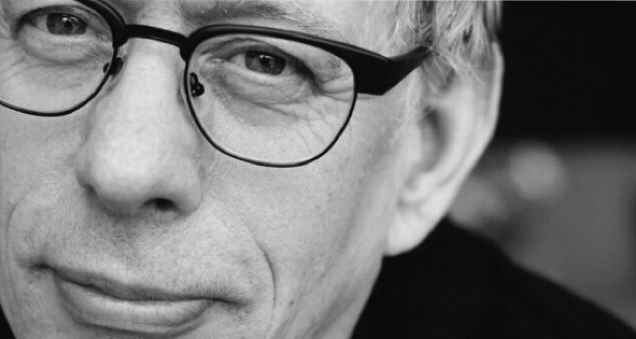
Designer and Art Director Stephen Averill takes us backstage on his intimate 30 year career working with Irish rock legends U2. This interview was featured in Open Manifesto #5 which focused on the theme ‘Identity’.
Kevin Finn: It may surprise readers to learn that Bono hasn’t always been a fan of the name U2. Equally, it may surprise readers to hear that it was in fact you, Steve, who suggested the name U2 in the first place. How did this come about and has Bono grown to like the name more over the years?
Stephen Averill: Well, yeah, interesting. [Smiling] No, he still hates it. But the first time I actually heard him voice this was in the book ‘U2 by U2’, where he said the band name was based on a pun, and he hates puns. But that’s fine.
The genesis of the name came from Adam [Clayton] really, and from talking to him about various names. One week they wanted to be a certain kind of band, and the next week they wanted to be a different kind of band. Our conversations led to names Adam liked, for example XTC, which means nothing and can mean everything at the same time. It’s a name that can be interpreted in many ways.
So really, I just thought about that for around a week and after various options I came up with the name U2 because it has, among other things, connotations with the American spy plane. It’s also a pun, in the way people say: “Have a good day” and the reply is: “You, too”. So it was part of common language. But I also knew that, graphically speaking, a single letter and a single numeral together would look very strong on a poster—it would be very identifiable.
There was a Manchester band around at the same time called V2, but it didn’t bear any relation at all to the naming. For me, U2 was by far the stronger and more meaningful name. And afterwards, I looked around and it was everywhere. My tape deck was a Sony U2. The popular battery of the day was Eveready and their most popular battery product was the Eveready U2. So it just seemed to be everywhere and, to me, that felt like a good sign.
So they took the name and played a talent contest in Limerick [City], Ireland, which they won under the name U2. I think had they not won they may well have changed the name.
I should say I have no problems with them not liking it, I don’t think it is a great Rock ‘n’ Roll name, and never did. But it fulfilled a need for them at that time. But they have grown into it. They couldn’t be anything other than U2 now.
U2 don’t actually have a logo like The Rolling Stones do, for example. That said, do you approach U2 as a branding project or is it an amalgamation of ongoing related U2 projects that have developed into an established broader band identity? Does U2 even have a cohesive identity, as such?
I think they do. With the process, when we’re talking about a cover project, we tend to refer back to The Stones album covers or The Beatles album covers. But the fact is if you look at U2’s work over the years they have created their own language; there are certain colours, certain styles of photography and certain ways of doing things that we introduce and continually update as we go along.
The most important thing for us is to sit down and listen to the direction the music is going in. We talk to the band to see where they might want to go with the album and then in some way bring the graphics in line with the way the music is going. And that can change quite dramatically. We have had situations where we have started an album cover going in one direction to follow the music and by the time we have finished the project the music has changed quite dramatically and so the graphics have changed to suit where the music has moved towards.
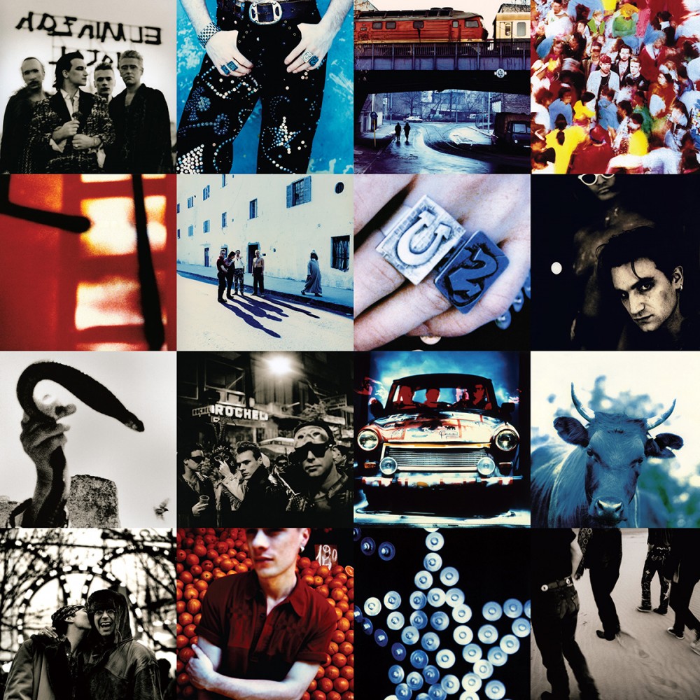
So, it is a branding exercise in that we are continuously trying to reinvent how people perceive U2. For instance, if you think about the first few U2 albums and then consider [the album] Achtung Baby [1991], where we introduced multiple coloured images of the band, something which hadn’t been seen for U2 before, this gave a very different perspective on how one might view the band. And I think their next album cover, if it follows a direction that we would like it to go in, will again be quite a different approach to how people view the graphics for U2.
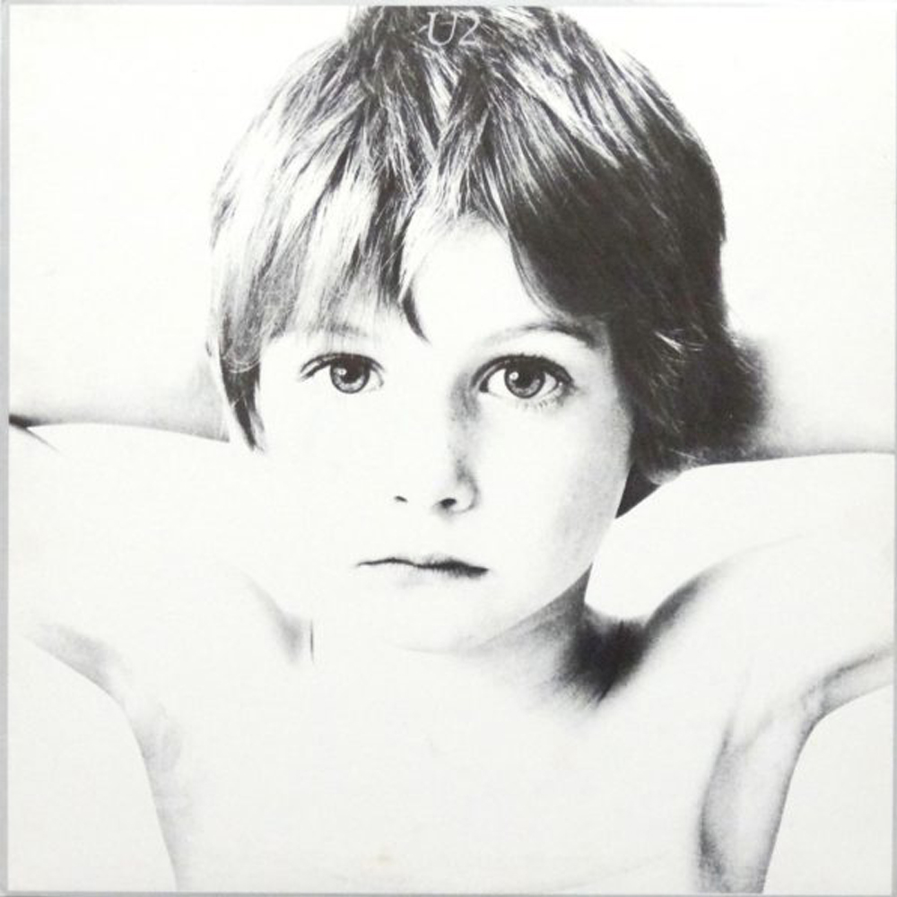
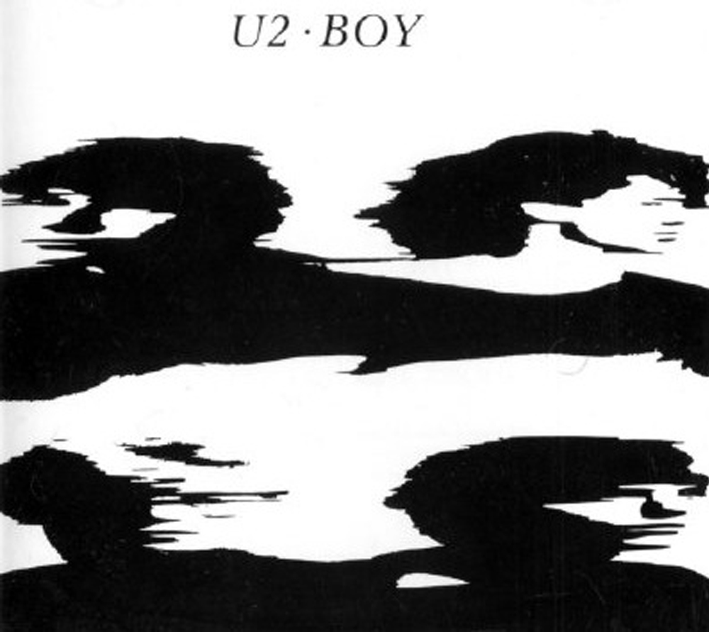
From personal experience [having worked with you], I know the design process with U2 is very collaborative. But the band also have strong views regarding what the graphics should look like. For example, on the first album cover—Boy [1980]—Bono had very clear ideas of what that album cover should be and what it would represent—the idea that [cover model] Peter Rowan as a 6 year-old boy was presenting the naivety and innocence of a band at beginning of its life. Even at this early stage, Bono was very determined about his intentions to create a narrative for U2. How do you recall this particular album cover design and do you think it was successful in starting a narrative or an identity for the band at this early stage?
It’s quite unusual in that most people wouldn’t put a person who is unrelated to the band onto their debut album cover and also have the band’s logo buried very deep in the model’s hair. People often say that, in comparing the first two album covers, though October [1982] is the second U2 album it looks more like a first album cover.
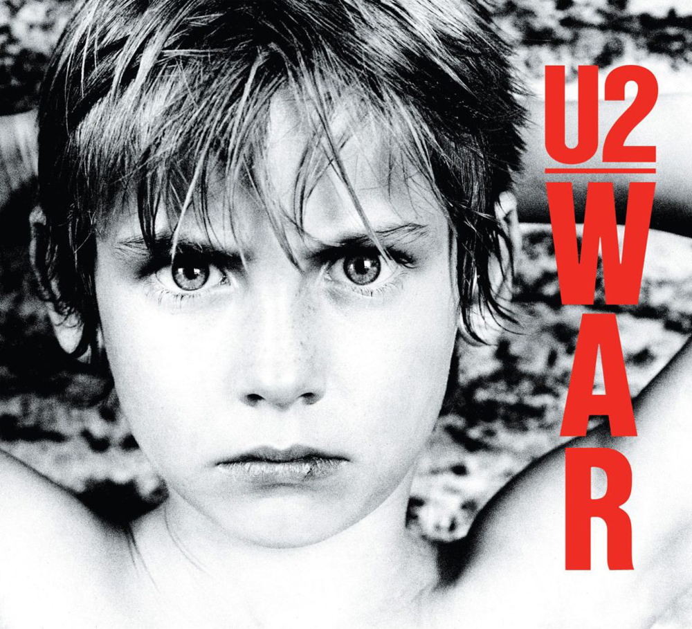
I mean, [Bono] had an idea—and not just Bono, all the band members had an idea, to a degree—of what they wanted the Boy album to be. But the choice of that picture and the way it was presented was really down to the way I wanted to do it. There were quite a lot of other pictures that people were talking about and that could have been on the cover but I just thought it was the intensity of the eyes in that picture, which to me suggested the innocence and, in a funny way, was repeated when War [the third U2 album] came along. It wasn’t a difficult choice for me, or the band, but it was a brave choice.
With any designer working on a project, you have to have the strength of the band behind you. If they aren’t convinced what you are doing is the right direction then it falls apart very quickly and you get taken over by marketing departments telling you the way it should be.
I’m sure Island (the record company) didn’t want to go along with it. I mean, the record company has been against some of the sleeves U2 have done all the way through their career. But much to their strength, U2 have always lived with their convictions and backed up what they did. For instance, I know the record company was very unhappy with the October album cover, which is probably the weakest cover we’ve done. I had certain ideas that I wanted to pursue but which weren’t used. But Bono had a particularly strong vision of how he wanted it to be, and when the record company started to complain about it he stood by it and said it was what he wanted the cover to be, so that was the cover the record company were going to get.
With any designer working on a project, you have to have the strength of the band behind you. If they aren’t convinced what you are doing is the right direction then it falls apart very quickly and you get taken over by marketing departments telling you the way it should be.
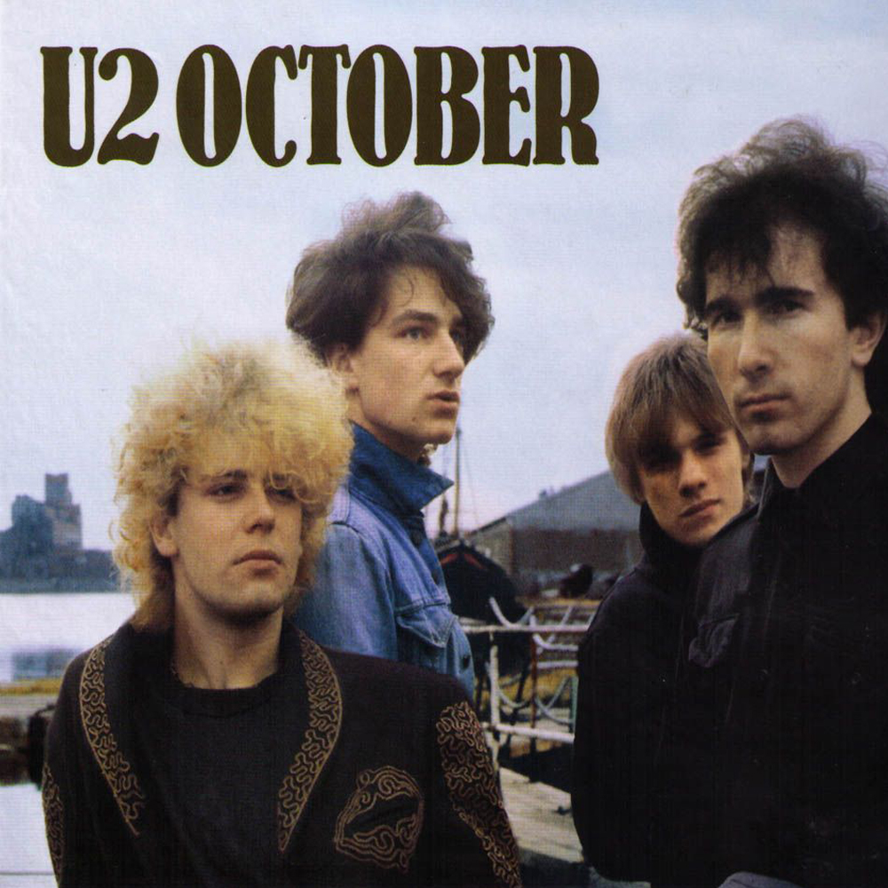
You mentioned that October, being the in-between album, was quite different to Boy and War. The narrative seemed to carry on between the first and third album covers, whereas the second cover—October—was quite separate. Was there a reason why you, or Bono, or the band opted to move back to an image of Peter Rowan on War, perhaps continuing a narrative of sorts?
I think, to be honest, and with any young band, there is no long-term thinking like “we will bring back a certain person for the third album and we’ll do something else for the fourth.” In the case of October, they weren’t even sure there would be another album after that and so weren’t in a position to worry about any future album cover. They weren’t thinking “this might be an album in a sequence.” What they were working on was just the next album.
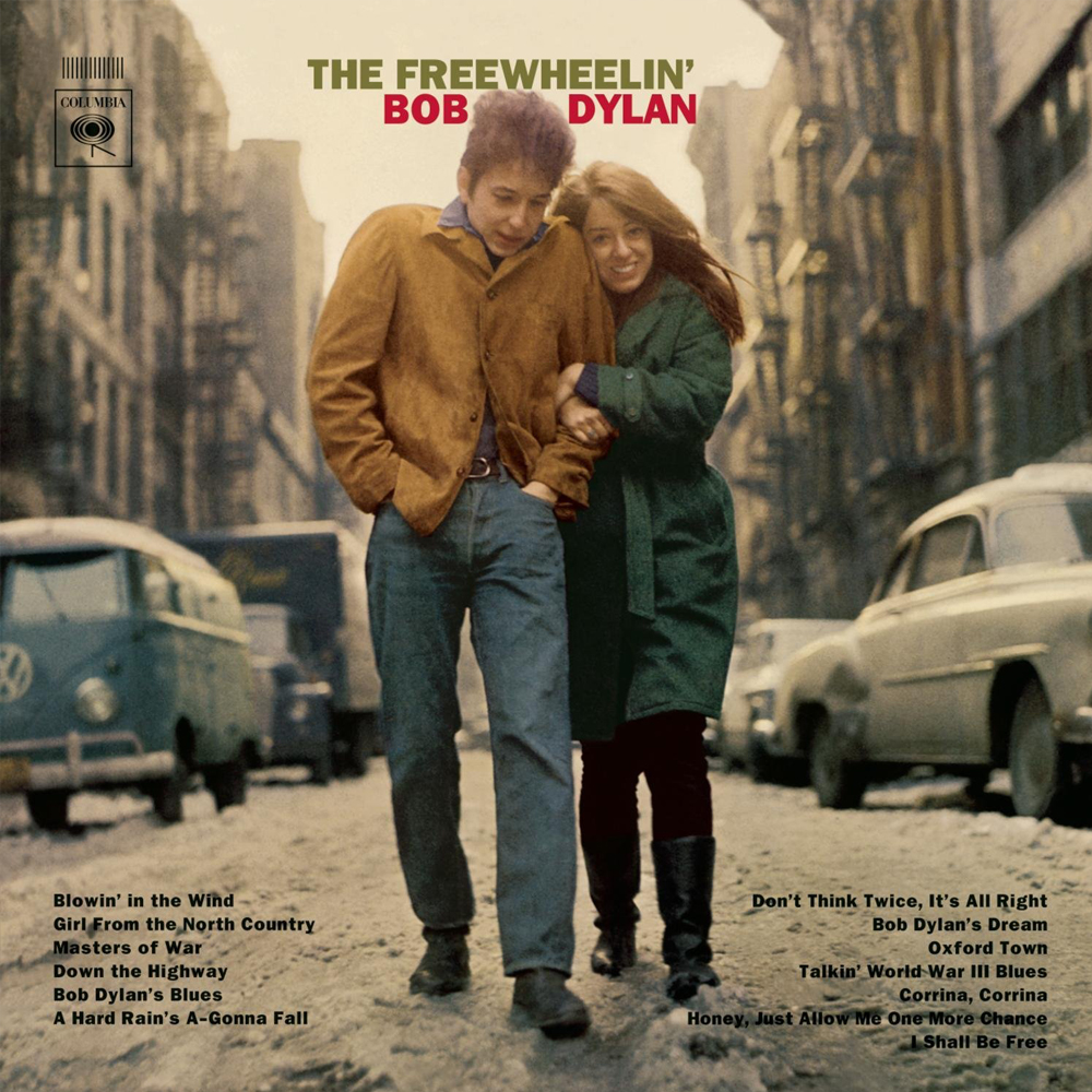
At the time Bono was fascinated with early Bob Dylan covers, where the song titles were listed on the front cover and in particular The Freewheelin’ Bob Dylan [1963] which featured a picture of Bob walking down a street in a very natural way. So the idea was to walk around the studio where the album was being recorded, which is exactly what happened; we walked around the area and shot the pictures in that area.
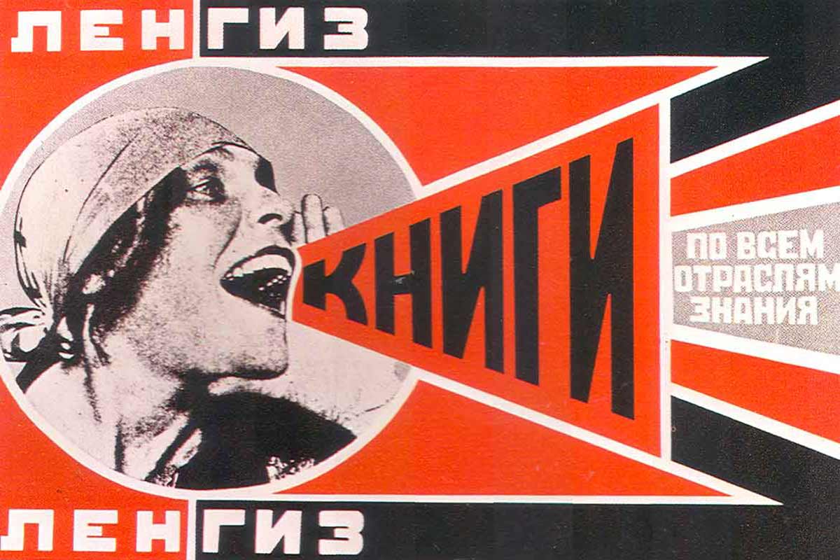
And then of course with the album title October there was a certain sense of thinking about Russian graphics. I tried to bring a little bit of that into the end product. The choice of typeface was a compromise between something that would be strong and easily read and a vague Russian-esque feel—although not as strong as it could have been because the band didn’t particularly want to go too far down that route.
And then there was the back cover. The album was originally supposed to be a gatefold sleeve and for the back cover we had another shot of the band on the pier. When you opened the gatefold you were supposed to see the band in the foreground, then the band in the background. This was intended to suggest where they were at that moment but also where they were coming from. But the record company said: “No, we can’t do that.” And they gave me some particular reasons, which I knew were bullshit, for example a concern that the images wouldn’t line up. Of course, I knew it could be printed perfectly with the images lining up. It was simply down to the record company hating the album cover.
It was simply down to the record company hating the album cover.
As I said, October is probably the weakest cover we’ve done. But bringing Peter [Rowan] back for the War cover was not a plan that was there from the very beginning. I mean, the title was so evocative that we considered a number of directions to pursue.
For instance, we talked about using [British photojournalist] Don McCullin imagery. And we talked about various war imagery that I had been researching. But in the end, after thinking about it for a while, I had a specific picture in my mind—whether I had seen it on TV or in a book—of a young boy in a Warsaw ghetto who had been rounded up with his hands behind his head, and he was up against a wall. You couldn’t see anything else but you could see the absolute fear in his eyes. And that was really what I wanted to capture. We weren’t looking out at a war, we were looking in at a war. The war could be anywhere in the world. We moved away from focusing on Belfast, or whatever particular struggle we had talked about. The idea was to internalise this through a person’s eyes. And again, Peter was great at that.
We did actually consider other people for the cover but everyone knew from the first album [Boy] that Peter had great expressive eyes so we used him again as the model. We also got a variety of props from an army surplus store, like helmets and gas masks. While we were taking the photo of Peter for the front cover, I felt we were missing something so I went out into the garden of the photographer’s studio and found this huge piece of rusted corrugated metal that he was using on top of his coal bunker and I brought it into the studio and stood behind Peter holding this piece of corrugated metal. The effect of the metal, the rust, etc, just added to what I was trying to achieve with this image.
It’s funny, when we think of a band like U2 we assume the images are created in far more controlled and contrived ways so it’s refreshing to hear an image as famous as this album cover was actually quite low-fi, with you literally standing behind the model with a coal bunker cover…
The work is very gut reaction. We need to be spontaneous. To leap forward slightly, it’s like the Achtung Baby cover where a lot of people began to read so much into the patterns and what we had put on to the front cover. With us it’s a much more gut level feeling. We are trying to balance colours while also allowing for an even number of the pictures of the band members, and all those practical elements, and putting them together to work. So, what it becomes at the end of the day is a totally different thing. And you get people saying: “Well, we know why you put that picture next to the other one because it represents East verses West.”
But I actually like covers that allow people to read something into it themselves. I find this to be much stronger than having a cover that is so literal you can’t have any other interpretation of what’s presented.
I actually like covers that allow people to read something into it themselves. I find this to be much stronger than having a cover that is so literal you can’t have any other interpretation of what’s presented.
I believe Bono once said—of an October single designed by the record label’s in-house designer—it was “a beautiful sleeve that communicates… absolutely nothing about the band.” 1 Again, it is obvious U2 are interested in communicating a narrative through their record covers. Does this make your role in the process easier or harder?
It’s instinctive and in a way it’s a result of our relationship with he band and knowing what might appeal to them. But that’s always changing, since they are also maturing and changing as people, and you’re changing with them. But yes, ultimately, most decisions when it comes to covers are your first instincts when you hear the music. The ideas that you actually end up following through on, and you try a lot of other things in the process, are the ideas that tend to go back to that first instinct and feeling when you heard the music. So yes, it is very gut feeling and instinctive.
To go back a little to the Boy cover, since we are talking about people reading into the cover images, am I correct in believing there was some controversy over he U2 debut album cover image? It is my understanding that this image was seen, by some, as an explicit use of a naked young boy. Was there a conscious decision by you and the band to use such a controversial image for the time, and was it an intentional marketing ploy to help make people more aware of the band?
I suppose we were all young enough and naïve enough living in Ireland not to make any conscious decision like that. It didn’t strike us in any way as being provocative in that sense. It was simply the strongest image of the young boy.
In America it became controversial. Without any reference to me—I knew nothing about it until it actually happened—the record company there decided to use a different cover and the art director at Island Records came up with another image, which was four stretched portraits of the band members on the front cover of the American release. And it was only six months after this happened that I even discovered there was a different cover in America.
You weren’t even consulted?
No. There was no consultation whatsoever. I heard nothing about it until way after it was done.
That seems strange considering you have such a close relationship with the band and which is obviously critical to the success of the design. This proximity has given you a rare insight into how the band has developed and how their identity needs to be expressed in design projects. But has access to the band decreased over the years, due to their incredible fame and busy schedules and, if so, how has this impacted your ability to interpret the next U2 project?
No. I don’t think there is any less collaboration with the band and [the design team]. In many ways that relationship is stronger, in that U2 have the ability to spend more time in the recording studio. Obviously, when you’re a young band you get less time in the studio and you have a smaller budget to do these things. But now, these days, like on the current album that we’re working on, we have met the band three or four times already to talk about where we’re going with the whole project.
And again, it is developing from some very early ideas myself and [design partner] Shaughn [McGrath] had, particularly Shaughn. In this instance the direction has come more from conversations than the musical direction, although the music did play a part. It’s really about defining where they’re going with the music and what influences that. From this, we can tap into a particular vision of where the album cover might go and that’s simply what we try to do.
You mention that, when it comes to design, you are almost in partnership with the band and that you try to keep regular collaborators to maintain a kind of consistency and familiarity, for example photographer Anton Corbijn. Is this continuity and regularity critical to creating a unified U2 identity or narrative?
Well, it does help that obviously Anton is such a wonderful photographer, probably one of the best photographers ever, in terms of rock photography. I mean, I had been a fan of his long before we ever worked with him on a U2 project—I loved his work with the NME [New Musical Express—UK music magazine]. And I think he has defined U2 in as much as he has defined other bands that he has worked with on a long-term basis, for example Depeche Mode. He has a very individual style of doing things.
But that can be positive and negative because after a while people could say: “Well y’know, his imagery is so iconic in one direction that it doesn’t allow you much flexibility to go in other directions.” And I think he is as conscious about this as we are, so we are always trying to approach the photography and the design in a fresh kind of way.
But it does help, in the over all sense of the things to have the same design team and to a large extent the same photographer to be involved in an awful lot of projects together because everyone is redefining how the band will be viewed. But I think it is unusual; there are very few relationships that I know of where a band and a design team have worked so closely together, for such a long time, because, in truth, record companies don’t like partnerships of any strength because they want to control the image. Most record companies won’t have the same design team working with a band for any length of time because they want to put their foot in and say: “This is the way it should be, we want it to go in this direction.”
There are very few relationships that I know of where a band and a design team have worked so closely together, for such a long time, because, in truth, record companies don’t like partnerships of any strength because they want to control the image.
Do U2 have a say in that? Is it due to them that…
Pretty much so. If it wasn’t the band supporting this relationship the record company could easily say they want to use a particular designer or design team other than us. The trendy designer of the month, or the year, would be the one getting the work.
It’s interesting because, as you mentioned, this is a very unusual relationship. The relationships between some designers and particular record labels have been well documented, among them Vaughn Oliver with 4AD and Peter Saville with Factory…
That’s a different situation because there you have a direct link between the person who owns the label and the designer. None of the work we create for the other bands we work with would have the same clarity as U2 because they are usually one-off projects and are often dictated by the record company, so you don’t get to develop the relationship.
Probably the only other band we achieved the same kind of relationship with was [mid 70s to 80s Irish band] The Virgin Prunes. Here again there was a long-term relationship where we worked directly with the band and the record company got the finished product without much input to the process.
But for the most part, when you are working with the record company, and you know this yourself [Kevin], the record company wants a very strong say in how they think things should be. But then, I’ve had sleeves that the band and the A&R person have loved and then the marketing people come along and say: “No, no. We want a much cleaner picture and we want the type up here…” and they attempt to dictate how the whole thing looks. As a result, the sleeve starts to look a lot less interesting.
But in this day and age, the more interesting sleeves are probably being done in areas that aren’t hugely monitored by marketing departments, for example Jazz record covers or parts of the Indie sector, can have a lot more flexibility than mainstream Rock and Pop.
I guess it’s harder in the more mainstream areas…
It is. And it is interesting when you see the process. I often got annoyed when I saw a Factory Records sleeve and I’d see they were using tracing paper and other special techniques. But then I was told I couldn’t use that for a major label project. They’re process doesn’t really allow for things like this. They need to stick to conventions so if there is a reissue of a release, if it is to be successful, they need to be able to reproduce or reorder the release very quickly. And this affects creativity in terms of the options available to make the sleeve under these circumstances.
For example, on a smaller run of say ten thousand you might be able to use something like sandpaper on the cover. But when you get into printing one hundred thousand or more, up to several million copies in some cases, then you find they want the design in a much simpler way, even though they are making more money on the release.
Undoubtedly you, and the design team, have a strong relationship with U2. But do you ever worry the band will move on to another design studio for future projects?
They have always reserved their right to consider other design teams. In the early days, when I worked with them on posters and stuff, which I basically did for free, my one request was that I got to do the debut album cover, which I did. Since then there has never been an unwritten agreement that we will get all the design projects. If we don’t come up with something that U2 think is strong and is as good as they could get anywhere else, then they reserve the right to go somewhere else.
There has never been an unwritten agreement that we will get all the design projects. If we don’t come up with something that U2 think is strong and is as good as they could get anywhere else, then they reserve the right to go somewhere else.
And we know for a fact that on two or three of the recent projects U2 have had other people working on the projects, as well as us. But we feel that, with our relationship and our experience over the years, we have learned how they interact and we have an inside track on this. Plus, we have a genuine love for their music, and we like all the people involved in the band. And we all have similar backgrounds. All these things are a help to us.
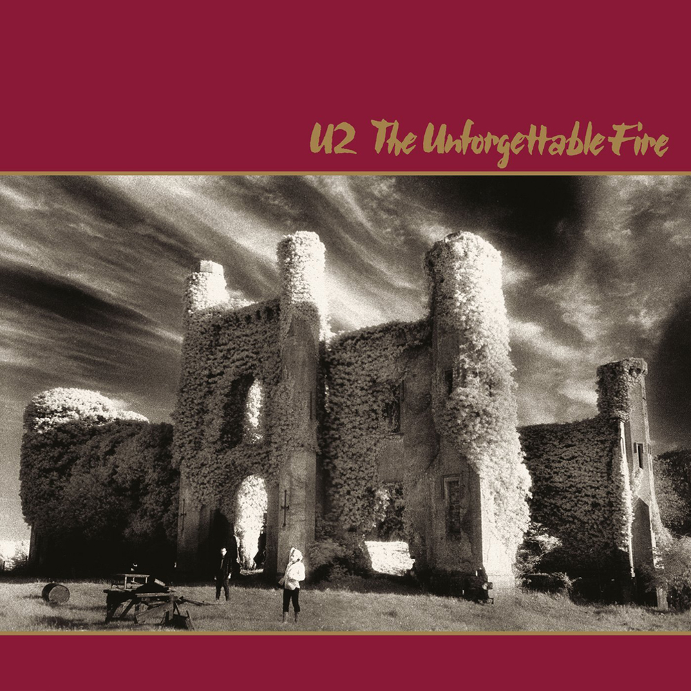
I remember one time when I was told The Unforgettable Fire [1984] album cover was going to be done by the record company. We knew the record company had been pushing to do covers for a long time but on this occasion the band was going to let them do it. [The U2 manager] Paul McGuinness asked me if I minded this. What could I really say? [Both laughing] I wasn’t about to say: “No, they can’t do it!”
At the last minute [Paul McGuinness] called me and said the record company people were coming down to the office with the album cover design and would I be able to pop down as well, have a look and give my opinion? I was kind of reluctant to do this. But anyway, I went down to the office. When I saw what was presented I knew immediately that, even though the design sense was good, the sense of what U2 are about was completely wrong. It was so far off what the band were about that everyone involved in the band also knew it was wrong. A few minutes later Paul called me outside and asked: “How quickly can you have a cover ready for us?” I then had to think of an idea overnight and come back to him the next day with suggestions for a cover design.
I guess it’s twofold; on the one hand you completely understand the identity of the band, as four individuals and as a group, which as you mentioned earlier gives you an inside track. On the other hand, the threat of potentially not getting the next project puts extra creative pressure on you and the team to keep on the cutting edge, within the parameters of mainstream music.
Yeah, I think so. I mean, you’re trying all the time to progress your own skills and work as a designer but at the same time your always trying to figure out how you can slot that into the bands consciousness as well.
Although I said it before, most of the U2 covers that get printed hinge on the point when all four band members agree one particular cover is the one they are comfortable to go with. If we follow the direction of any individual member it would probably go in quite a different direction. So with all four band members involved there is already a certain level of compromise: there is myself, as well as [design partner] Shaughn [McGrath], Paul McGuinness and the four band members who all need to say: “Yes we can all live with this cover, this is strong, this is where we want to go.” But it may not be as graphically extreme as Bono might want to take it, or as Edge might want to take it, for example.
So that’s really where the compromise is—and it’s a very good compromise. It reins us in a little and it reins the band in a little, but in a good way. And there have been cases in the past where the band has said that if I can argue my point they will listen. And they do listen. Other people I have worked with have no intention of listening. They have decided what the design is going to look like, and that’s it! But with U2, if your argument is cohesive and strong, they’ll listen to your point of view and can often go with your suggestion.
With U2, if your argument is cohesive and strong, they’ll listen to your point of view and can often go with your suggestion.
A case in point is the inner sleeve of War, where the band really didn’t like the Anton [Corbijn] image of the band—and this was the first time I had worked with Anton. I felt it was the only band picture that had the emotive force to suggest war; they looked like German soldiers on the Russian front. They looked uncomfortable in the image and this suggested to me what war was going to be for these four people.
But the band didn’t like it and wanted four individual pictures. I asked what was the point of having a gatefold sleeve if you’re only going to have four individual portraits, and this argument went on until the early hours of the morning. But I had to bring the artwork to the record company early the next morning so we were under time constraints. We argued and debated for several hours and then they said: “If you feel so passionate about it, then we’ll go with your feeling on it.”
That shows an unusual amount of—not so much humility, but—respect for your opinion.
Well, we were just young people. We’re not that far apart in age and you have to be passionate about what you do. If you’re not passionate you won’t fight for it.
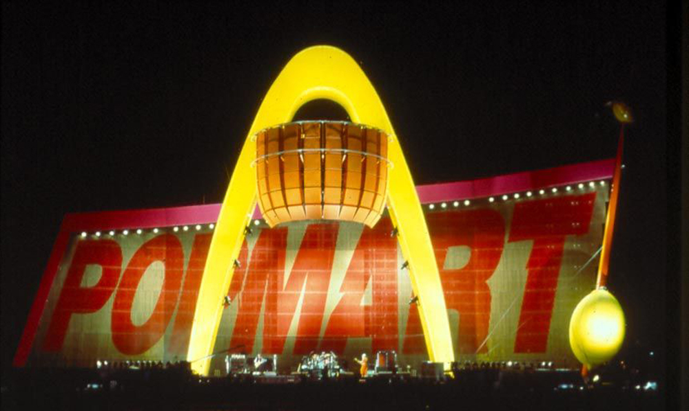
On a slightly separate note, each album is like a U2 product, individually branded. You mentioned earlier, every album has a particular sense of what the music is about. But it is also marketed under the master U2 brand and extended into all sorts of related product branding. For example, Zooropa and Pop were enormous live shows with vast quantities of Zooropa and PopMart products, tour programmes and merchandise. Is it difficult to sustain a coherent U2 identity amid these goliath-sized branded album projects?
Not really. You have an overall sense of where things are going. And this goes back to a point I made earlier. The ‘record company’ tend to view the album from their particular perspective in that they’re thinking: album cover, single. Whereas from our viewpoint, we have to think of a bigger picture; about how something as small as the tour passes are going to work, or how the signage backstage will look, the t-shirts, the tour posters or how the tour program might work.
Usually, most bands don’t have that kind of design continuity. By working with U2 in the way we do, and knowing their history, we can police the brand as is required. So there is a ‘design bank’ that can be called upon to see if other suppliers have done things the right way. And also, if the band is away on tour and something is needed, they can rely on us to put things together that will fit the overall look.
Each album or tour has a specific identity: the typography, the photography, etc; everything changes to suit this. We also try to keep the singles within the framework of the album packaging. But when we get to items like the tour program, the band has already signed off on the overall look and feel, so there is a lot more freedom, which allows more space to expand the ideas into other creative areas.
For example, I feel some of the tour programs we’ve done are graphically—and in a design sense—more exciting and allow a greater creative expression than even the album covers allow.
Of course, the digital revolution has undoubtedly created new opportunities for bands but how has this affected the design and packaging of music. I mean, vinyl was reduced to CD, and that has been superseded by iTunes and downloads, and the CD format seems to be declining. Has this opened up new opportunities for your work, particularly with U2?
[Pause] Not specifically. In the case of U2, we’re still doing vinyl for pretty much every album. In fact, we’re doing more formats and special packaging than we’ve ever done because there has been a realisation in the download culture that a lot of those who download don’t have a great deal of interest in packaging. If you go into any young person’s room, one who downloads a lot, there tends to be a stack of CD’s piled up on a desk—some without even a title on it, some with just handwriting. The music has become more of a background to a particular mood or a particular week and then they move on.
But there is still a very strong and conscious market for people wanting to own something that expands their knowledge of the music. Therefore the packaging has become even more important. It may be a shrinking market but there is hardly a release that comes out now that doesn’t have additional packaging or that doesn’t have an expanded edition or a box set or something where there are even more graphics than there ever has been. So from that point of view, there has been no decline in the print side of the design.
There is still a very strong and conscious market for people wanting to own something that expands their knowledge of the music. Therefore the packaging has become even more important.
But we’re also considering other things, for example when Apple did the U2, campaign we came up with lots of graphics for that (which were downloadable). But I don’t think there are too many people who would download a booklet and make it up by hand and put it into a CD case. You either go out and buy the CD to get that information, or you don’t.
So, I don’t think this has affected us too much. It may well change over the coming years, but how it will really affect graphics I’m not sure. People will always want to relate to the band through lyrics and photographs and I don’t think this is ever going to lessen—it’ll still be there. But how that will be transmitted is going to be interesting, whether it’ll be digital, or print or some other medium, there will always be a want for people to see a band, to get closer to a band through its imagery and stuff like that.
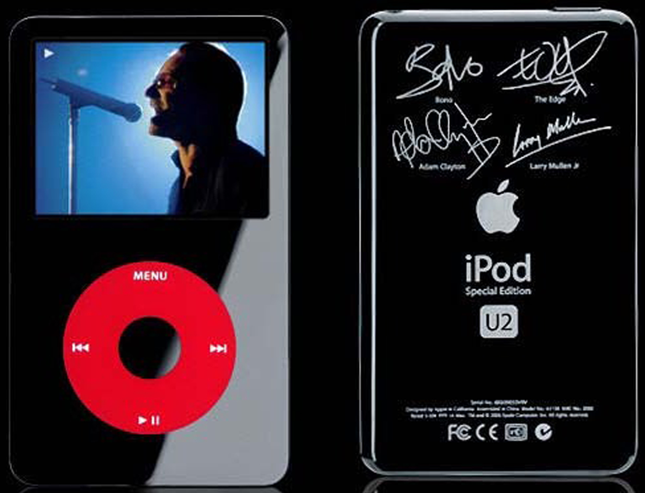
Didn’t U2 do a special edition iPod as well?
Yes, there was a dedicated edition of an iPod. We worked with Apple on this and they came up with the black design and we worked on the graphics with them for this. I mean, there is always going to be new mediums. It’s the one thing we all know very well, that the industry is always going to come up with new hardware. They can’t afford to stop at one particular new invention. They want to keep moving forward; we’ve had everything from 8-track to cassette to the Mini-Disc to iPods and it’ll carry on developing to some other format as well.
One has to move with the medium, but you’re always expressing something about the band in a creative way regardless of the medium.
Even if it comes down to: the next release is going to be on a USB memory stick. Well, when you plug that into your computer you’ll want to see something. So a designer is going to have to come up with interesting ways to do that. And it’s always interesting to come to terms with new technology and make the most of it.
On a bigger scale, do you think U2 have retained a sense of their Irish identity or have they simply become too big and too global?
In a funny way, we were never, ever conscious of bringing a sense of an Irish identity to the band. I don’t think they ever saw themselves as an Irish band. I think they always saw themselves as being much more and in a wider context than that. We never sat down and said: “How can we make this more Irish?”
Now, quite obviously we have done photography in some Irish landscapes but there has never been an attempt to integrate a sense of an ‘Irish consciousness’. Though, I think it is there because [design partner] Shaughn and myself are both Irish and are extremely aware of that identity. We are aware of movements within that identity as well, for example [Irish music and theatrical show] Riverdance and particular Celtic themes that have developed. This is especially the case in the American market where there are a number of other acts who very much want to trade on their Irish identity and you have to go back and look at Celtic patterns and Celtic forms. And when you are researching this, you suddenly realise they also fall very much in line with North African patterns as well. So even the Celtic identity in itself is far more universal than most people would probably realise.
But with U2 there was never a sense of wanting to establish them as an Irish band. We wanted to establish them as ‘a band’.
To finish up: where to now for U2 and Steve Averill and the design studio?
Well, we are currently involved with work on the new album [No Line On The Horizon] and there are other people involved in that packaging as well, so we have to see what’s happening with it. But we are in the middle of this project and working towards finalizing the packaging.
Musically, it is very exciting because I think this album is probably one of the most exciting that I’ve heard them do. They are working very closely with Brian Eno and Daniel Lanois, who aren’t just involved as producers and as writers, they also play on the album and have a say in how the songs sound.
We’re also trying to make a shift in how the graphics will relate to the music. For this album design, it has largely been Bono led, in terms of how he wants the direction to go, with the rest of the band coming very closely behind, so we’re quite excited about the whole thing. It’s that question we always get asked: “What is your favourite U2 album?” I always say: “The next one”. It’s exciting and an honour to be involved at the periphery of what U2 are doing and to be putting together the design of all this.
Reference
1. Stealing Hearts at a travelling show: The graphic design of U2 by Four5One Creative, published by Four5One Creative, Dublin, 2003, p.18.
Image credits
Stephen Averill portrait provided by Stephen Averill
The Freewheelin’ Bob Dylan cover from personal collection—photographed by Don Hunstein and featuring Dylan’s girlfriend Suze Rotolo
Books! poster by Alexander Rodchenko and Varvara Stepanova, 1924
U2 Boy (Alternate cover) by Island Records provided by Stephen Averill
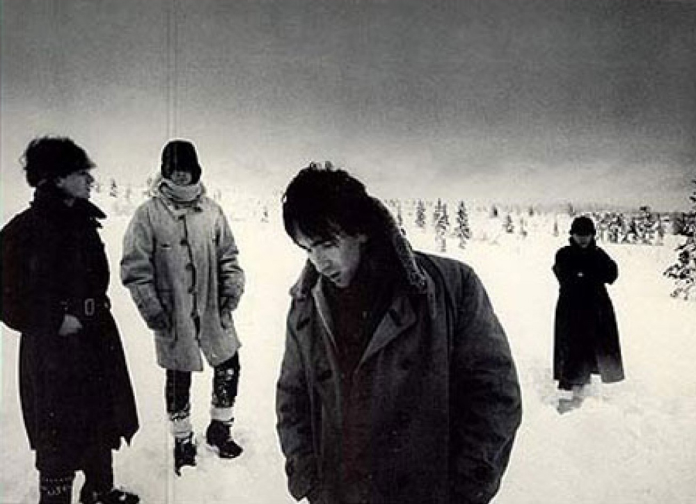
U2 in the snow from personal collection: photographed by Anton Corbjin
Popmart stage photograph courtesy of U2
U2 albums from personal collection in order of appearance:
– Achtung Baby
– Boy
– October
– War
– The Unforgettable Fire
– No Line On The Horizon