Michael Bierut—influential partner at Pentagram, the world’s largest independent design firm—talks about his approach to design, including his identity design for Hillary Clinton’s Presidential campaign. This interview was featured in Open Manifesto #8, which focused on the theme ‘Change’.
Note: This interview took place in late 2016 and refers to specifics from that time.
Kevin Finn: I know the Clark Forklifts logo opened your eyes to graphic design—and changed your life. But it was your Dad who pointed it out to you, and who appreciated the thinking behind it. Considering he brought your attention to graphic design, how has he reacted to your success in this profession?
Michael Bierut: I’m really glad you brought that up because I tend to downplay my Dad to a certain degree; because it interferes with this myth I’m trying to build [laughing] where I was in the middle of nowhere and—entirely on my own—miraculously stumbled into this thing called ‘graphic design’. In fact, my Dad sold printing presses for a living, so he knew that world. Although, what he knew of it wasn’t something he was necessarily eager to share with me. He thought I was smart; he wanted me to go to college to preferably become a doctor or a lawyer, or something, rather than an artist.
[Laughs]
And that’s probably true with so many people. Part of it was because—in his capacity as a printing press salesman—most of the people he saw doing something resembling commercial art were doing it in the back rooms of printers, you know? They were essentially doing mechanical artwork for church bulletins or bowling alley score sheets, things like that. Not really high level design.
Once I expressed an interest in design he got much more alert to his advertising agency clients, to whom he was selling things like photostat cameras. He would see they had magazines on their waiting room table; he even started bringing home paper samples and ambitiously designed books, which were selling paper to printers. He would say: “Hey, my kid would like that. Do you have an extra copy?” God bless him, he was really great. So he had that great combination of knowing just enough about what I did that he could be an informed fan, an informed enthusiast. Not so much that he could be a real critic, you know, but he was a really good cheerleader.
Sadly, he died very young. He died at about the age I am now; in his late 50s. And coincidentally—and kind of horribly—on my 30th birthday. That was 28 years ago.
So, I miss him a lot. And he’s a guy who I think had this nearly infinite capacity for pride in his kids’ achievements. I have two brothers, and he would’ve been proud of all three of us. I know that having a book with his name printed in the back of it would’ve just rocked him beyond words. It’s a regret that he wasn’t around to see it.
And I’m not the only person to have made that observation. My two brothers both knew he was like that. I once had a story written about me in our local newspaper back in Ohio, and my brother’s said: “Dad just sort of like, freaked out!”
I don’t want to go in a completely depressing direction here, but my Mom died in March [2015]. She had Alzheimer’s disease for years. And something interesting happened towards the end, where she consistently forgot that my Dad had died. She’d always be asking about him: “Is your father coming back? Wasn’t he just here?” [Clears throat]
I don’t know if you have ever experienced anyone with Alzheimer’s. Your first reaction to a question like the one Mom asked about my Dad is: “Oh my God!” My brother, Ron, would just say: “He’s dead, Mom. Dead, dead, dead! Dad is dead. It’s easy to remember, they both begin with ‘Ds’.” And then, three minutes later, she’d say: “Well, what about Dad? Where is he?”
But I remember her also saying: “Why do I keep forgetting? Why do I keep forgetting that?” But when you think about it, there’s actually a reality that we’re experiencing in the moment. I know you’re alive [Kevin] because I’m talking to you right now, right? And I know Paula [Scher], Abbott [Miller], and Eddie [Opara] are here [in the studio] because they’re right over there. But everyone else are just people I have in my mind. My daughter, Martha; she’s been in Uganda since August 2015 so I haven’t seen her since then. And I said that to my Mom: “Dad seems real to you, because he’s in your memory. He takes up part of your mind, the way I do when I’m in New York, and you’re here in Ohio.”
And so to a certain degree, I think even when something sad like that happens, that someone you care about is not alive anymore, I think they’re still capable of exerting a really powerful influence on you. Just your idea of them in your head can really dominate your thoughts. I mean, to an extent that people go to psychiatrists to relieve themselves of that particular issue.
[Both laughing]
I think when it comes to my parents, my Dad and Mom, they’ve both been a really positive influence.
Did your Mum see the rise of your career, considering your Dad didn’t?
When Dad died, I had been working for Massimo [Vignelli] for just a little bit more than seven years. He knew that I’d gotten a really good job in New York. And Dad was one of those guys who would clip things out of a newspaper so, occasionally, his ad agency clients would say: “What happened to your kid? Wasn’t he going to art school?” And he’d say: “Yeah, he works in New York for Massimo Vignelli now…” And there’s a possibility that they may have been impressed by that, so he got to partake in that a little bit. But I don’t think I had done any really notable work that he could’ve taken to the golf course with him to brag to his buddies, like redesigning the United Airlines livery or the Hillary Clinton logo, or stuff like that…
[Laughs]
Or the Verizon logo, all that kind of stuff. None of that had happened yet. But he would have loved all of it. He was just an unquestioning enthusiast. In contrast, my kids forget about it. Particularly my youngest daughter in Uganda. She’s like: “Well, that’s that thing you always do, isn’t it?” So, you know…
[Laughs] I think I remember, or read, that you once said being a famous designer is like being a famous dentist. It’s like…
Actually, I think [Stefan] Sagmeister [who featured in Open Manifesto #2] said that. But I fully endorse it. Yeah! I fully endorse it.
You mentioned Massimo earlier. With that in mind, another seismic change in your life probably wasn’t joining Vignelli Associates but deciding to leave.
Yeah, yeah, it was.
You thought you’d stay for 18 months, but ended up staying for 10 years. So what changed in you to want to run your own practice, which actually became being partner at Pentagram?
It’s an interesting question. I didn’t become a designer with a vision in my mind of an office door that said: Michael Beirut Design Incorporated, you know? Somehow, I wasn’t interested in the idea of being a sole practitioner—which I think a lot of people actually have as a ‘thing’ in their mind. Oddly enough, it’s not what led me into design.
When I look back on it, the more I think about my childhood, and the decisions that I made when I was very young, I didn’t know any people who had become designers. Some people don’t even decide what they want to do until they’re full grown adults. But I sort of knew I wanted to do this—when I was 15 years old.
I think one of the reasons is that I like the idea of design being a way to be around people, to be with people and interact with people. I somehow sensed that the person designing the record sleeve got to hang out with the band.
[Laughs]
It wasn’t so much that I wanted to hang out with rock musicians. But, in contrast, the notion of being an artist and just painting canvases, exhibiting them in galleries, and going back to paint more canvases alone in a room just didn’t appeal to me at all.
So when I learned there was a type of art that involved participating in a larger world, and being with other people, that’s what really appealed to me. And so, when I got to New York, the family that I acquired at Vignelli Associates was really important to me. And I mean that quite literally because Massimo and Lella were a married couple, who were very much perfect mother and father surrogates, if you were in the market for that.
They ran the business, with probably a dozen people then, whom you got to know and those people would become your own brothers and sisters or aunts and uncles. So it was a very tight knit little group. And I came to really like it. So, as the months turned into years I enjoyed the work, and really liked working with them. I really respected them. And I also couldn’t really imagine a phase two after that.
A phase two still seemed like this weird thing where I’d end up saying: “OK, that’s enough. Now I’ll find a small office and put my name on the door.” That always seemed like the thing you would do, if you had to. But why would you…? I just couldn’t figure out the appeal of it, actually.
Unlike other people, I didn’t find the notorious restraints that Vignelli would put on the practice as being so inhibiting that it was making me miserable.
And unlike other people, I didn’t find the notorious restraints that Vignelli would put on the practice as being so inhibiting that it was making me miserable. Oddly enough, I had figured out a way to both accommodate his aesthetic point of view, but also do things that I found personally satisfying.
And I realize in retrospect, he was indulging me. He trusted me, and would let me do freelance jobs, or after hours work in between my other work; things that were just for me and which weren’t even necessarily his aesthetic. He was patient with it. He might have actually thought it was terrible, but he understood that it was me—and he let me do it…
So why did you leave after 10 years?
I started working there in June 1980 and passed my 10 year anniversary in June 1990. Right around then, I really started thinking, there was something about the landmark of 10 years where you think: “Well, if you’re gonna leave…” I had never said to myself: “Yes, I like this so much I’ll stay here forever.”
So I challenged myself; called my own bluff. I started thinking: “Well, look, if you’re not gonna stay here forever there’s got to be a good plan.” So I started having conversations in a number of different categories. There was another designer in town then, with whom I had become friendly. We started talking about the idea of each of us leaving our firms and doing something together, or even me just switching to another firm.
I mildly entertained that idea [of switching firms]. But it didn’t seem like progress to me. It just seemed like a change and I wasn’t sure that would be enough. Then again, I thought, maybe a change would be good. So I was just entertaining those questions. At that point I already knew a lot of the partners at Pentagram socially or through design events, conferences, and lectures here and there. One of them—Woody Pirtle—who I perceived as being like Massimo. Massimo was more than twice as old as I was when I started at Vignelli Associates. I was 23 and he was 49 going on 50. But Woody was maybe 10, or a dozen years older than me. So he seemed like my equivalent, closer to my age.
Of course, no one is quite like Massimo. Woody was completely eclectic in terms of his approach. A brilliant illustrator as well as a designer. A real maestro. He was able to use dozens of different typefaces without it seemingly going wrong. So, I figured, it’s somehow possible. And that’s why Massimo liked and admired him—quite a bit, oddly enough. He was a real fan of his work. Woody had a kind of virtuosity that was completely different from the Vignelli approach, where he could do something that looked one way one day, and do it beautifully—and yet another way another day, and also make it look beautiful. I was in awe of him.
In fact, he represented a model: I could certainly do Massimo’s style, but I couldn’t do what Woody did in those days—no one could. At any rate, Woody and I went out to dinner and he raised the idea of me joining Pentagram. Of course now I know, being on the inside, how the partners talk about people. They think: “Gee, I wonder if, you know—this guy—I wonder if he’d be interested in joining?” Because at that point, in 1990, the partnership was a little bit more than a dozen years old. And it had already grown from being just a five‑person partnership in London to having three different offices including San Francisco and New York. Woody had come up from Dallas, Texas, to anchor the New York office, along with Colin Forbes, who was one of the original five partners in London.
They always felt they needed to expand their American base somehow. And the way that Pentagram expands has very little to do with deciding, for example: “We need to do interaction design”; or “We need to do some other design discipline.” They don’t think like that. They just want someone who they perceive as being talented, who seems fun to be with, and who has some confidence, who can actually grow into the position somehow.
So Woody raised that question. And I have to admit, I had never thought of it before. But it miraculously represented precisely what I was looking for, what I yearned for a little bit, which was more autonomy and more control of my own fate to a certain degree. But at the same time I still liked being part of a bigger thing, surrounded by people who are doing interesting work and whom I can be inspired by. And Pentagram just delivered that perfectly. I mean, it was as though it was invented for me.
I actually think I’m the one partner who joined without any trauma, or bruising, or regrets. Every other partner had this grieving process along the lines of: “Oh, it’s so great, but maybe I shouldn’t have left my own firm?” Or: “These people are driving me crazy. I can’t stand it. What have I done?” But it was perfect for me.
So that was in the summer of 1990, and I learned they were also talking to Paula Scher, whom I knew better than Woody and who I admired for all those reasons—and then some. And so, the two of us got together and started asking: “Well, should we do this?” But Paula had an office and was finally making a reputation. But we decided to do it together…
I’ve heard you say you’re constantly trying to impress Paula. I love that notion of continual respect…
Yes! We had those conversations in the late summer and I was in Pentagram by October. Paula had to wrap up her business, so she couldn’t join till January, I think. She didn’t join till early ‘91. But we both joined at the same time. But having made that decision it was really, really difficult to tell the Vignellis. It was terribly hard and I felt really bad about it.
I bet all the people that have worked for me have thought, you know: “That bastard. I can’t wait to see the look on his face when I tell him “I quit!” You son of a bitch…” You know? [Laughing] But I swear, I just never had a bit of that in me. I had nothing but affection for the Vignellis. But I was also quite realistic. I knew that it wasn’t about an ambition, it wasn’t about an ultimatum: “Either put my name on the door and make it Vignelli & Bierut, or I’m going to leave!” It wasn’t anything like that. I really thought I wanted some sort of situation where I was unencumbered by any of that.
It was actually hard for Massimo to understand it, but because of the way Pentagram is organized; I could get that. I wasn’t going to go work for Colin Forbes, or another, you know, very senior, eminent kind of designer. I wasn’t trading the ‘Italian guy’ for the ‘English guy’. Instead, I really felt I was joining a confederation of people whom I admired, a place where I would be challenged to just make my own way in that—not get assignments from them and not adhere to some Pentagram style. But just to really make my own way. And that was really, really exciting for me.
I assume Massimo would have been both devastated and delighted for you…
He was more devastated at first. And then pissed. Actually, I was thinking just today; I heard second‑hand that he referred to Woody as a “Texas horse thief” for what he had done. He felt they [Pentagram] were scoundrels.
[Laughs]
Of course, I was blissfully unaware of it, as one is, you know? But I know that Massimo was very close friends with [Pentagram founder] Alan Fletcher and Fletcher really didn’t want Massimo to be mad at him about Pentagram stealing me from him. It took a couple of years, but we ended up being really good friends in the end. I had some beautiful, beautiful moments with Massimo after I had left the office. I had at least a couple of occasions introducing him on stage. One memorable time he got an honorary doctorate at the Rochester Institute of Technology, and I got to give one of the speeches as part of the ceremony. So I was really able to say what he had done for me and, in fact, in the back of my book I reiterated that really quickly, too.
Switching gears a little, relatively early in your career you came to the conclusion that knowing how to read is much more important than knowing how to draw. Can you expand on that?
I grew up at a time—and I was trained at a time—where no one used computers to do anything resembling design. It was all done by hand. So motor skills and hand‑eye coordination, those were considered really important attributes. So you could argue that knowing how to draw was either a way to express ideas, or some demonstration of an ability to control things with your hands and the hand‑eye coordination meant you could see clearly, too. All that was seen as being able to design well.
But I think one of the things that led me into design wasn’t so much how things look. The resolution of abstract form, as a thing in itself, is a beautiful thing. But it was more about the interplay of form and ideas. And a lot of times those ideas are expressed in words: those words are written as letters, those letters then become words, and those words become ideas.
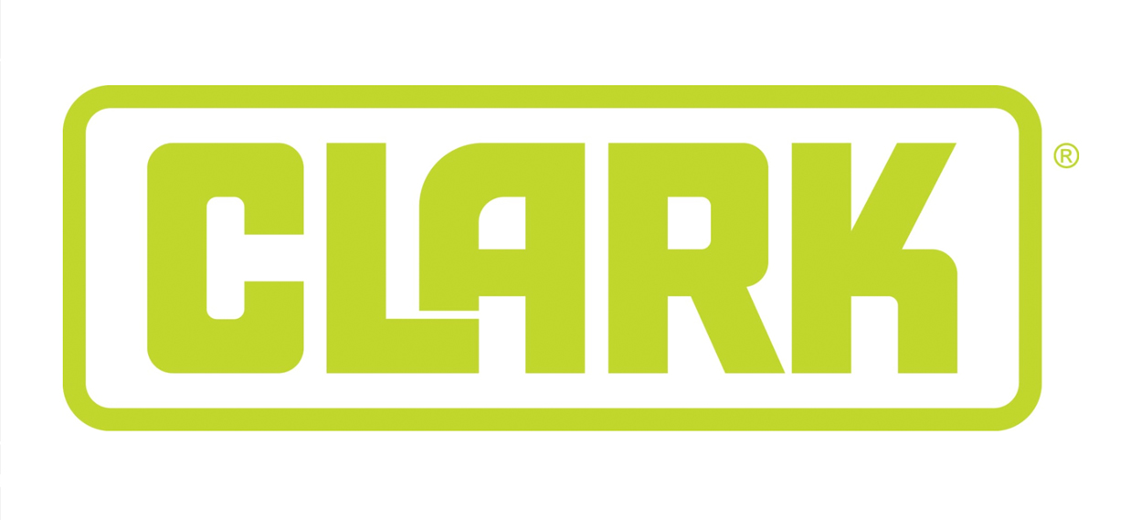
So even though the Clark Forklifts logo might be over‑inflated in my mind—it was just the name of company that manufactures a certain kind of thing, and there’s some idea about that thing. But look, the miracle of that thing happens to resemble what the letter L can do to the letter A [lifting it]. That interplay of lettering and a word, and what the word stood for and the idea behind what it stood for… It just seemed like a really powerful thing to me, and that’s just five letters!
Around that time my uncle James subscribed to Esquire magazine in the ‘60s. And so, when I was at his house I would see that the magazine had great pictures of girls. I came for the girls, but those were the years when George Lois was designing the covers.
And I remember, my Mom signed me up for art classes at the Cleveland Museum of Art, which is one of the best collections in the United States—indeed in the world, to a degree. So I sort of knew who Andy Warhol was, for instance, and I remember seeing at my uncle’s house the famous cover with Andy Warhol drowning in Campbell’s soup, with the headline: The Decline and Collapse of the American Avant‑Garde. I don’t even know if I knew what avant‑garde meant exactly, but I could sort of tell it was about the kind of soup-can art Andy Warhol was doing and that it was somehow collapsing. And I understood someone had come up with an image to express it. I remember that was just so thrilling.
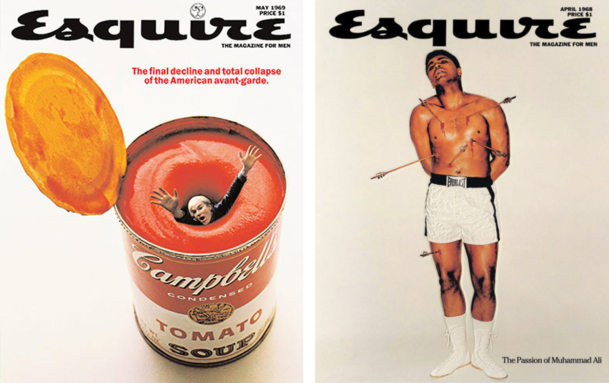
Clearly when you’re looking at that cover, even I knew there was a whole story on the inside about this image. Someone wrote that story. Someone had this idea about Andy Warhol, which they wanted to convey. It got blown up into a headline, which landed on the cover. And then someone else had to figure out how to make a visual thing to relate to that headline. [Clears throat]
So, where does drawing come into that? Well, if you ask George [Lois], he’d probably be able to produce at least a tissue paper from his archives that had a pretty accurate drawing of Andy Warhol drowning in a can of soup. He would have given it to [photographer] Carl Fischer and said: “Here’s what we’re going for.” Carl and his re‑touchers, and all those people, would conspire with the art department at Esquire to create a cover that looks like George’s idea, right? But, on the other hand, I’d say you don’t need a drawing at all to understand this idea.
In fact, for an artist like George Lois you might say something like: “Known for the Esquire covers, including the famous one showing Andy Warhol drowning in a can of Campbell’s soup.” You don’t need to know how to draw to appreciate that idea.
It has nothing to do with the drawing. It has nothing to do with photography. It has to do with the precision of the concept.
That’s how we communicate ideas to a mass audience. Writing and reading is how ideas are communicated at a mass level, whether it’s a Stop sign or an Exit sign, or whether it’s the Declaration of Independence. Ideas can be reduced to pure form.
At that point, everything I knew about Andy Warhol was based on something I had read. I couldn’t decipher who he was [as a person] just by looking at his paintings but I could understand the Pop Art movement through other things. When I was growing up in the middle of nowhere, reading made me smarter—made me more informed—and I stored what I had read in my mental bank account. This has built up over the years and when I’m working on projects now, I get a lot from firsthand observation, firsthand conversations, talking to people, interviewing them, watching, listening. And so, listening is important, too. I would take reading and listening above any kind of drawing…
Listening is important. I would take reading and listening above any kind of drawing…
What about writing? If you consider your American Institute of Architects manifesto, that particular writing restored passion within a community of architects. It became a powerful communication tool. So, along with reading you’ve got writing. How important do you think it is for a designer to be able to write?
I think it’s important. Almost all the designers who have worked on my team, and have done well on my team, are good writers. Sometimes their style of writing actually works from a design point of view. Sometimes I can have an idea that’s half‑cooked and they might suggest: “What if we changed it to this?”
Right now [at the time of this interview] we’re in the throes of the run up to the presidential election. Someone over at the Hillary Clinton headquarters put out a really simple message that says: Love Trumps Hate. Of course, if you ‘trump’ something, you overcome it, like playing a trump card—a winning card. So this beautiful thing was circulating this morning and a few people thought perhaps I had done it, because of the meaning, and the colours and the type face. But, someone over at the Clinton HQ realized you could actually deliver a nice kick to someone’s ass in this completely indirect way, while saying something completely positive. To me, that’s just so deft and so beautiful, the fact that it can be a hashtag—it doesn’t have to be designed at all.
So, it’s the manipulation of words, whether you’re writing them or reading them. Writing is useful in that it helps you understand readers better. What I’ve learned about writing and working with writers—as well as writing, myself—is the effect that words have on paper before there’s been a chance to influence—or be influenced by—the design; that it has a communicative effect. And then understanding what the effect is by getting responses back from readers, you really understand what makes a powerful bit of communication. I’ve learned this from working with really good writers, as well as by being an avid reader, myself.
We’ll come back to the Hillary Clinton campaign, but before that: you co‑founded Design Observer which led to the book 79 Short Essays on Design. But I was surprised to learn that you found writing a book about your own work challenging. Why was that?
It was slightly challenging. I think the hardest thing about it was coming up with a tone of voice that was appropriate for it. I think a lot of people will sidestep that by having someone else write the book, or edit the book, or ghost write the book. This happens with a lot of monographs.
When I was talking to the publisher, they asked: “Well, what writer do you want to work with? Do you have an idea about that?” I responded by saying: “Well, I was planning on writing the whole thing myself. Is that OK?” They had a moment of surprise but then said: “Oh, sure… If you want do that, of course, you could do that, too.”
It never occurred to me to enlist a writer. On the other hand, I know from having been involved with conferences and presentations, there are certain people—I could name a half dozen of them—where if you asked: “Will you come to our conference and give a 45‑minute speech in front of a thousand people?” They would say: “No, I can’t do that!” But if you say: “Can you come to our conference, and sit in a chair next to a sympathetic questioner and answer questions for 45 minutes?”, the response is: “Oh, of course. I can do that. That sounds great!”
So, I’ve been on stage in that questioning role with people. The last time I did it—I won’t name names—in the course of an hour and 15 minutes I probably only really asked five actual questions. I’d ask a question and would get a perfect 10‑15‑minute monologue, basically. So that person would’ve been perfectly capable of standing up at a lectern stringing together three 15‑minute monologues and delivering a 45‑minute speech. But, I think what inhibits them from doing that, is a sense of: “Ooh, you know, I don’t want to seem like the kind of a person who gets up and gives speeches at people. I like talking to people, but I don’t wanna get up in front of them and lecture them.”
So when I was writing the book, I was self-conscious in this same way. I had to ask: why would this be worth reading? I think those are all really hard questions. When I was just getting started this had me in a bit of a panic, because I just couldn’t decide what voice I would use to talk about my own work. With all my writing for Design Observer, and the subsequent 79 Short Essays on Design, I had a rule that I would never, ever, ever, talk about my own work. I just wouldn’t do it. The few times I broke that rule was where I was simply talking about my personal experience, with how work is credited, for example. Or, I would talk about office culture or things that had happened as I was working as a designer. Essentially, anecdotes about things that had happened, but I would always ask: Is that interesting? However, in terms of calling attention to something I had designed—purely focused on the work—that was something I just never did.
So, figuring out how to do that and coming up with the tone of voice was challenging: Do you use contradictions? How personal do you get? I’ve worked with a lot of architects who have produced monographs and it’s amazing how they’ll revert to this passive voice. For example, they’ll describe the site, and they’ll say, like: “The Finn residence is situated on a bluff overlooking the south Atlantic, and it’s approached by this or that. It required a complex series of setbacks and the use of…” Anything to make it sound like no-one sat down and asked: “What the fuck am I gonna do? How am I going to design the Finn residence?”
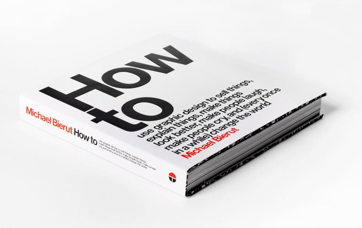
So, it took a while to figure out the tone I would use and, frankly, I more or less stole the tone from Milton Glaser and the first book he wrote back in, I think, ‘74 or ‘75. I was very self‑conscious about the fact that monographs had been done and people seem to be contemptuous of them. The ones that were coming out, which were deemed cool, and which people seemed to like, always had this ironic post monograph attitude to them. And I like those books.
Michael Rock did one a couple of years ago, which I thought was fantastic. It has an elliptical way of talking about the studio’s work. I thought it was fascinating. Experimental Jetset published a book, too, and it’s very episodic. The work is always reproduced in this kind of casual, unstudied, haphazard way.
It’s a good reflection of them, where the tone of voice is genuine…
Yeah! So, finally, I just figured I’m simply going take a project and describe what happened. I figured I’d just try to actually explain it, as if someone asked: “How did you do that?” And, that’s basically why it’s called “How To…”
The tone of voice is very up-front and practical. You regularly refer to times when clients challenged your thinking or changed the circumstances. Initially, it seems these situations were frustrating moments where you tried to fight back or stand your ground. Examples that stand out are the International Design Centre invitation and the New World Symphony. Earlier you said that listening was a really good skill to have. Why do you think designers find it hard to listen to clients and accept that a client might, unknowingly, have a solution? Isn’t a designer’s job to identify the solution, no matter where it comes from, as opposed to exclusively generating it?
I’ve come to really feel like the solution is somehow always present in the problem. Michelangelo described his way of doing a sculpture; you just start with a piece of marble, then you take away everything that’s not the sculpture. Obviously, I’m not Michelangelo, but, in a way, it’s the same approach. The best solutions are the ones that give you the pleasure of inevitability, in some ways, a feeling like they’re almost already there. Sometimes, it’s hard to see what’s there. It’s hard to hear the clues that would tell you where to look. As I’ve gotten older I’ve become more trusting of the process, trusting that, if you have a solution that’s been rejected, there’s always a reason and it is a meaningful reason for being rejected. And that somehow you can learn from that. But not just learn resilience or learn grit, or learn that art is 99 percent perspiration, or whatever the poster [phrase] says.
I actually think rejection is more interesting than acceptance because you learn more from what’s rejected than you do from what’s accepted.
In a way, I actually think rejection is more interesting than acceptance because you learn more from what’s rejected than you do from what’s accepted. A lot of times, people just accept something. In my experience, people are more inclined to accept things blindly around trust. I like that sometimes. But I think rejection is much more specific, if you really ask questions about it. And so you can learn things from it.
We’re in a phase now, where I have a lot of work that’s struggling as it comes down the birth canal stage; where we’re going through a lot of rejection. But I no longer despair or panic. I always think, if you just keep working at it you arrive at something. And that just happened. I’m working on a project, and we thought we had it solved. Our client took the proposal around and people there pushed back. At first, I was mad. I thought: “No, I did my part. Now, you sell this internally. You said you could do that.”
[Laughter]
“I trusted you, so, please—can you do that?” That’s what I said under my breath—to myself, not to them.
But then I asked: “Tell me what you’re hearing?” What they heard was interesting enough to send us off in a slightly different direction. We ended up with something that was better, which is actually kind of scary because you realize that you should be thanking your clients for pushing you harder, for rejecting the first easy thing, or the second easy thing.
There’s been a couple of instances—not many—where I haven’t been able to come up with something that I feel confident about. In those cases, my confidence, and my client’s confidence, is so shaken that I think, you know: “You should just start over with someone else. Here’s your money back.” I actually did that the last time it happened. It was about a year and a half ago, or two years ago.
I guess it’s like reading a book. You want to read it, but then you just realize you don’t like the book and you know you don’t have to finish it. No one’s making you finish: I’m not gonna finish it, right? It’s about giving yourself permission to just close the cover and put it away. That’s a nice thing, sometimes.
And granting your client that permission can be helpful to you, too. I don’t do it that often, and it has different and interesting results when it does happen, as you can imagine…
[Laughs] So, you’re talking about the struggle between enthusiasm and fear…
Yeah, yeah, yeah, yeah.
The fear of not being able to do the project. So, to overcome doubt, do you now just go with the flow or do you have a process to move forward? Some might call it iteration; one step at a time. How do you overcome doubt?
I need to have confidence that there is a solution, you know? For example, I have a client right now who I actually think is trying to do something that’s almost impossible. They have a marketing challenge, where they’re trying to sell something to a market which, in this current state, is very difficult. And, I’m not sure that a new headline, a new design, or a new anything, is gonna change that basic fundamental equation.
But I think, for the most part, things actually do have some kind of answer. If you’re doing a very difficult crossword puzzle and you just cannot solve part of it, the one thing that keeps you interested in it is the idea that there is an answer. It’s not like every few weeks they throw in a crossword puzzle that’s just fucked up with nothing but random letters. They’re not saying: “Hey, fooled you! There are no clues and you just bought it!” Or that you have to spell these five words completely wrong in order for it to work. So, what actually keeps you engaged with the problem is your bedrock conviction that there’s a solution to it. That can actually sustain you as you’re doing the work. And sometimes you just need to give yourself permission to do something completely different.
Sometimes you give yourself permission to re‑read the brief, to go back and revisit the comments you were given, to fixate on a couple of things you may have overlooked before. What if you built the whole thing at a different point focusing on different information, instead of trying to build it where you’ve been trying to build it?
Solving a design problem happens like so many other things: slowly, then all at once.
I love your quote: “Solving a design problem happens like so many other things: slowly, then all at once.” So, how do you reassure your clients with that process?
I think, for me, it’s more about how you reassure your designers in that process. My designers are much more prone to panic and despair than I am…
Really? [Laughs]
Oh, yeah. I mean, we might do a really great presentation and it gets rejected. The designers might get mad or frustrated, and want to give up. They start to think: “These people won’t like anything!” So I just say: “Look what just happened, though. We thought it was solved but it wasn’t. Then we all got mad and did this other idea. And now, it’s even better, right?”
So, in theory, all the clients are rejecting everything all the time—just to see what else we’ve got.
[Both laughing]
And thank God they don’t all do that constantly. That would be distressing. But I have to admit, I’m really blessed for the most part with the clients I have, whom I really like and trust,—and they really like and trust me. We don’t have that many really big corporate clients. We don’t get involved with really complicated political situations too often. It’s not because we don’t want to, or we turn up our nose at those things, but those kind of clients don’t tend to hire us, because we’re not structured that way. There’s a reason why ad agencies have armies of account supervisors and account managers, and account executives and junior account executives, and assistant account executives. We just don’t have those people, you know.
I mean, it’s just me and a couple of designers, and clients want us to design something, and we’re gonna keep trying until we solve it. That’s how we present it to people who want to enter into a contract with us. The people who tend to get really scared in those situations are middle managers, whose job is on the line, who might have—and often do have—unpredictable bosses. Yet, they pride themselves on their ability to anticipate their boss’s every decision. And then we introduce the arbitrary and capricious elements of design into the mix: shapes, and colours, etc. They often find themselves out of their depth. I mean, everyone’s out of their depth, and people start panicking and fear that kind of stuff. But their type of fear is really unhealthy. For the most part, I’m an unfortunate necessity for them.
Of course, we now also have Design Thinking. I know in a Harvard Business Review article—in a feature on Design Thinking—you said: “Underlying it all, I think, is this constant quest, which is quixotic, and, or doomed to failure, to convince a number of people to be comfortable with ambiguity, and to somehow be patient with an iterative process that could have mistakes.” Isn’t this simply the design process?
Yeah! Yeah.
Does giving the process a label help communicate or normalize that process to the uninitiated? It also moves design from artefacts to include systems and processes?
It does, it does. But sometimes my regret with design thinking is that by focusing on the process—and I think you said it really well, Kevin— it normalizes it, gives it a name and makes it something that people feel comfortable with. I’ve noticed it tends to create the illusion that the process is more important than the outcome. I bet there’s people out there who would say the process is more important than the product. You could probably even put that on a poster. It’s almost as if the artefacts are ‘yuck’, because physical things get old, or become tiring or become fetishized in a way that’s just not mature or thoughtful.
Sometimes my regret with design thinking is that by focusing on the process—and I think you said it really well, Kevin— it normalizes it, gives it a name and makes it something that people feel comfortable with.
But by defining the product as some sort of end point you’re deluding yourself that things have a fixed state in a world that’s so dynamic, it’s not just bits and atoms, right? At the end of the day, people are reacting to specifics. But it’s a mélange of specific things which are creating an overall, much bigger effect. They are seeing the product of strategies. We’ve seen the product of design thinking, that which is made manifest in the world and which we communicate with.
It’s like a great novel. The idea might be compelling but you could write it, or the Clark Forklifts logo might be so good but you can do it in a bunch of different typefaces or a bunch of different colours, and it wouldn’t matter. You could describe George Lois’ Andy Warhol cover for Esquire over the phone, but it’s still an idea, an idea fated to live a life in our world as the cover of a magazine, or something on the side of a physical truck parked on roadside. Or a website, or whatever. What I’ve noticed about design thinking is that it tends to neatly avoid committing to what that thing is. It’s really about avoiding commitment.
Somehow making a decision that requires comfort with ambiguity, not just comfort with iteration, but confidence that you can point to iteration number 73 and say: “This is what we’re going to do.” It’s the difference between a battle plan and actually shooting.
It’s interesting, along with the Design Thinking trend we also have an increase in mainstream commentary about design over the past decade. There’s the Brand New website, and there have been public push-backs on logos, like the Gap logo, and the extensive commentary on the Airbnb logo, etc. You previously said: “I’ve declared a temporary moratorium on commenting on new logos in the press. I find that my first impressions are too often superseded.” And your colleague Paula Scher is also very much against the short‑term style of commentary on Brand New. It’s a blessing and a curse, isn’t it? A blessing that people are interested and talking about design and a curse because it can be so damaging. How do we tackle this as a profession?
Having been subjected to a couple of these things this year, I’ve been asked that question a few times. I really feel that in the end, when it’s all said and done, I would much rather have more people interested in—and talking about—design than not. I mean, I really appreciate the fact that people think things like logos or packaging or graphic design or design in general, is an interesting thing.
We can’t pretend it’s important, that it’s worth paying for, that it’s worth going to design school for, that it’s worth going through all this effort that we go through, if we’re then going to say it’s important but no one should really talk about it because it’s none of their business. We’re designing it to be their business. I think it’s very disingenuous to try to have it both ways, as you implied with your question.
That said, you know, much of—or even most of—the commentary about design, particularly at the public level, is naive and frustrating. I think that, in many ways, it’s early days. It took me decades to come to a point in my own work, and the work I see other people doing, to be more measured, to be more patient. I used to love having opinions about logos and stating them as quickly as I could. Recently, I was really pleased that I had boiled down something which I’d been trying to say for a while: People think it’s a diving competition, but it’s a swimming competition. And Paula [Scher] said: “It’s like judging the play by the cover of the program.”
I’ve spent a lot of time trying to figure out how something like the Target logo works, or the Nike swoosh works.
I’ve spent a lot of time trying to figure out how something like the Target logo works, or the Nike swoosh works. I’ve certainly encountered enough clients who seem to want the Nike swoosh logo and I’ve thought: “OK, what is it that they want?” You can say dismissively: “Oh, these poor fools want me to give them a logo that mysteriously already has millions of dollars invested in it, something as powerful as the Nike logo, or the Nike swoosh”.
Still, if you want something that will work that way, how do you do it? To me, a lot of it has to do with the way it appears at the moment of its inception. It isn’t necessarily the way it’s going to be fated to live in the world and how it plays out. And more frustratingly, you can’t actually predict or control exactly how it’s going to play‑out, right? You have to be able to accept that, particularly when it comes to identity design. The general public can understand that, to a degree, and have come to take pleasure in it. In time, they may temper their reaction, at least.
But for now, I’ve actually been really heartened by my clients, who are amazingly patient and mature about it, even in the initial launch period if it’s getting shot down. You just dig in and acknowledge people ain’t seen nothing yet.
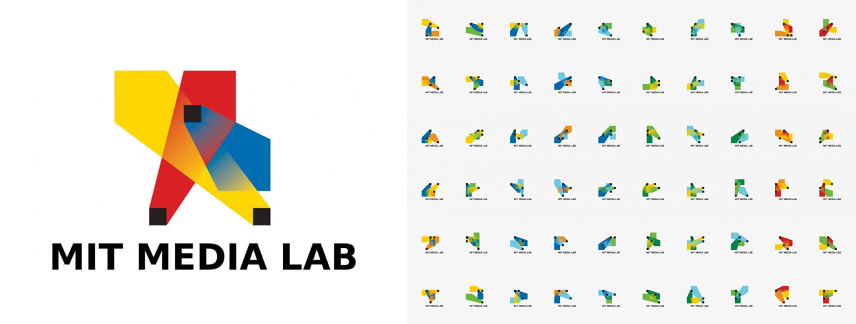
You mentioned the Nike and the Target logos, which we would classify as traditional static logos. And I know you’ve got a view on dynamic identities, that multi‑logo approach. In your opinion, is it a phase, or a fad—or is dying out? I believe you have a preference for moving back to that single static logo. So how do you reconcile that with the dynamic Mad and MIT Media Lab identities, and the work you’ve done in those spaces?
Well, the MIT Media Lab specifically, was an attempt to have it both ways, in a sense.
[Laughs]
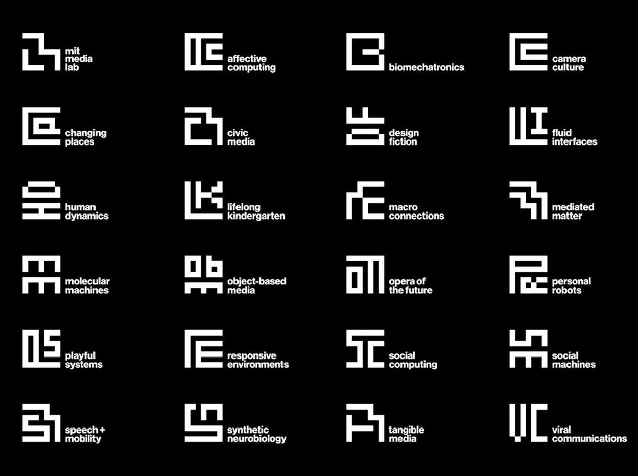
We had really great, almost laboratory conditions for that identity, because we did the work in the shadows of two preceding identities, which I admire tremendously. Specifically, the one that Richard The did for MIT Media Lab’s anniversary. That was the famous one which had something like 80,000 permutations. I thought it was brilliant. The MIT Media Lab is one of the few places that can really take that approach and legitimately claim it’s who they are. It’s like MIT Media Lab can justifiably say: “Only we can do all that stuff. Only we can come up with the logo that is so dynamic that it has this many algorithmically generated versions.”
Of course, the absolute opposite of that was the MIT Press logo, which the MIT Media Lab’s co‑founder Muriel Cooper designed in the early ‘60s. Her design, which is a classic black and white minimalist logo, has really more than stood the test of time. What’s interesting is her logo was dynamic, in that it has an unstable meaning. It’s not explicit in its meaning; it’s open ended. It’s hard to decipher if you don’t know what you’re looking for. You can’t see the letters MITP from IT press. You could say it looks like books on a shelf, except it’s not really. Or you could try to say, at the time, they somehow evoked the kind of perforations and punch cards that were probably all over MIT at that point in time. But that’s not really relevant now.
It looks kind of lo-fi now, but there is an enduring quality about it, the fact that it is attached to so many different interpretations and so many different kinds of messages and still works well against all those backgrounds. It acquires a sense of dynamism by osmosis, or by association.
Whereas in the anniversary logo for MIT Media Lab—the one with 80,000 permutations—each one was finished: what you saw is what you got. Yet there was always another, and another, and another. They were all different, and they were all the same. They did all the work for you. As a viewer, you didn’t need to do anything in order to complete that puzzle or to participate in it.
My understanding of that is the MIT Press logo is so open to interpretation, that’s where the dynamism exists. But with the MIT Media Lab you created, that’s less of a logo and more of a system—a visual system.
Yes. Exactly! We were trying to incorporate the ‘60s Muriel Cooper aesthetic and create a system that could combine the kinetic quality of the MIT Media Lab. At the same time, we wanted to reflect the energy of Richard The’s identity and, in fact, Jackie Casey’s identity, which was done previously to The’s.
So we came up with a system where any one of those versions look like a finished black and white minimalist logo. When you see them all together, you realize there is just a simple set of rules that can be applied to make your own. If someone just joined the MIT Media Lab that person could set up their own group, which would have its own name. And one of the things they’ll get to do is create their own glyph-like logo within that system. For me, that’s really great dynamism, as well.
Let’s return to Hillary Clinton. I only recently became aware you did her campaign identity. When we spoke in New Zealand I actually didn’t know you’d designed it. Of course, in recent times presidential campaign logos have really stepped up, particularly with Sol Sender’s Obama logo. That was a turning point. So how did it come about that you designed Hillary Clinton’s identity and was it difficult to design?
They just called me, partly I think acknowledging what you just said. In the last eight years examples like the Obama logo have highlighted this, but also because of platforms like Facebook and Twitter, these distributed affiliation based logo systems are now something every campaign understands. It’s something they have to accommodate for one way or another, or at least they should understand they have to accommodate it one way or another. There are lots of examples currently where people mysteriously don’t seem to have realized this fact, even though it doesn’t seem that mysterious to me…
The public also seems to be picking up on this notion, that a strong identity or logo for a presidential campaign is a good thing to have.
Yeah, and now we have so much news coverage. Plus the presidential campaign literally starts nearly two years in advance—half way through the term leading up to campaigning. All these people are hungry for news stories and a candidate’s logo, particularly in the early days, becomes a news story in its own right.
I think, in the case of Hillary Clinton, the campaign team is extremely smart, very experienced. There are a lot of Obama veterans; there’s a lot of Clinton veterans; there’s just a lot of very smart people. And they knew this would be an important element to work with. They asked us whether we would volunteer our time, which we did. Everything was done on a volunteer basis. They didn’t “buy an expensive Pentagram logo,” as some have suggested.
From the start we looked at a lot of different elements, and a lot of different aspects. Unlike some of the Republican candidates, we had a candidate who is extremely well known, who arguably has 100 percent name recognition, but who has a disadvantage of this sense of inevitability. Of course she’s going to be the candidate. And the competition is using an increasingly gruesome type of entertainment strategy. It’s so awful to watch.
The [Clinton team] realized the combination of things permitted them—or challenged them—to look for certain aspects in the way they handled the candidate’s messaging. That made for an interesting challenge. It gave us the freedom to make variations of it over time. In the case of the Obama logo, that aspect wasn’t embedded in it at the outset, this idea that it could be adapted for different purposes. But that really became one of its fundamental attributes.
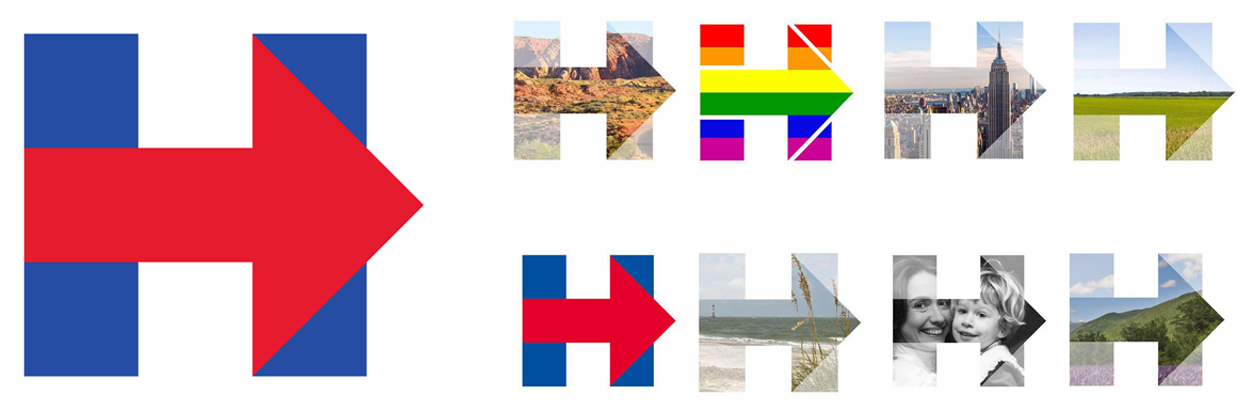
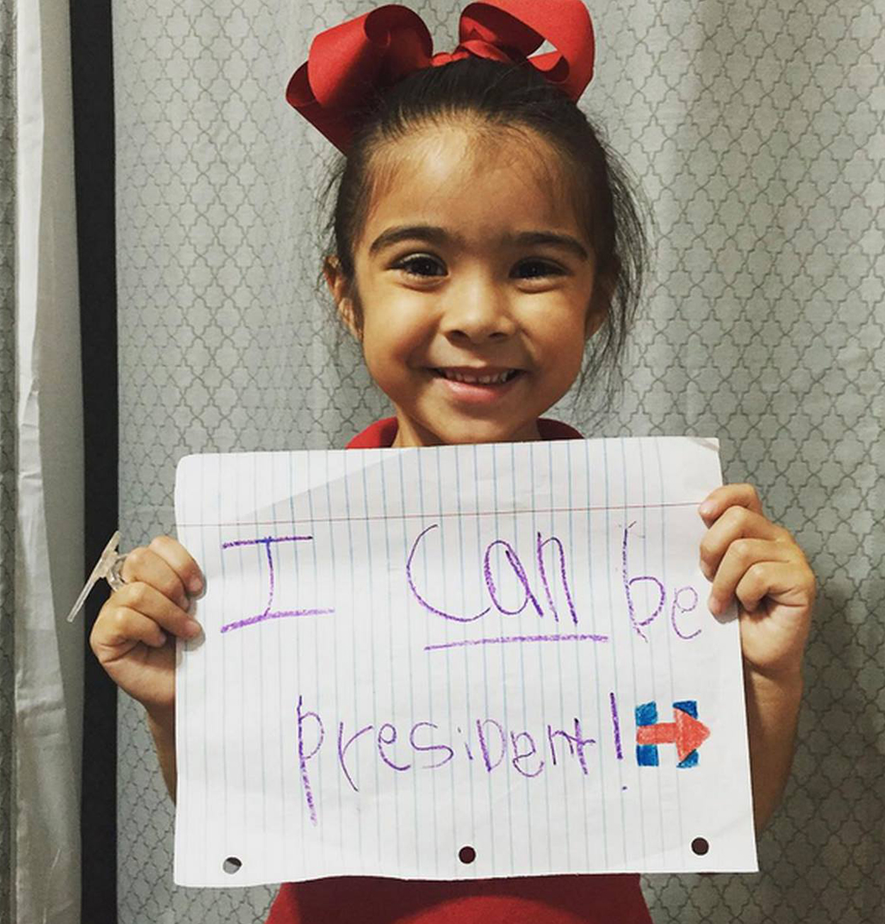
So, the Clinton logo is the simplest thing in the world: straight vertical and straight horizontal lines, and then the arrow that points forward, which is just created by adding two 45 degree diagonals. Of course, it’s been criticized because a four‑year‑old could draw it. But I have a beautiful picture of a girl, who looks about four years old, and who wrote on a piece of paper: “I can be president.” The image has our logo drawn with a red and blue crayon. It makes me makes me think: Hell yeah! Go for it, four‑year‑olds!
So, when someone says a four‑year‑old could draw that logo, I say: “Thank you very much!” You know?
So, when someone says a four‑year‑old could draw that logo, I say: “Thank you very much!”
Isn’t that part of the power of remembering a symbol—that a four‑year‑old can draw it?
You’d think. But on the other hand, people tend to distrust simplicity. They say things like: “That one looks like it was designed in PowerPoint.” I often feel like saying: “No, no! I went to Switzerland and used the Large Hadron Collider to design it. Now what do you think?” Or: “I did it with a pencil. I dipped my fucking finger in some ink, and I did it on a dirty paper towel.”
I mean, it doesn’t matter what it was designed in. Should I say: “I used all these software programs, so now do you like it?”
People want it to look complicated, they prefer complicated things. They prefer things that look like all the cleverness is already built into it. They like things that have what I call “preemptive cleverness.”
I mean, the Target logo is the most boring thing in the world. And the Nike swoosh, it didn’t even quite mean anything in the very beginning, you know? But, in both those cases and for decades, they provided a canvas for creative ingenuity in the way that they were manipulated and their meaning was permitted to expand. I think when we were collaborating with the Clinton campaign team one of the things we wanted to do was just provide an arena for things that could then evolve and grow. And so that’s why today—out there—you’ll see that symbol with lots of photography inside it.
When gay marriage equality was argued in front of the Supreme Court—making it legal for gay couples to get married—the Clinton logo changed from being just red and blue to having the pride rainbow stripes in them. And it made headlines: “Hillary Clinton Changes Logo.” It’s a way to show your support for a position. It ended up being this really startling thing she could do to show her own capacity to embrace positions, her own capacity to broadcast messages, in a way that I’m very proud of. We just provided the barest outline, and Jennifer Kinon [Clinton campaign design director] and her team just do amazing things. They did a series of customizations which were just flabbergasting. For Thanksgiving, they turned it into a turkey.
[Laughs]
For Small Business Saturday, which supports American small businesses, they turned it into this beautiful little shop front. For Hanukkah, they turned it into a Hanukkah candle. It’s amazing.
What strikes me is that you designed a logo, not a presidential campaign logo. And I think there’s a difference because all the presidential campaign logos that we see—from this side of the world—are embedded with this nationalistic, stars and stripes, American flag approach…
Yeah…
But when you look at the Hillary Clinton presidential campaign logo, it’s a logo. I mean, you’ve got the colours, which obviously represent the flag and America, but it’s not blatantly screaming presidential campaign. It’s saying: “Here’s my logo.” Was that intentional?
It was intentional on our part, and with the full support of the campaign, as well. I think they were confident that the candidate’s patriotism was beyond doubt. Or that those who doubted it wouldn’t be persuaded by seeing a logo. There’s a kind of deadening predictability in that language of waving stripes and stars. It really is difficult.
In doing that work we generated lots and lots of different options. And it was amazing how quickly people moved away from things that fell back on those clichés of patriotism and nationalism, the type of symbolism where it’s preloaded already. One of the reasons people resisted this was because it’s a predictable approach, and it’s clichéd. But also, the more you load the logo with that symbolism the more it inhibits what you can ultimately do with the mark.
So, in working through the idea, and proving it, we did this whole series of: “You could do this, you could do that, you could do this other thing.” But we didn’t come anywhere near what has been done. We just scratched the surface, which is great to see.
In one of the early days, like in the first week, I was trading emails with someone on the campaign and I said: “Don’t worry. All the haters eventually get bored and move on to the next thing.” But the reply was: “I don’t want them to move on. I want them to love this thing—and they will.”
And I think it really is happening. I see it out there. I mean, it’s still a very polarizing campaign and people take these national political symbols very personally and assess them critically. They think: “That’s something of mine you’re messing with, there!”
That makes it a much more complex challenge. But I think it’s also a really interesting and exciting one, too. If I was asked to do it again, I’d need to deeply believe in the candidate. One hears of these political guns for hire, who move from campaign to campaign, or even cross party lines, and I just can’t fathom that.
I don’t intend to do this project again for anyone. But it was certainly really interesting to do and very interesting to watch it play out in real time—in real life. And particularly watching all the other candidates who have made a concerted effort to do something purposeful with their campaign mark. In some cases, they tend to wallow in the stars and stripes approach …
The clichés…
In other cases, they do things that just don’t seem like they’re properly thought through, in my opinion. But compared to eight years ago, certainly Obama’s logo stood alone. It was like he was the only guy who actually seemed to be living in the 21st century, or seemed to have seen a graphic design book published in the last 40 years. Every other candidate just had some shitty default typeface with stars and stripes, literal drawings of flags behind them. But Obama did something transformative.
But there was something even more impressive about Obama, because obviously it wasn’t just a symbol. I think people tend to get overly focused on logos, in general, and the Obama logo is another case in point. But it was his ability to fill an entire auditorium with people holding up signs that were all in perfectly right‑left justified Gotham Bold! And I remember thinking: “Wow! If he can do that, you know, surely climate change, peace in the Middle East…”
[Laughing] Yeah, it’s all possible…
“Economic prosperity, etc. All that can’t be too hard of a challenge, right?”
On the flip side, in your opinion, how damaging is Donald Trump likely to be for Brand America?
I think he’s just a truly terrible idea, a terrible brand representative. I mean, leaders are polarizing figures and almost none of them are unscathed in their lifetimes, or while they’re serving. You can see this with Obama, whom I deeply admire. But there are people in this country who really hate him. There are people overseas who don’t like him. There are progressive, liberal people in the United States who are profoundly disappointed in him, who had high hopes for him and feel that he’s betrayed them. And they actually feel more alienated than people who are just merely racist, who just hate him because he’s black.
With any sort of demagogic figure like Trump, the part that’s scary isn’t the demagogue themselves, it’s looking at the crowd. To me, that’s actually much more alarming.
So I think political figures are potentially polarizing. But with any sort of demagogic figure like Trump, the part that’s scary isn’t the demagogue themselves, it’s looking at the crowd. To me, that’s actually much more alarming.
He’s got a bunch of people who actually don’t care if he’s just making stuff up, who don’t care if what he’s saying has any relationship to what our country supposedly stands for. But, at any rate, it’s the crowd that’s scarier than the person.
I will say though, we’re at an early stage of the campaign where traditionally a lot of different, fringe characters will get out there and have some kind of appeal. I just read a quote, from People magazine, which sounds apocryphal, where in 1998 Trump said: “If I ever ran for office, I’d run as a Republican because the Republicans are just so stupid they believe anything you tell them and it’s just really easy to get them all riled up.” It’s just one of those things where you feel it can’t be true. He can’t actually have said that. [Editor’s note: Incidentally, the claim that he said this has since been proven false]. But on the other hand, part of what’s amazing about him is…
He’s capable of saying it…
What wouldn’t he say? So, I don’t know. An America that would support a candidate like that is not an America that I’d be proud of—and it’s an America that would not look good on the world stage. But we’ll see how that ends up playing out.
Interestingly, there are a lot of people on the Democrat side who believe a theory that somehow he’s secretly a Democrat and this whole thing is just an attempt to help their cause.
Sabotage?
They think it’s an extremely diabolical plan. The whole thing is crazy. It’s exhausting, actually. I’ll be glad when it’s over.
I’ve only got a couple of questions left, so I’ll switch gears. The Pentagram business model is widely recognized, but I’m not aware of any other design firm who has adopted the model. What are the pros and cons of running a design business in the way Pentagram does?
I think you’re correct, actually, and this has always surprised me because I think it’s really a good model. It really works well. Or rather, I think it’s a good model and it’s really worked well for us.
At this point we have, you know, 40‑plus years of track record. The original guys made it simple enough for art school graduates to follow along with, you know? So, we’ve never really required a managing director with an MBA to come in and sort us out—miraculously enough. There are 21 partners now, and not one of them has a background from anything but the creative fields; no history or experience in anything but the creative industries. It’s really unusual in that regard. And I think there are actually several things that have made it work.
One is that any new partner who comes in has to be unanimously approved by all partners. For example, if us New Yorkers wanted to bring in a ninth partner to this office, that person would have to meet the partners in London, San Francisco, Berlin and be unanimously approved by them. There’s a real discussion around: “Is this the right person? What do you think will happen when they join? What are you hoping to get out of the relationship? What do they feel about it?” It’s a conversation we have with everyone on this level. So we look really carefully at that sort of thing. But when they join it’s not just a business relationship. We’re hoping to build a lasting relationship which will be as much about friendship as anything else, including business.
Not unlike Massimo?
Indeed, yes! Of course, the other part is that we really respect each other’s work. We all might have our creative ups and downs, and whatever, but we’ve never brought in a partner for financial reasons where we’ve thought that person will make us a lot of money. Or that person is based in Hong Kong and China, and that’s a big market so we need someone to be a partner there. It’s always because we’ve met someone who’s work we really admire and find stimulating, who’s company we want to see more of.
I’m really thrilled to be among this group in the New York office alone. My partners are seven of the best designers in America, if not the world. You can tell it’s just like an all‑star sports team. Or like some crazy Rock and Roll Hall of Fame tribute where Paul McCartney’s playing the guitar, and Keith Moon is playing drums, you know? These are all really old guys, by the way.
[Laughs]
But let me point out the way the business model literally works. Every partner is responsible for their own portfolio and clients. I write my own proposals. I send out my own invoices. I collect those invoices myself. I have sole responsibility for the clients that my team works for.
Sometimes partners will share clients and share projects and they just have to work out some way of making sure they are responsible. But there’s no ‘passing the buck’ attitude about that responsibility. Each partner runs a team, runs their own profit and loss record. So you know how much money your team’s made or not. Then, finally, the diabolical thing of it all is that all the partners share the income equally. So even though you kept scores separately, and someone always makes more money than someone else, and someone always makes less money than someone else, we all get paid exactly the same amount.
That’s an acknowledgment that contributing financially to the health of the firm is only one kind of contribution a partner can make. Someone else may be the one person who makes sure the printer on that table over there works, and who will worry about that. Another person just does brilliant, cutting edge work that makes us all famous, and that’s something too. Sometimes one of us makes a lot of money, and that helps because the heat can stay on, and the lights can stay on, and you get paid salaries, and that’s valuable.
It suggests that the structure nurtures mutual respect, where nobody wants to be seen as falling behind? You always want to be…
Yep, correct. And I was going to say, if you’re curious about the downsides…
Yes, I am…
I’m aware of them over the years. One was actually described as a secret advantage because each team is run by a partner and the teams are really small. For the most part, it’s considered there is no glory in being big [in company size] and Partners like to have teams where they can be in personal contact with all the designers, and do a body of work that they can stay personally involved with—all the projects and all the clients at the same time. So that automatically puts a limit around how much work—and the kind of work—we can take in, to a certain degree. So, for instance, I’ve always had this alternate kind of history that I’ve invented which involves a proposal that no one wants. I find it helpful because you can play it out and see where it goes. The scenario is: there’s a managing director here—a person who can sort of say: “OK, we just got this big enquiry and it’s a really important and interesting project. But it would mean that six partners working in three offices across multiple disciplines will have to work on it and I will get it all organized.”
But that level of organization would need to happen at a central umbrella level. And that person would realize the potential of taking on larger projects where you can really exploit the talent in the different groups. In reality, when we actually do something like that it’s simply because one partner will just pick up the phone or send an email to another one and say: “Hey, I think I need help with this one” and they do it together. So it’s much more casual, much less organized. When it works it works beautifully, but you can’t always count on someone to pick up the phone and do that.
It’s nowhere near as purposeful as it would be if there was a managing director at the top calling the shots, right? But, on the other hand, if I were that person at the top I’d be thinking: “I don’t need 21 prima donnas. I need a maximum of six.”
[Laughs]
And so, you’d need everyone to figure out which six people are going to be the most easy to get along with, and then just slowly but surely get rid of the others. But why stop at six? Maybe get rid of all of them and start from scratch. You got a good brand name. All these silly ass partners, with their egos and their personalities and their design styles and their own personal control of the client relationships, a managing director would find that kind of threatening and inconvenient—and too sprawling and difficult to get a handle on.
The interesting thing is though, all of those names inside the business—yourself, Paula [Scher], Angus [Hyland], those names, those individuals are what Pentagram stands for—you’re all designers…
Yeah, indeed.
So, it would be interesting for a general manager to come in and say: “Let’s put a corporate structure around this. We don’t need those big individual names anymore because we’ve got the Pentagram brand name.” It would fall apart.
Yeah. It would turn it into something very different, I would say. Because what Pentagram has done—if we’ve done anything unprecedented—is manage to take a founding group’s mentality, their entrepreneurialism, and sustain it over five decades. Because almost every architecture firm that’s got a human being’s name on it started because someone like Walt Disney or Skidmore & Merrill, or whoever McKinsey was, were all people who evidently had some big idea and garnered trust, and built something that people felt was compelling. They eventually died, or moved on, but somehow those firms all managed to have figured out a way to continue in their stead. I think Pentagram’s unusual just because—as you’ve said—it doesn’t seem to be anything more or less than the aggregate of the talent represented by the partners. To the degree that we have a unifying ethos that has to do with confidence, and talent, and imagination, and hard work, and commitment as a way to address client problems. The partners who join us are all ones who have that confidence, who have those capacities.
I’ll finish on one last question. And it follows on from the previous business related question. Most of the projects you’ve included in your book seem to be—or at least are perceived to be—either for multi‑million or billion dollar companies, or incredibly high profile organizations and charities. If you were to add one last chapter in your book, for example: “How to Attract Large Corporations to Your Business” or “How to Design a Sustainable and Profitable Business,” what advice would you offer?
Uh. I’m bad at it. Actually, I’ve attracted big corporate clients at Pentagram almost by accident. That might side step your question because I can’t really give any solid advice about attracting big corporate clients. I could say that running a profitable business basically has to do with just being certain that you have a unique offer, and keeping your overheads low.
Those are the two things I feel are the most important things. And that works for almost anyone, right? If you think you’re doing what anyone in town can do, and you’ve rigged it so that it’s really hard to make money because you have expensive tastes in office furniture and stuff, it’s not a good way to start.
Design is interesting because you can really do it for a long time if you want. And I’ve been doing it in almost exactly the same way.
However, there’s something interesting, which I discovered as I was writing the book, but didn’t really think about until I was done. And I’ve become much more aware of it this year, I think. The thing is, design is interesting because you can really do it for a long time if you want. And I’ve been doing it in almost exactly the same way. How I approach my day, or how I think about my work, is not that different from the way it was the first year I was working for Massimo Vignelli. When I was doing my book, I was writing those chapters describing what happened in, say, 1983, or 1988, or 1991, or 1992. I didn’t feel like I was talking about a bygone age. I felt like I was talking about something that had just happened that morning. It felt very familiar to me.
What changes though is that you change. Like I said, I was 23 when I started at Vignelli, and now I’m getting closer to 60. I used to think people my age were really, really old—like, super old. I remember when Massimo turned 50, I thought: “Jesus, he’s old.” And now I’m much older than he was at that time. Of course, your first impulse is to ignore it, you know? I feel young and I feel the same. Why can’t I be the same? But you actually learn that when the designer walks into the room for a meeting, it’s different if he or she is 23 versus 43 versus 63. And we tend to be in denial about that. I like to be in denial about that.
Let’s take the Hillary logo as an example. There are lots of designers who I think could’ve done a good job. And I think somehow the client made a determination—rightly or wrongly—that they wanted someone to come into the room who had a certain amount of gravitas and experience, who could communicate not just with some kind of wisdom coming out of his mouth, but with lines on his face and a lack of hair on his head. If you’re in denial about that, you have to at least be conscious of it while you’re taking the ride.
I was so accustomed—for years—of being like a ‘boy wonder.’ I mean, to go from suburban Ohio to working for Massimo Vignelli was like a whole culture shock that I can barely describe. And it cast me in the role of this star‑struck farm boy who was blessed with some sort of talent. A feeling that: “Oh, look. He really can design.” Or like whenever I say anything intelligent, I could tell people were sort of surprised. I’d never been anywhere. It was all stuff I’d read in books, basically.
[Laughter]
But I realised recently that people don’t think that way about me anymore. I’m just too damn old. Now they think I’m old and potentially out of date—perhaps irrelevant or something. But then you have to have something else to offer when you come to the table. That’s what Vince Frost would call designing your life to a certain degree.
And maybe he means it in a solely different way, but I think it’s really interesting when you think about that as a design problem. It’s almost like a branding problem, you know? It’s like when you’re working with a brand; you identify the existing characteristics, something you can work with, that we either have to accommodate or we can leverage. And if you look at yourself, it’s who you are at that point. But it’s also how long you’ve been around, and all this other stuff.
I used to go for decades at a time without ever thinking about aging. And now I’m about a millennia older, that’s all. So maybe the last chapter will be about that. It’ll be appropriate—and kind of depressing—but appropriate.
[Both laughing.]
Image Credits:
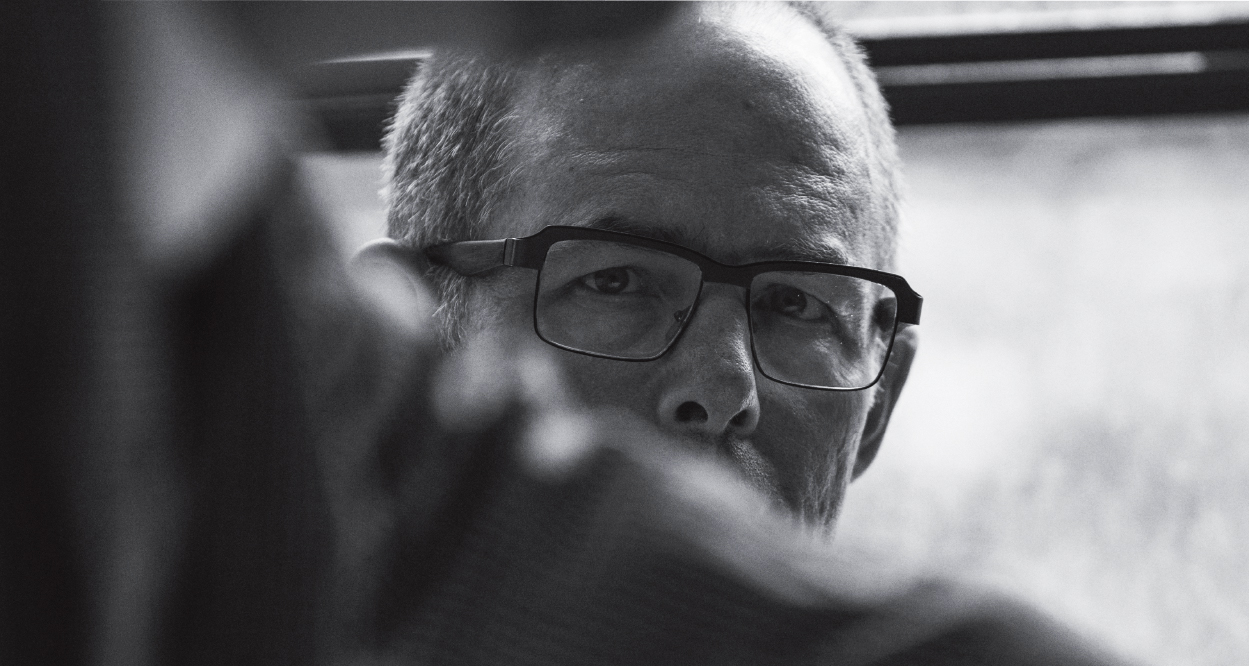
Michael Bierut portrait provided by Michael Bierut
Clark Forklifts identity—designer unknown
Esquire magazine covers: Designed and Art Directed by George Lois, (Andy Warhol cover, 1969; Muhammad Ali cover, 1968)
‘How to…’ published by Thames and Hudson, 2015, written and designed by Michael Bierut
MIT Media Lab identity system by Richard The (2011)
MIT Press identity by Muriel Cooper (1962)
MIT Media Lab identity system: by Michael Bierut (2014)
Hillary Clinton Presidential Campaign logo by Michael Bierut; Applications developed by the Hillary Clinton design team.
Photograph of young girl provided by Michael Bierut