Edward de Bono—influential physician, psychologist, author, and inventor—discusses the immediacy of visual language, how the brain organises visual patterns and why he chooses to draw as he speaks when delivering a presentation. This essay was featured in Open Manifesto #2, which focused on the theme ‘Interpreting Visual Language’. (Sadly, Edward passed away in 2021, aged 88.)
You can recognise a friend instantly because visual perception allows many things to be assembled at once. Imagine trying to recognise a friend by building up and using a verbal picture on every occasion. The ‘totality’ of a visual impression is one of the key advantages of visual language.
When I lecture, I draw continuously on an overhead projector. As a result, the attention of the listeners is always on the point of development of the image. This is very different from presenting a fixed slide, which shows the same ultimate picture. But one of the limitations of visual language is that, often times, everything must be shown at once—for example, as in a printed advertisement on a page. If it were possible to allow the image to develop step by step, it would be much more powerful because the attention would thereby be controlled instead of choosing its own path.
The brain organises incoming patterns into routines and is a self-organising information system or pattern-making system. Pattern-making systems are always asymmetrical (having a lack of symmetry) and can be explained visually in the following simple diagram.
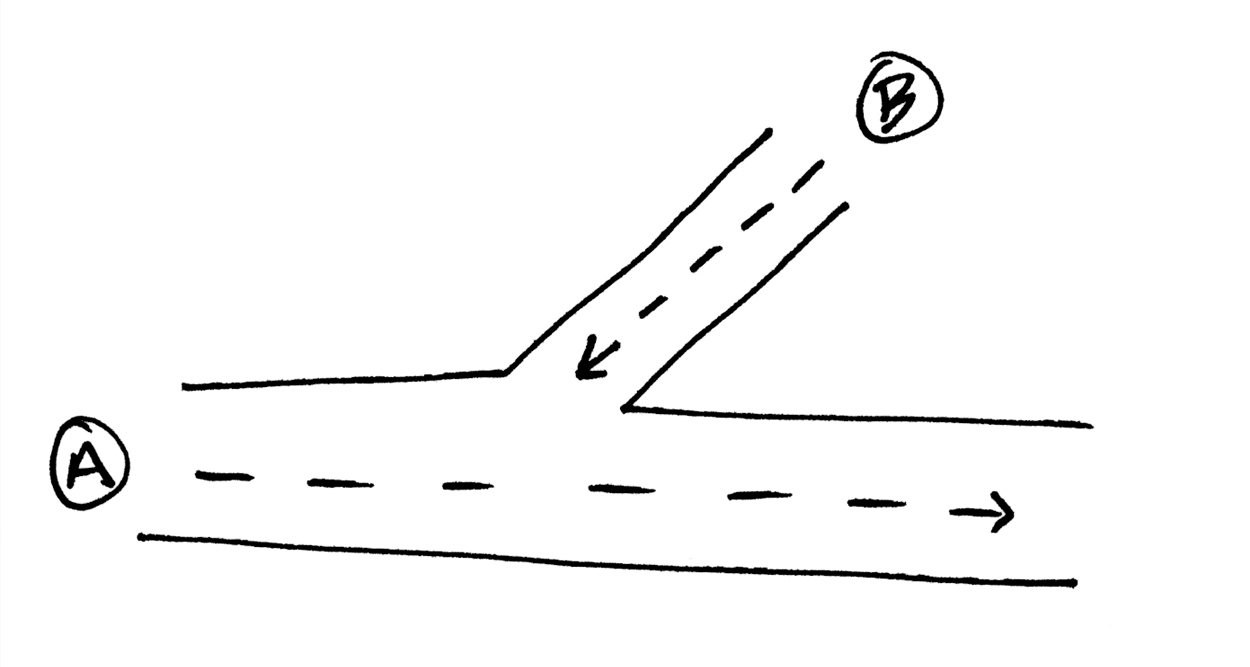
It is true that this simple diagram could be described in words, such as: “the path from A to B is not the same as the path from B to A”. While this verbal description may be technically correct it does nothing to convey the function of an asymmetric system.
When the asymmetric system is presented as a diagram it becomes very easy to see how the formal tools of lateral thinking are logically based on the system. For example, it becomes very easy to see how ‘challenge’, ‘concept extraction’ (finding the general objective), ‘provocation’ (provocative suggestions) and ‘random entry’ (introducing random elements) all arise from the very nature of the system. Of particular interest, it would be completely impossible to see this from a verbal description of asymmetry.
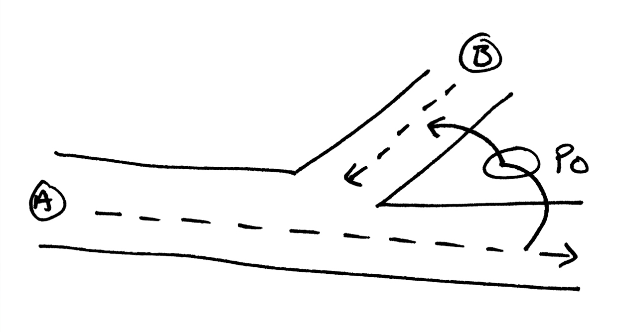
Of course, the process of provocation seems totally irrational. To suggest that a car might have square wheels is an engineering nonsense. But from this provocation comes the idea of anticipatory suspension. With the introduction of a provocation, or ‘Po’*, the following visual diagram of an asymmetric pattern shows very clearly how and why this can come about.
*Po cars have square wheels.
A visual language shows the interplay of complex factors in a way that would be very difficult if using verbal language. This interplay contains powerful factors but also uses more subtle factors and nuances. For example, a picture of a building is always going to be more comprehensive than a verbal description.
Essence.
One of the advantages of a visual language is the comprehensiveness and totality that can be conveyed. Another advantage is almost exactly the opposite. Caricatures are not photographs. Caricatures do not show something as it really is but distil and emphasise certain features in a way that goes beyond realism and, in a sense, becomes even more realistic.
Here is another example; a good sign can compress a complicated message into a simple visual form. This is a lot harder to do with verbal language because a visual language can be pictorial or diagrammatic. It can also be half way between the two by using simplified pictorial effects that approach being diagrammatic, something that an equivalent verbal language would find impossible to achieve.
Symbols.
Certain visual symbols come to have a rich identity of their own. For example, the simple arrow can come to mean different things;
– this leads to something else.
– this influences something else or some process.
– these things come together to create something else.
– pay attention to this point.
etcetera.
However, we have yet to reach a stage where we have symbols for a wide range of concepts. If we were at that stage, we could string these symbols together to describe complex situations. Indeed, we might still prefer to seek to do this in one visual effort rather than use the sequence effect that verbal language has to use.
Familiarity.
A visual symbol that becomes very familiar still has a high communication value but can, in some circumstances, lose its ‘attention getting’ value. The power of a fresh visual representation is strong in getting attention but has less immediate communication value because the viewer is required to ‘figure it out’ rather than use an established understanding.
Of course, it all depends on the viewer’s motivation. If the viewer is already interested in the communication then established symbols can work quite well. But if the viewer is not so interested, then a fresh symbol has a stronger chance of capturing attention.
Irritation.
In writing my books, I often use diagrams to explain a point in a parallel way. Usually, these diagrams are optional, meaning the point has been covered in the writing and the visual picture is just a way of reinforcing and clarifying the point.
However, I have been told that some readers find the diagrams to be irritating. This may be because they do not understand the diagrams. It may be that they have understood the point so well from the text that the diagram is superfluous—and hence irritating. It may even be that some people are actually unhappy with a visual representation. This may be because they understand the point but cannot see how they would use the diagram, in conversation, to convey the point to others.
To accommodate these circumstances, I try to include three modes: text, diagrams and metaphors. Incidentally, of these three, metaphors are the easiest to convey to others.
One of the obvious challenges to visual language is the conflict between being simple and being comprehensive.
Simplicity.
One of the obvious challenges to visual language is the conflict between being simple and being comprehensive. If all the factors and processes have to be included then communication becomes rather complex. If only the essence is included then the communication is usually incomplete. There is also no point in communicating the wrong message very effectively, but neither is there any point in having a message so complex that it cannot be communicated at all. Such is the challenge of effective visual communication.
The future.
There is a real need for a comprehensive visual language, which would at once be international. But there is also a need to develop ‘visual literacy’ in youngsters so that they can comprehend visual language more effectively.
There will always be a need for traditional verbal language but the special advantages of visual communication need to be explored and used more fully than is the case at the moment. This has special relevance not only to less developed societies but even the most developed societies where there is a great need to communicate complex concepts more effectively.
Editor’s Note: This essay was written in 2005, but I have always felt that—in his comments about ‘The future’ — Edward had foreseen what would eventually become a universal visual language popularised by youth beginning in 2010: emojis.
Image credits:
Edward de Bono portrait unknown (sourced on www.aljatasi.com, which is no longer operational).
Diagrams reproduced from faxed illustrations provided by Edward de Bono to Kevin Finn.