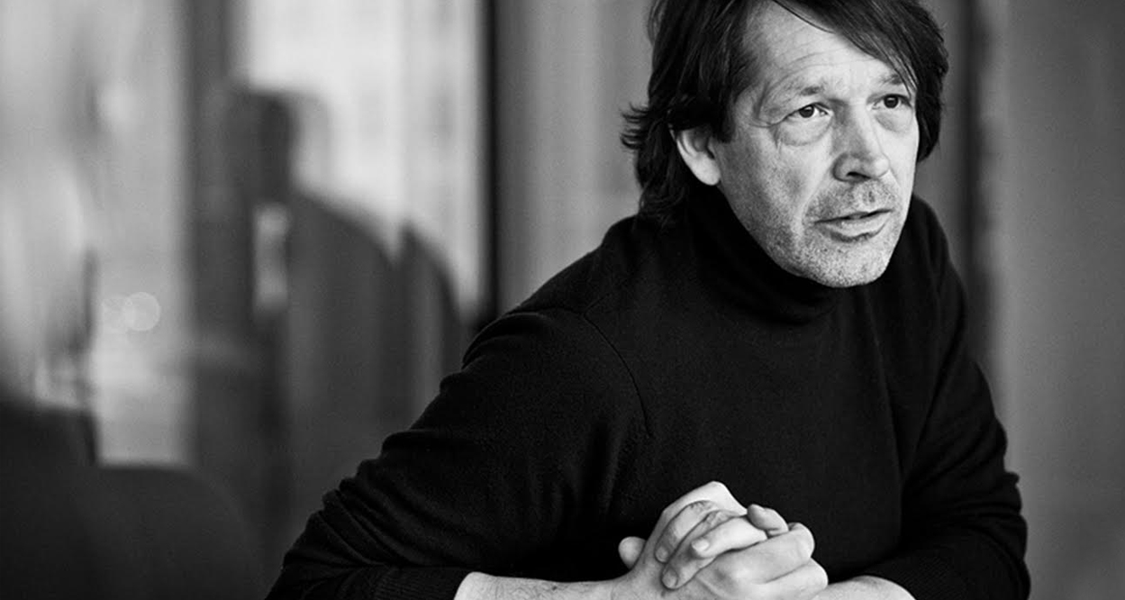
Influential British designer Peter Saville discusses his views on the evolution of the graphic design industry, while also questioning the role of truth in branding. This interview was featured in Open Manifesto #4, which focused on the theme ‘Propaganda’.
Kevin Finn: While you were at Art College you came to the conclusion that graphic design was a service to other disciplines. Do you still see this as being the case?
Peter Saville: Yes. [Pause] I got steered towards graphic design when I was a young person, when I was a teenager, because I liked the aesthetic of the graphic art. I think this is probably a condition common to many young people. The graphic arts are very much a (sort of) entry-level course for someone who is visually interested. Because it is pretty simple stuff, isn’t it?
It’s accessible?
Yes. It’s like Pop Art. You don’t need to know much. Many of us, from average middle class backgrounds, are not highly culturally aware in either music, or literature, or theatre, or cinema, or art, or whatever. You know, the arts are attracting many, many people whose parents were in the more mundane activities of life; shopkeepers, factory workers, accountants, bookkeepers, business people, whatever.
Actually, when we meet individuals who have grown up in a more highly attuned arts background, they’re usually a lot more focused about what they want to do. The Arts are attracting increasing number of people who don’t really have any high art background when they arrive at art college age, at 18. And pretty much, the things they know most about are the popular arts and the arts associated with youth culture. As a result, they know quite a lot about fashion and pop music and graphics.
Now, this was exactly my condition 30 years ago when I went to art school. I liked Pop Art. I knew a little bit about Modernism, because I studied architecture at Art School, rather than art history. And I think I liked graphics, or was drawn to graphics. And the work I was doing at high school looked like a graphic aesthetic because it was what I knew and liked.
Of course, I liked record covers. I liked pop culture posters. I liked Andy Warhol and Allen Jones and the Pop Artists. I liked that stuff. I could identify with it. It was accessible for me—I knew about it. So I expressed myself in that kind of language and in the world of graphic art, I found myself in a universe of this kind of—aesthetic.
Now, I think it would be fair to say that an awful lot of young people are drawn to something like graphics because they ‘get it’. It features strongly in their universe. They are the audience. They see so much of it in its groovier formats.
And I would say, increasingly we are seeing people drawn to fashion, and photography—and fashion photography [laughing]—and motion image, and they know about music video. You get drawn into the stuff you know and understand.
I don’t think they have any real idea what the discipline of communication design is really about. So, the fact that there is service component is something that, I believe, a lot of them don’t even think about. And I didn’t.
I don’t think they have any real idea what the discipline of communication design is really about. So, the fact that there is service component is something that, I believe, a lot of them don’t even think about. And I didn’t.
Was it surprising for you to come to this conclusion?
I think I avoided it. I avoided the reality of graphic design until I was about 30. Where I found myself was in this particular position (and this was my state of mind when I went to art college): I was interested in what was setting the cultural agenda, as seemed important to me at that time.
We’re looking at the mid seventies here. I was very interested in music and fashion. And if you think about the great movements in music at that time, which is the relationship between image and identity and music—David Bowie is this time, and Roxy Music is this time—so they’re my, kind of, artistic role models in music and they are playing with issues of image and identity through the form of pop music. And there is obviously a very strong link with fashion at work there, too.
So what you‘ve got is music, which is like the common denominator of youth culture—music is the glue, whatever it is, particularly if you’ve got this youth avant-garde mentality—the music is the glue. And this leads you to the role of identity and fashion. Fashion is very important, and what’s going on in fashion is important. Obviously what’s going on in photography, and it’s role in fashion and identity, is important. At my time there was Helmut Newton and his contemporaries. They were like the avant-garde fashion image-makers.
And then there was this kind of graphic branding—or a branding role—in it all. I wanted to be a pop star, but accepted I wasn’t musically inclined so I couldn’t be a pop star. And I didn’t even dream of being a fashion designer. Later I would have done, but I didn’t at that time. I was a bit intimidated by photography because it seemed rather technical and hard work. But the graphic element, there was definitely a graphic element in all of this and it seemed to me that I could do that.
Interestingly, the graphic component was another kind of multilateral glue—music involved graphics and photography. And fashion? Well that also involved graphics. And other aspects of design had it. So I thought, this graphic thing is common to everything.
If you are looking for a convergent practice that can, in a way, link you to all of these different spheres of activity, from fashion design, to being a pop singer, to making movies or being a photographer—well hang on a minute, this graphics thing, this is common to all of these activities. That’s interesting. This ticket gets me into everything.
I figured, ‘I can do this’. I like the graphic art look and it’s an access all areas ticket. But it wasn’t setting the pace. Image-makers and the music, they were the pace setters. I realised very quickly that graphics is not the pace setter; it is subordinate to a message written in one of these other disciplines. But I thought, ‘yeah, I’m here now—doing it—so I’d better make the most of it.’
So that was my position. I spent no time at all in the graphics department because, with the exception of my friend Malcolm Garrett, they were all pretty boring. And I spent all of my time with the photography people and in the fashion department, because it was there that I saw, in a way, the trends and the directions being set.
Then I would go away and ask, what does this mean to the graphic language? What’s the graphic language for this direction in fashion? What’s the graphic language for this direction in pop music? What is the graphic equivalent for this progressive photographic image making? What’s its graphic equivalent? This was my mission.
You also say graphic design is—‘for others, to others’. Can you expand on this?
Well, the ‘for others, to others’ is a very good way to bring oneself down to earth, vis-à-vis, the role of communication in design. What I actually ended up doing, as I graduated from college, was different, courtesy of the autonomous playpen that was Factory Records—a place where no one set the agenda and the groups were free to do what they did—there was no commercial agenda.
There was no commercial agenda because there was no money at stake. Tony Wilson [founder of Factory Records] put five thousand pounds in at the beginning and it was a bit like one of those accumulated debts. So, seven turns into 20, 20 turns into 50, 50 turns into 250. When Ian Curtis [lead singer of Joy Division] died, there was a windfall of cash. Because, remember, we had no contracts, we had no advances, there was no advertising, there was no promotion. All there was was the cost of a group going in to a studio and recording a track quickly. I mean I know ‘Unknown Pleasures’ [Joy Division] was made for six thousand pounds.
There were no advances. Nobody took a salary. There was no office. There was nothing. There was just the cost of making the product. And in the case of Joy Division, the cost and the income [laughing] became disproportionate.
Of course the catalyst for that was Ian [Curtis] dying. Suddenly Tony Wilson’s five thousand pounds stake turned into… I don’t know, 250 thousand pounds. That was in turn able to fund the Hacienda [Factory Records nightclub and venue], as well as further releases and whatnot.
And it’s really important to remember that Factory Records never got commercially orientated throughout the entire Eighties. In fact, it ended because it was never financially controlled.
This is quite important. It created an autonomous operating zone for everybody that was acting within it. What did it do for me? It gave me an opportunity to do graphic art, communications art, whatever you want to call it, as a kind of free-form medium of self-expression. Nobody gave me a message. Nobody really declared whom the work was for. Certainly not Tony Wilson.
And the groups were too shy, and insecure, and disparate among themselves to say what they wanted, with the exception of Joy Division on the first album. They gave me something and said “we would like this on our record cover”. So I put it on their record cover.
They didn’t say how. They didn’t even have an approval process in place. They just said ‘we would like this on the cover of ‘Unknown Pleasures’’. It was wonderful, what they gave me, and I looked and it and said, great! And the then I asked, what else do you want on the front? Their answer: “Well, dunno really.” “Do you want it to say Joy Division? And they said, “not really. It’s a bit obvious isn’t it?” [Laughing] Would you like it to say ‘Unknown Pleasures’? “Not really”. And that was the biggest brief I ever got from them [laughing].
They were shy and they wanted to be anonymous. They wanted to be enigmatic. They didn’t want to enter into the clichés of the music industry because this is the period immediately post punk where everybody had burned the house down.
So it was cool to be detached and enigmatic, because there was no brief, and there were no business people, and there was no marketing person, and there was nobody in control, and there was nobody who knew what they were doing. So—do what you want. And for the next 10 years, I was able to use the medium of communication to express whatever I felt like expressing.

Unencumbered by…
Unencumbered by anything! By the time Ian [Curtis] died and Joy Division became New Order. But they couldn’t even agree on what to eat for lunch, or whether they would go on tour or not. I mean, they couldn’t agree on anything.
How does that now fit with your definition of graphic design?
Well, the point I am mentioning here is that I did all that work, which I am known for, and it was completely outside the normal practice of graphic design. Graphic design isn’t like that—it’s completely not like that. And in my entire fucking career—30 years on—nothing else has ever been like that.
And of course, half way through the Eighties when I had to do something other than record covers, because you grow out of it, then I began to hit the real meaning of communication design. And I didn’t like it. I hated it. It was astonishingly boring.
Brett Wickens (who was my top colleague by this time) and I painfully buckled down to the reality of communication design as a profession and began to operate in the normal practice of—client, audience—and shaping the message from the client to the audience. And I didn’t like it.
I began to hit the real meaning of communication design. And I didn’t like it. I hated it. It was astonishingly boring.
The message was obviously someone else’s.
Of course—it was ‘for someone else to someone else.’ It was not for me, and it was not to me. I mean, luckily, in the early years we had some very liberal and open-minded clients.
Our first client was Nick Serota, who is now Sir Nick Serota—he’s the Director of The Tate [Art Gallery/Museum, London]. At that time [1976] he was the Director of The Whitechapel Gallery [London]. He was our first client outside of music.
He asked us to do an identity and house design program for the The Whitechapel Gallery. He asked because he was beginning to work with a younger generation of artists who knew my work through music. He felt [the artists] would have confidence in me.
I assume it was a segue for you as well because it was still based in culture, or it was still coming from your previous experiences, but in the world of reality in graphic design.
Yes. And Nick was very wise and very patient. He had a year for us to do a letterhead. And he needed it because Brett and I realised that we didn’t know what we were doing.
I mean, we studied enough, and we read enough, and we knew enough about the discipline of design, and we knew what the benchmarks were. But it took a while to get there. But Nick was patient and open-minded and we did an interesting piece of work with The Whitechapel Gallery identity.
[Nick] was tough, and he’s very scary, but he was still a very user-friendly client if you’ve got principles. If you don’t have any principles, if you don’t have any style, if you don’t have any craft, if you don’t have anything [of that nature] then Nick Serota doesn’t have any time for you. He was a great mentor for our… [Pause]…amateur idealism [laughing].
And very soon after that we started to work, through Paris, with [fashion designer] Yohji Yamamoto in Tokyo. Similarly, Yohji was an idealist. He was very interested in doing something very different. There was no commercial agenda. There were no marketing people. There was just: “Show me a fresh way to make a fashion book.” And we did. We brought a lot of graphic art standards and skills to it, which were not prevalent in fashion at that time.
This still reflected the freedom you had at Factory Records and with The Whitechapel Gallery. It was almost like a soft introduction for you.
It was really soft. That’s the perfect way to put it, Kevin. Nick Serota and Yohji Yamamoto were a soft introduction for us.
I mean, [laughing] they’re both a couple of scary demi-gods but where we needed the softness they had it. They were interested in what we were doing, not in its commerciality. And Nick was quite a champion for us with what we were attempting to do—and we were attempting to do something very new. For example, Brett created a Serif Sans Serif typeface for The Whitechapel Gallery. We were looking for a conceptual solution in our work. Nick saw that and appreciated it. Yohji saw it and appreciated it. So it was a soft introduction.
And Pentagram, in 1990, became the finishing school of the relationship between the idealist designer and commercial practice—business practice…
I get the impression you don’t believe these two characteristics can really go hand in hand.
No, the skill is learning ‘how’ these go hand in hand. That’s the skill. And of course, for two years at Pentagram I had a dozen partners to teach me, some of whom had written the book on the relationship between business and graphic design—Colin Forbes being a great example. Alan Fletcher being another great example. And John McConnell is just an amazing navigator of business and is just brilliant at articulating the value of design in the context of business. He was just brilliant…
Was that daunting?
No. It was pretty damn impressive. Brett and I had five years on our own, of seeing the enormity of the problem. And suddenly, there I am with all these older guys who were 20 years older than me and who had figured it out.
The problem was, that in figuring it out they had parted company with aesthetic innovation. And this is where there is a fundamental difference.
Of course, they were probably under the impression that—with 15 years of practice behind you—you also understood the relationship between business and design…
All they thought was that I was a reasonable exponent of the new aesthetic but only in as far as they liked some of the early work. They liked where I had gotten to a few years earlier because it could trickle down to their level of sensibility.
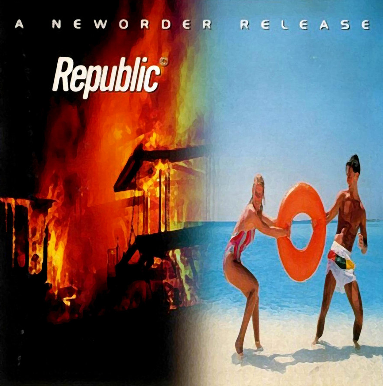
But what we were doing in 1990—they didn’t like. It was not graphic design. Even Alan Fletcher said to me about the Republic cover for New Order: “Peter, that isn’t graphic design.” They didn’t really see the value of this work with fashion because the luxury goods business had not really happened the way we understand it now.
It was pre-Prada, pre-Gucci, pre-Louis Vuitton, pre-Dior. The massive business that fashion was going to blend into hadn’t really happened yet and it was still a bit of an avant-garde activity. They didn’t really see the point in it. And they had never heard of Yohji Yamamoto. They’d heard of Issey Miyake, but this guy Yohji—[they thought] “it’s a bit weird isn’t it?”
My friend Nick Knight, whom I was working with at the time, wasn’t regarded as a proper photographer then, either. The graphic language aesthetic we were exploring when we were at Pentagram, their taste hadn’t arrived at it yet. But they liked the early work. They wouldn’t have liked the early work five years earlier. I mean, this is what happens with old people…
It’s retrospective?
Yes. But they thought: “[Saville and Wickens] are trendy, but they’ve got longevity. They’re not just trendy for the last 12 months. Peter has been trendy for the past fucking 10 years so he must have something.” And there was a certain kind of elegance to the work, which they liked. Once they were able to visually decode the work—when they got to like things—they could see there was an idea there. But they believed: “these boys have no idea about business. But now they’re here, perhaps they’ll learn.”
Well, we didn’t [laughing]. The two years I was at Pentagram, it was too much. And at the same time, it wasn’t long enough. Also, I didn’t really want to work the way they worked. I didn’t really want to do that. Kevin, here’s a perfect anecdote to explain it: one evening around eight o’clock, Brett and I and an assistant were all sitting around a [Apple] Macintosh; the fact that we had Macintosh’s was deeply, deeply unpopular at Pentagram. They did not want us to use a Mackintosh. In 1991, 1992, they kept on begging us—“please get rid of those fucking computers!” This is how out of sink I was with Pentagram.
Anyway, three of us were sitting around a Mac at eight o’clock at night and John McConnell was the last partner to leave the building. He called to me and I went down the stairs with him and the first thing he said to me was: “Peter, that looks expensive.”
He’d see my hourly rate, Brett’s hourly rate, and someone else’s hourly rate all sitting around one job. John didn’t like to see that, quickly calculating six hundred pounds an hour sitting on one job. And his final words were: “you’ve got to stop trying to reinvent the wheel.”
Ironic since, as you said, the fashion industry was about to explode and the Apple Mac was about to revolutionise graphic design. So, in a way, you were staring into the future and they weren’t…
Well, we were always trying to reinvent the wheel. That’s what we were doing. That’s what I wanted to do. At that time I wanted to follow the evolution of the discipline, of the art. In fact, it’s what you have to do now if you want to stay out there.
And also to avoid the problem of what we spoke about originally, that graphic design wasn’t the agenda setter.
Exactly.
To counter this you were exploring areas of innovation and experimentation—areas that were challenging—otherwise you’d end up on the treadmill?
Exactly. But what you can’t do is work in an innovative way commercially. What I ended up realising; the first thing was to re-understand the word professional. What I learned at Pentagram was: you have a ten thousand pound budget for this job. That means you do it with this number of people in this number of days. That’s professional. You have two days to do whatever it is—you do it in two days.
And John McConnell would say: “what’s wrong with a day and a half. There is nothing wrong with a profit.” And if we look at the way those design companies developed their aesthetic, that’s how they worked. They stopped reinventing their aesthetic. They learned how to do it, to some extent, on autopilot…
Within parameters…
Yeah. And if you wish to work professionally, and successfully within communications design, that is what you have to do. And I didn’t really want to do that. I realised that I didn’t want to do that. It wasn’t interesting for me to do that. I didn’t really think it was a very good way to navigate the times. I saw fashion and trend starting to set the agenda in graphics and this was a bit of a problem.
I think how I see it now, Kevin, the entire culture has changed, the climate has changed, the audience has changed, everything sitting in communications design is now positioned via fashionable codes. That’s the deal.
The position you can get to, and to some extent this is where [John] McConnell ended up and where I live half my life, is no longer as a ‘doer’ of anything graphically, but as a consultant strategist on ‘what to do’.
The entire culture has changed, the climate has changed, the audience has changed, everything sitting in communications design is now positioned via fashionable codes. That’s the deal.
As a Sheppard?
As a ‘route-finder’. A guide. And I mean this in a professional capacity. At Pentagram, I was twelve hundred pounds a day. We can equate that now as like, two thousand pounds a day. There is only one thing that clients, companies, or corporations pay two thousand pounds a day for and that is strategic thinking. Who the fuck does [the implementation of the design work] doesn’t matter. It’s about ‘what to do’ for that client to that audience. This is a boardroom level activity.
There is only one thing that clients, companies, or corporations pay two thousand pounds a day for and that is strategic thinking. Who the fuck does [the implementation of the design work] doesn’t matter. It’s about ‘what to do’ for that client to that audience. This is a boardroom level activity.
Your definition of graphic design ‘for others, to others’ seems to be…
Totally. It is that in its purest sense. ‘For others, to others’ in its purest sense. You have no hands on involvement because the decision on what to do has to be entirely impartial. It may be something you can do, but actually, is anyone going to pay you two thousand pounds a fucking day to do it? No, not really!
The laying out of type, the positioning of images… blah, blah, blah. The clever things to do with Helvetica—whatever! I mean, no-one is going to pay fucking two hundred and fifty pounds an hour for that! You don’t need to, because there are loads of talented young people who are desperate to stay up all night looking to do something different with Helvetica.
So, the value you’re talking about is increasingly in knowledge, and in awareness, and in opinion?
Yes. Positioning. How to employ the universe of visual codes, which are constantly changing in meaning as a result of pluralism, popularism and fashion; how the visual codes position the clients service offer, vis-à-vis, the given audience.
Do you find the boardroom level is seeing value in this?
Depending on the nature of the business you are dealing with—yes. Yes, they see the value in this. In the luxury goods industry they understand it totally. They are very much interested in graphics now, just as much as they used to be in fashion and the art direction of [fashion].
It’s positioning. It’s positioning and branding. How do we brand ourselves? What is our brand? And this is understood to be the realm of communications design.
It’s positioning. It’s positioning and branding. How do we brand ourselves? What is our brand? And this is understood to be the realm of communications design.
Of course, that whole notion of branding, from what you’re saying, has matured. Over the last decade the buzzword has been ‘brand’ but I don’t think designers even understood that it was more than a big corporate identity. But now, since the business world understands it, designers understand it and culture understands it, we see it has matured.
Yes it’s much more than a corporate identity. But it’s interesting, Kevin, there is still a lot of mixed opinion and confusion as to what is really meant by a brand. It’s not necessarily about branding.
For example, in the two years [I have been] a branding consultant to the City of Manchester, branding has really got nothing to do with it at all. Instead, it’s: ‘what is the understanding of the city?’ The brand is Manchester. That’s the brand. The question is what do people understand when they hear the word Manchester? Pretty simple. What do people understand when they hear the letters BMW? That’s the brand. I mean the graphic symbol of BMW is just a little part of it.
If you go to a city, what’s the graphic symbol of a city? We never fucking see it. You and I are talking about Manchester; you haven’t seen the logo, but you know what I mean when I say Manchester—a city in the north of England. Does Sydney have a logo? I have no idea, but I can tell you about my impressions of Sydney because that’s the brand. So the work with Manchester has been entirely about: what do people think when they hear or see the word Manchester?—in any typeface; in any tone of voice.
I guess the critical thing there is, it’s purely experiential and it is purely individual so it’s a very difficult thing to wrap up in one particular mark or…
It is. It relates to what is said about the place and where it is said. This is where the brand of a place is brokered. I see a brand now as a ‘news generator’ that lives in an information net that circles the world. And a key thing for a brand is that it must be a regular frequent ‘news generator’. If it’s not generating news, it is clipped out of our awareness. And the news it generates must be on message.
Take the brand BMW. If we hear BMW is working on a new range of high fuel, high emission, power vehicles, we begin to get the negative connotations about BMW. If we hear that BMW is working on hybrid vehicles, that they have ideas of a non emissions or a super hybrid—whatever—then that is keeping BMW in the ‘on message’ version of brand positioning now…
I see a brand now as a ‘news generator’ that lives in an information net that circles the world. And a key thing for a brand is that it must be a regular frequent ‘news generator’. If it’s not generating news, it is clipped out of our awareness. And the news it generates must be on message.
As dictated by popular culture, and the people.
Exactly!—a constantly moving target. You know, if we heard them talking about green vehicles ten or twelve years ago we’d think: “Oh, they’ve gone really fucking hippy on us—really boring.” So the message is constantly a moving target. To be a communications consultant, the more manoeuvrable you are the less tied down to any baggage or given aesthetic, the better.
So, the communications design business is now about ‘doers’ and ‘thinkers’. You would have to give the career longevity to the ‘thinkers’ because the ‘doers’ have a fashion season-like lifespan.
Of course, this is not unique to graphic design—and it’s not rocket science to figure out—but it seems to have taken quite a long time for us all, and the industry, to catch up with that idea; that the ‘thinkers’ are the ones who will withstand the shifting trends and the ‘doers’ will be the ones who interpret it…
It’s mainly because there is very little writing of any significance or consequence in design, right across the board, but particularly in graphics. The level of writing is banal.
Why is that? Is it something that is still maturing?
I don’t know. [Pause] I think it’s because of the enormity of the media culture issue. We haven’t really come to terms with it yet. There are an awful lot of dots that still haven’t been joined up.
Think about the diversity of things written in business, in psychology, in media studies, in graphic art, in typography, in branding issues (you know the famous ‘No Logo’ book [by Naomi Klein])—if you join it all up you’ve got a really big issue. But I don’t think it has really been seen yet.
For example, we go and get one or two graphics magazines out now—what the fuck do we see? We see Creative Review and Grafik magazine. What do we see? We see a bunch of ‘doing’ stuff. We don’t see a highly informed, articulate, intelligent essay about the meaning of media culture; the relationship of business to media culture. It’s really dumbed down.
Perhaps it is still catching up with itself?
Yeah! You need a Marshall McLuhan writing in fucking Creative Review. You need a Peter York writing in Grafik magazine—there are people out there and they are writing about these things in other areas, but no one is really joining it up. There isn’t a publication that embraces psychology, philosophy and media. People are still taking about what they did with Photoshop, and it’s all intuitive. None of it has had any intellectual discipline brought to bear on it.
The argument, which is always presented, is: designers won’t read the material. Perhaps this is due to the fact that, at the moment, the industry seems to be populated by what you refer to as ‘doers’ and not ‘thinkers’…
Yes. There are a bunch of ‘thinkers’ and manipulators who just use the ‘doers’ like they harvest them. We don’t get marketing people or business people writing. It’s presented as though all of these activities are in there own separate little capsules. But if you are working at the highest professional level, you need to be articulate in these different skills.
You need to talk to business people; you need to understand the psychology of an audience; you need to understand the routes of influence via media and how much the world is changing as a result of being a media culture.
Within the academic system, you get too many people who are out of the loop so the academic system doesn’t adjust quickly. Graduates come out and they’re at the foot of the mountain—they’re not even at base camp one.
You need to talk to business people; you need to understand the psychology of an audience; you need to understand the routes of influence via media and how much the world is changing as a result of being a media culture.
And the industry isn’t really supporting the intellectual side of things. So whatever academic rigour students have gained at university it isn’t accepted in industry; and so they become ‘doers’?
Yeah. Over the past decade we are only just beginning to see proper partnerships between business minds and designers within the context of design companies. They are beginning to get together and starting to think: “Hmmmn, maybe we can help each other.”
Now, I’ve seen how to do it, and if needs must, I can do it, but I don’t wish to do it. I don’t actually wish to practice design to manipulate audiences. But of course that’s the job now. There is no ideology in business except profitability. That is businesses ideology. That is businesses raison d’étre —to make money. It’s not the business world’s raison d’étre to change the world or make it better…
Unless it’s profitable to do so [laughing]…
Unless it is profitable. [Pause] So, therefore, the job is to steer and engineer people’s perceptions of things towards a profitable outcome for your clients—that’s the job! And that hasn’t sat comfortably with me as a role to play.
It seems shallow?
It’s a misleading conspiracy, you know. It’s smoke and mirrors. The brief is: make it look like we believe in something; make us or our product look believable; look like we mean something. That’s the job.
Image Credit:
Peter Saville portrait provided by Peter Saville
Album cover images from personal collection